I currently have a another render going with Volumetrics and dust in the air(going on 12 hours now). Helpful criticism welcome, thank you!
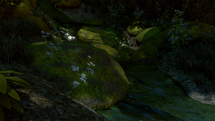

I really love the amount of detail in this image. But I’m not sure if the water should be that green… swiftly flowing water (if that’s what this is) usually isn’t green. The water flowing between the smaller rocks looks like lime jello. I think that possibly the water should be defined mostly by the surface reflections and distortion of the creek bottom when viewed from above, instead of by color.
On the right side of the image, the wet/dry boundary between the water and the bank seems too sharply defined. It looks like they are different materials, and you can’t see any transition between these materials. In “real life” you’d see the surface sloping down into the water, and there would be a dry part and a submerged part of the same surface.
On my monitor, the overall image seems a little dark. You’ve done such a great job all on the details, I kind of wish there was more sunlight in the image so I could see them better!
I assume this is followed from the youtube creek tutorial? If so, please be sure to credit the tutorial author.
My feedback: It’s way too dark and some of the textures look like flat 2d images, i’d take more time to add actual geometry to them, such as dead leaves and sticks. Doesn’t have to be super high poly, literally a plan with a subdivision or 2 and an alpha map would work well.
Overall though, you have a good scene started. Just brighten it up and put more attention in the details.
One can see that this has lots of work, even If I recognize some premium packages of nature life being used.(If im mistaken, pardon me).
Anyway, I feel that it is too low poly for a render that tries to be somewhat realistic. I would test with some displacement modifier on the rocks with any texture, this way the shape will be more rocky, and less oval-shaped.
The lighting could be improved a lot, it is too dim atm. Like, maybe you should work on increasing the brightness on the top side of the picture, adding other lights with contrasting colors to generate more atmosphere. You did hit an interesting point tho, with that water reflection. In post pro you give a nice glow to it, and it will be perfect.
The hardest part with a picture like this, is integrating different elements like wet props, with rough surfaces. To be more precise, giving the feeling that the rocks are wet because they are close to the water. It will require a couple of specular maps in order to get a nice effect.
Lastly…some bugs. Maybe a couple of butterflys.
Closing note: I dont think volumetric lighting should take more than minutes or just an hour. 12 hours is just too much. If I would notice that my volumetric lighting is taking that much time, then I would just render it through blender Internal. I have done that several times and the difference is like non existant after you post process it.
Dust in the other hand, could be just added by PS. Rendering it just takes too much time.
Like Alvarocgi said, the scene is too low poly for the style. To work on the lighting I suggest you watch Andrew Price’s tutorial on a grassy meadow scene (he sets his sun lamp to like 10). For the longest time I was silly enough to think that the default 1.0 value for a sun lamp or world lighting was correct for simulating the real sky or sun: this is what the really great artists mean when they say you have to setup your lighting before your materials 
Also, it looks like you didn’t use any bump mapping (if you did it is too subtle) which is a must for a realistic render.
And on the topic of increasing the poly count - don’t just add a subsurf modifier to everything - this is not what modelers mean when they say it is low poly! For example, the leaves from the plant that is right next to the camera are just not varied enough. Add some variation to the edges, add a groove down the middle (make the leaf slope towards the center from both sides), make the leaf bend down like it is weighted towards the tip (look at reference photos of that type of plant and mimic them).
Everyone here has offered some really great, and I would also suggest maybe adding a more specific point of interest in your scene? If this was a photo, why was it taken? I’d like to see something (a frog, weird stick, a particularly nice flower etc) that pulls my gaze and then I can take in the rest of the scene and details.