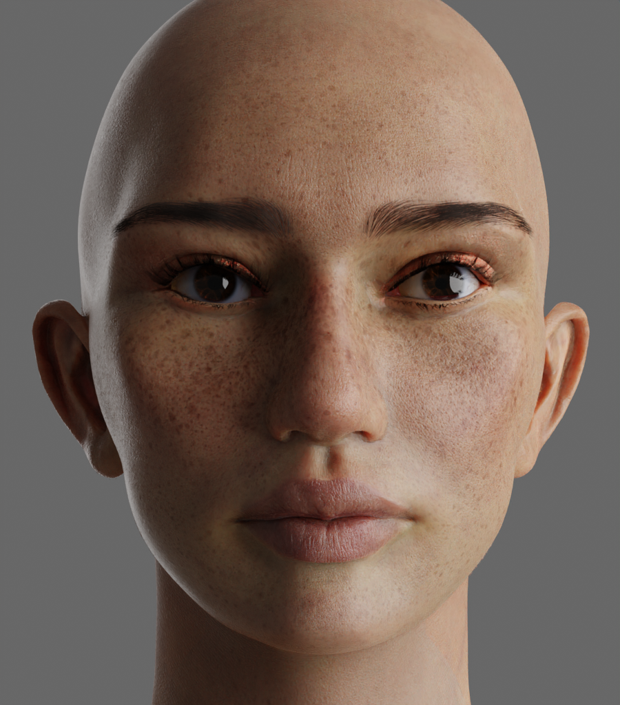
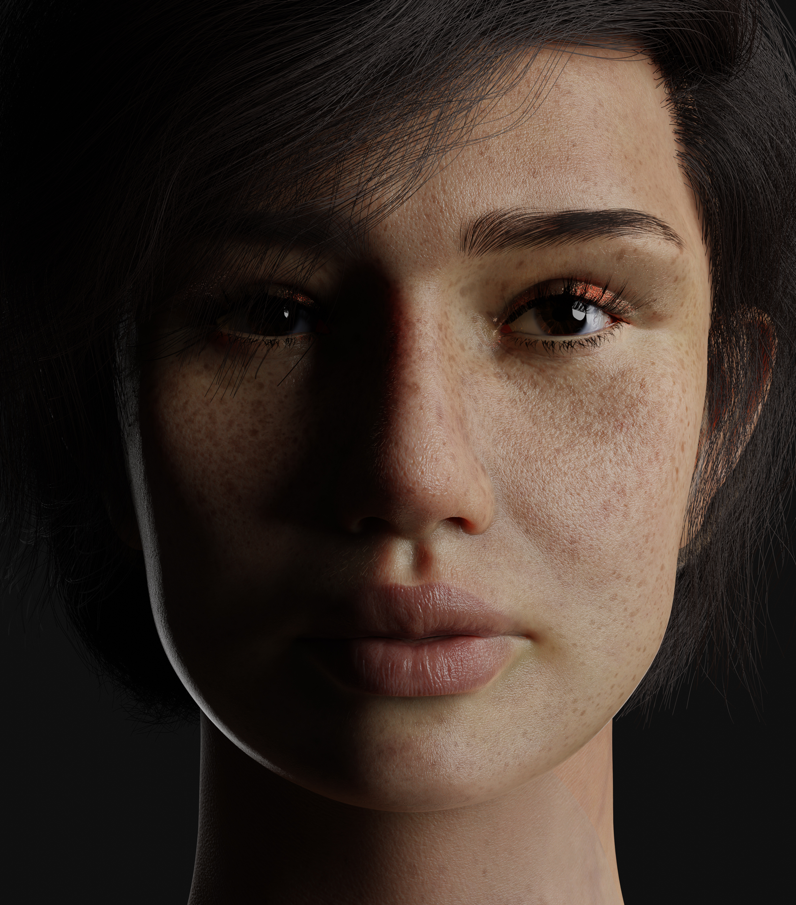
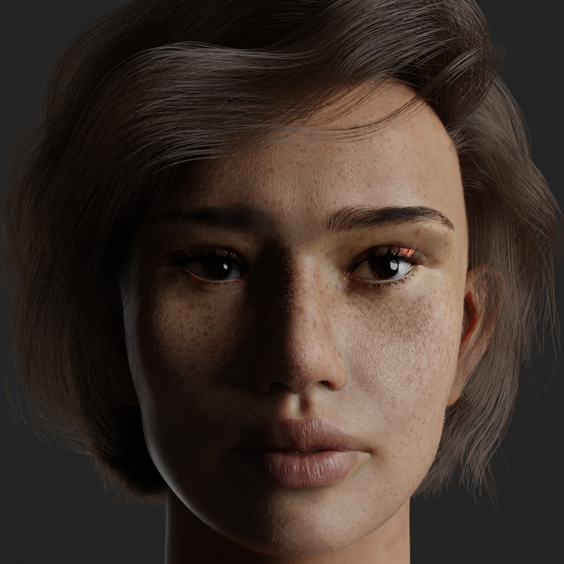
Any feedback on how to improve her will be greatly appreciated. She currently still looks a little cartoony.
21 Likes
far far better than i could do 
my advice would be for the eyes- more bags under the eyes/ subtle creases/ small wrinkles just below eyes
maybe a touch longer eyelash hairs on the bottom lids
the tearduct part of eye might need minor resculpting it fades to a sharp/ thin point in your verison
the cheekbones look a bit too high up/ squashed into the eyes?
everything looks perfect below the eyes
textures / colours are amazing 
eyes are super hard when it comes to realism good luck!
2 Likes
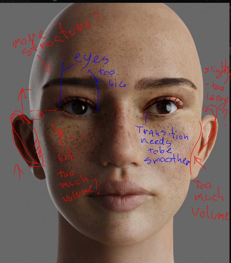
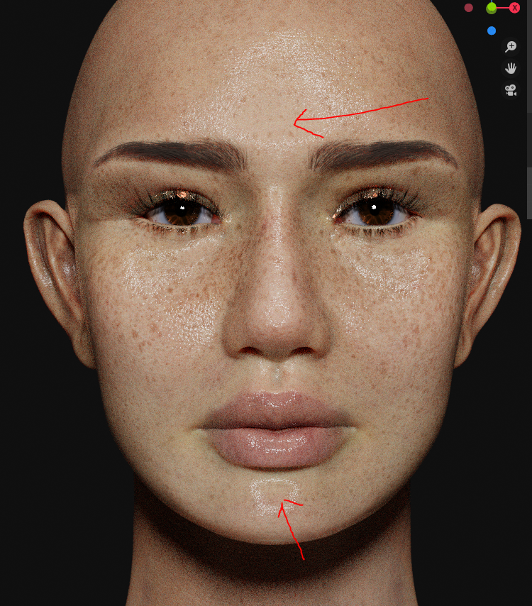
Sorry for the awful handwriting.
Ears are too low, are under cheekbones has too much volume and eyes too big, other comments are more towards opinion/preference.
Textures are looking great!
4 Likes
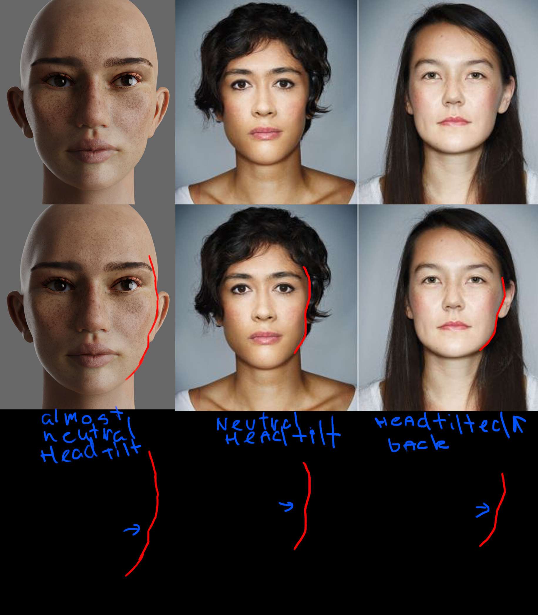
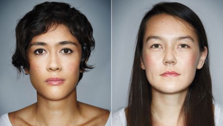
Firstly this looks absolutely beautiful! Stunning work on the skin texture and the yebrows, the lips look so good too! I don’t think they have too much volume personally, I think they give her a nice character trait - I love the rounded nose as well! I think my main pointers for critique would be the eyes. They are a bit too wide height wise - it looks a little bit like she is widening her eyes in surprise because the eyelids are not covering part of the iris, which naturally happens with relaxed eyes. Here is a picture of a woman with natural, relaxed eyes - notice how the eyelids are slightly covering the top and bottom of the irises?
Another small thing would be kind of match her skin texture to match her bone structure. She looks like she could be her late 20s or early 30s with her bone structure, which looks beautiful, but her skin looks much younger and it might appear as slightly uncanny. Adding some faint lines on her face would really help compliment her face (such as small smile lines or under eye lines) This is a good example of what I mean.
As for her cheekbones, since I saw someone mention it, I wouldn’t suggest reducing them. There’s no point in removing character traits that don’t look wrong. Your model has the same cheekbones as this woman to the right and she’s a real person.  Perhaps adding blushing/shading the same way as that woman it might appear more natural.
Keep going at what you’re doing, it’s looking amazing!
2 Likes
Thank you all so much for your really helpful criticism, am working on them now!
Here’s the thing though, I’ve been fiddling with my model for a few weeks. What I’m trying to figure out is why she still doesn’t look real even in a small thumbnail. Would this more likely be a texture/roughness/displacement issue?
this looks great …
i think what @bebob said is what you need to focuse on … also i would say the top of the haed is more rondy like a ball … maybe you she has hair things would be diffrent
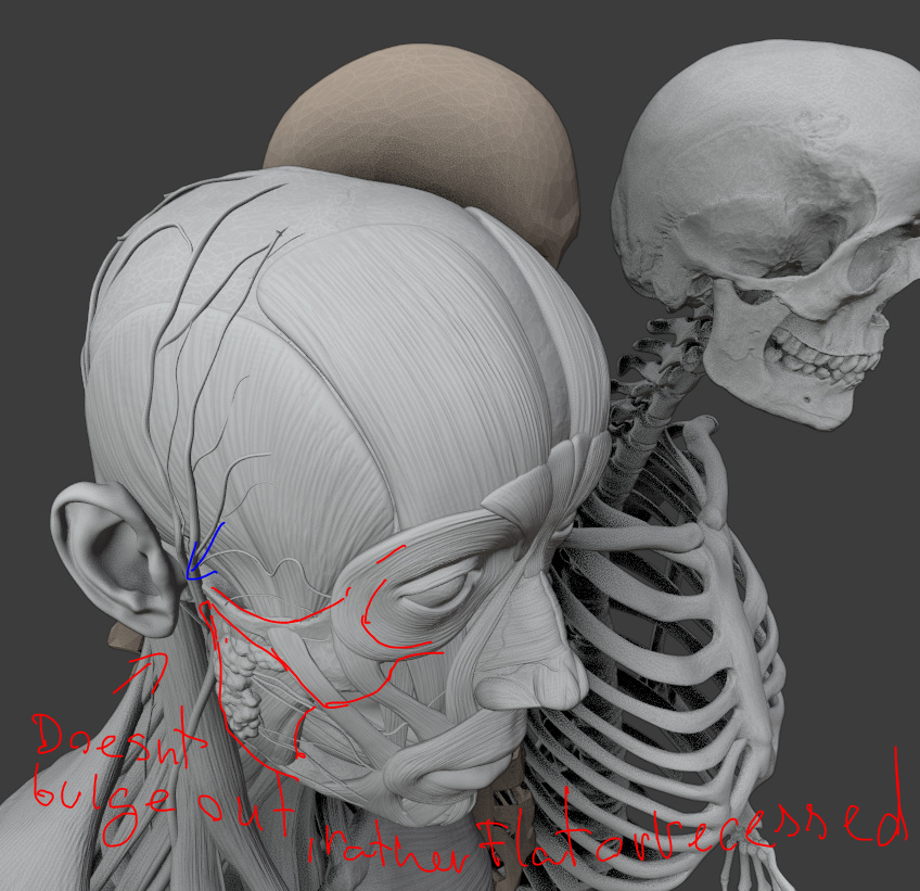
You have very nearly nailed it. I am no expert by any wild stretch of the imagination. Just thinking, if there was more definition in her neck it would go a little bit. I think that the main thing that I can see is I think her ears may be to low? If you just use a search engine and search “bald person” most of them seem to have their ears higher.
I’m sure there is somebody in the world that looks exactly like her. Really pretty.
Thank you all! I readjusted her ear and cheekbone position, defined her neck a little more (not obvious in this lighting), fiddled with her skin and I think she looks quite a bit more realistic now!
Still a looks little CGI but better! How else can I improve her?
6 Likes
Major flaw I see: The hair looks pretty thin, especially in front of the ear and where it is attached to the skull. I don´t know how this should look like, however I have some very short and wavy hear around the attachment points, but I don´t know if that is usual. And maybe some more and denser hair, again, no Expert, it just looks wrong. You did a great job, keep it going!
yeah her birdnest hair is another thing i’ll have to deal with eventually hahaha. i forgot to disable it in render. I do have trouble trying to stop it from having very parallel strands though!
anyway here’s my model in a different light. I have some strange issues with her highlights though, not sure how to fix it. the area that should be the brightest gets dulled down.
also she became way shinier in this light. should a finished shader work in all lighting or does it have to be tweaked everytime the light changes?
roughness map:
displacement map:
really big improvements good job 
next step- making hair have subtle colour changes /better softer transitions
maybe a tiny tiny 2% extra bit of pink /offwhite in the corner of eyeball closest to ear
may or not work - the eye looks pretty amazing already
one more thing: your face model now has ideal symmetry. Real humans have very asymmetrical faces
can’t help but Looks somehow like a Little Comic Version of gal gabot… 
but … it Looks good so far. But as you said… it’s important for what you wan’t to have. if you like to make it more realistics, then everythhing has said i guess.
Wow! Artists are really rough on each other.
THIS IS WONDERFUL. As good as many feature film characters.
Was Blender the only tool you used?
I use MakeHuman - mostly to simplify the process, however I’m not looking for “Absolute Realism” in my animations, I just try to tell a story
A physically correct material will work physically correctly under every lighting condition.
If the material is correct then you should consider your lighting setup to be flawed, however if you are certain that your lighting setup is correct yet the shading results in something unexpected then you should consider your shading and/or geometry.
Also make sure your textures are correctly color managed. If you save your texture in a sRGB format then make sure to load it in as such so that blender knows to internally covert it to linear. etc. There are likely people here better fit than me to explain that in detail if you wish to learn more about it.
If another artist asks for constructive criticism then sure, others will be happy to oblige. A good artists understands the positive value of it and is willing to both receive as well as give it. There’s nothing mean about it. Given that it truly is constructive.
Yeah. I was a software engineer. Code reviews could be quite challenging - personality wise.
There was one guy that would turn beet red. We always thought he’d leave on a stretcher one day.
Thank you for all your helpful suggestions so far, I’m definitely open to as much feedback as possible!
My base model is from Daz3d where I then basically changed… everything hahaha.
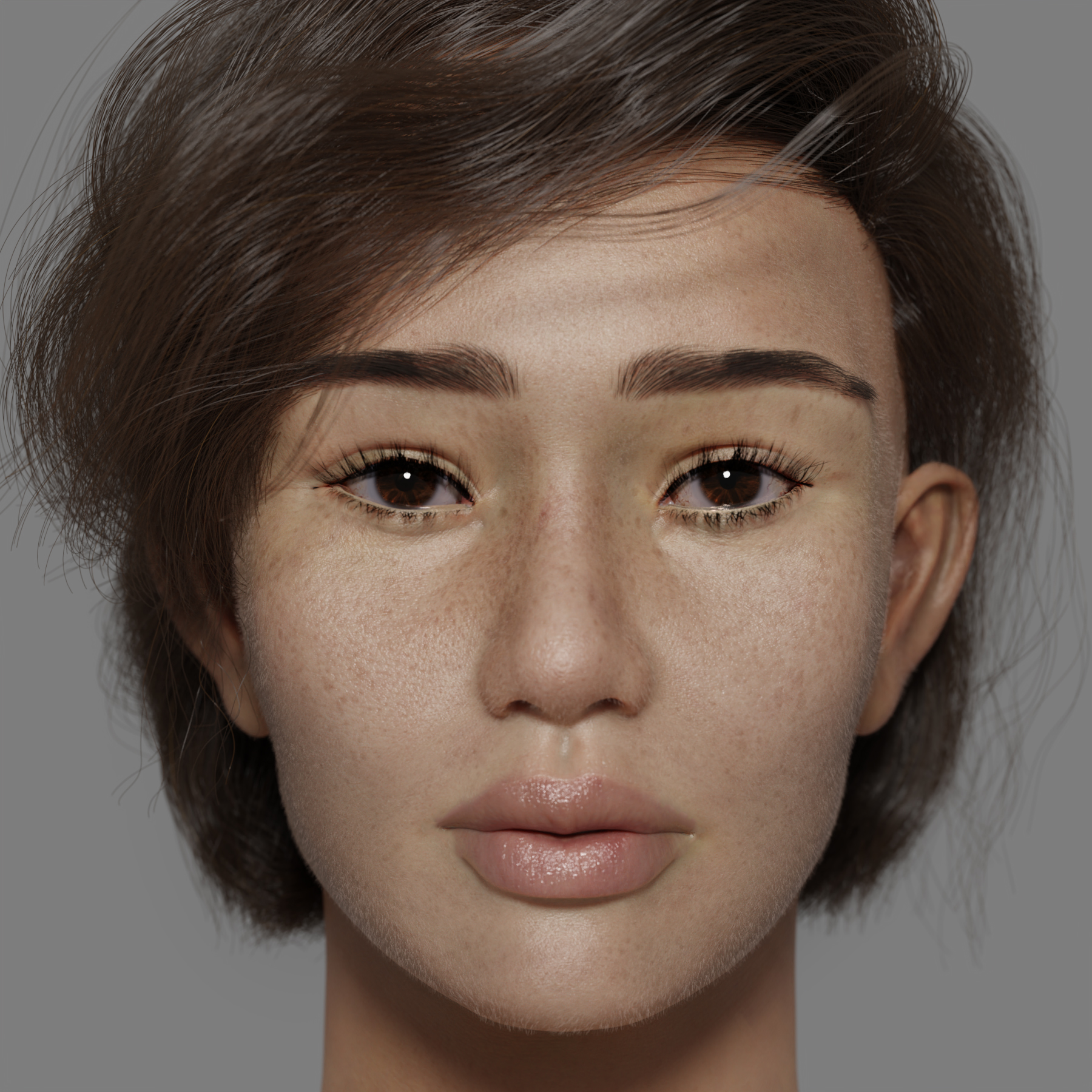
For this update I worked on her hair a little more, gave it a lighter colour. Reduced the cheek line so she looks slightly younger. Moved her features slightly again to see if I can make her a little more asiany since… I’m asian hahahaha.
Am happier with her but still not satisfied yet with her realism. Let me know if you guys have any more thoughts on how I can improve her!
1 Like
Latest render! She looks a little more asian now hahaha.
Lightened her frackles and skin tone and increased her face vellus hair.
Improvement, but still not completely there yet.
Btw I’ve read that a specularity map is not necessary for PBR workflow but she does look more realistic after adding it in… My roughness map on it’s own was not able to achieve this (or at least I did not fiddle it right.)
Does that mean it is now not physically correct? Also, what is a flawed lighting setup? @Felix_Kutt
3 Likes