As long as the values are correct it should be fine.
As for this, I’d say basically if you have built a lighting setup to achieve something specific but it’s not resulting in what you want.
As long as the values are correct it should be fine.
As for this, I’d say basically if you have built a lighting setup to achieve something specific but it’s not resulting in what you want.
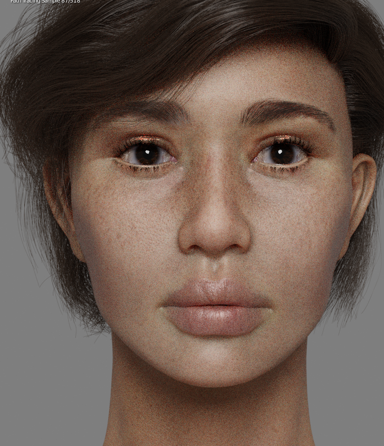
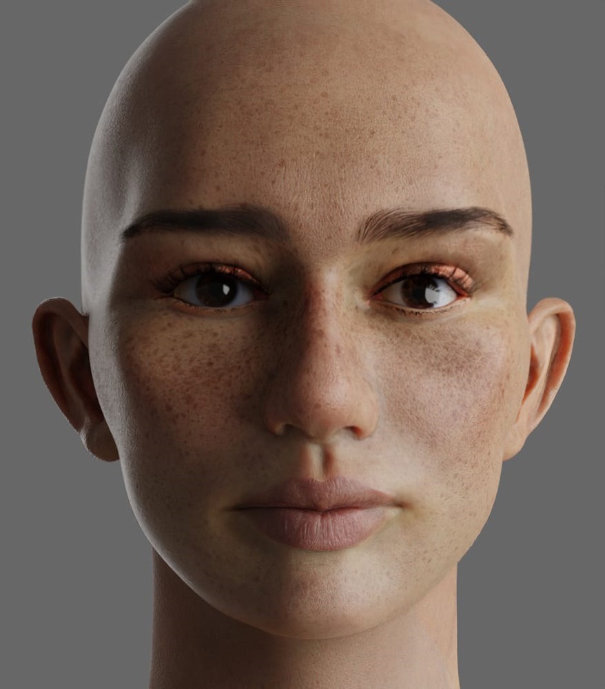
Vellus hair / peach fuzz seems slightly bit too strong on nose.
The skin albedo looks seriously amazing! I feel the pores are a bit too strongly defined though, detracting from it. Play with the bump and/or the roughness to soften mainly the inner cheeks area.
I included some facial structure considerations in an overpaint if you don’t mind.
Just to elaborate on some points:
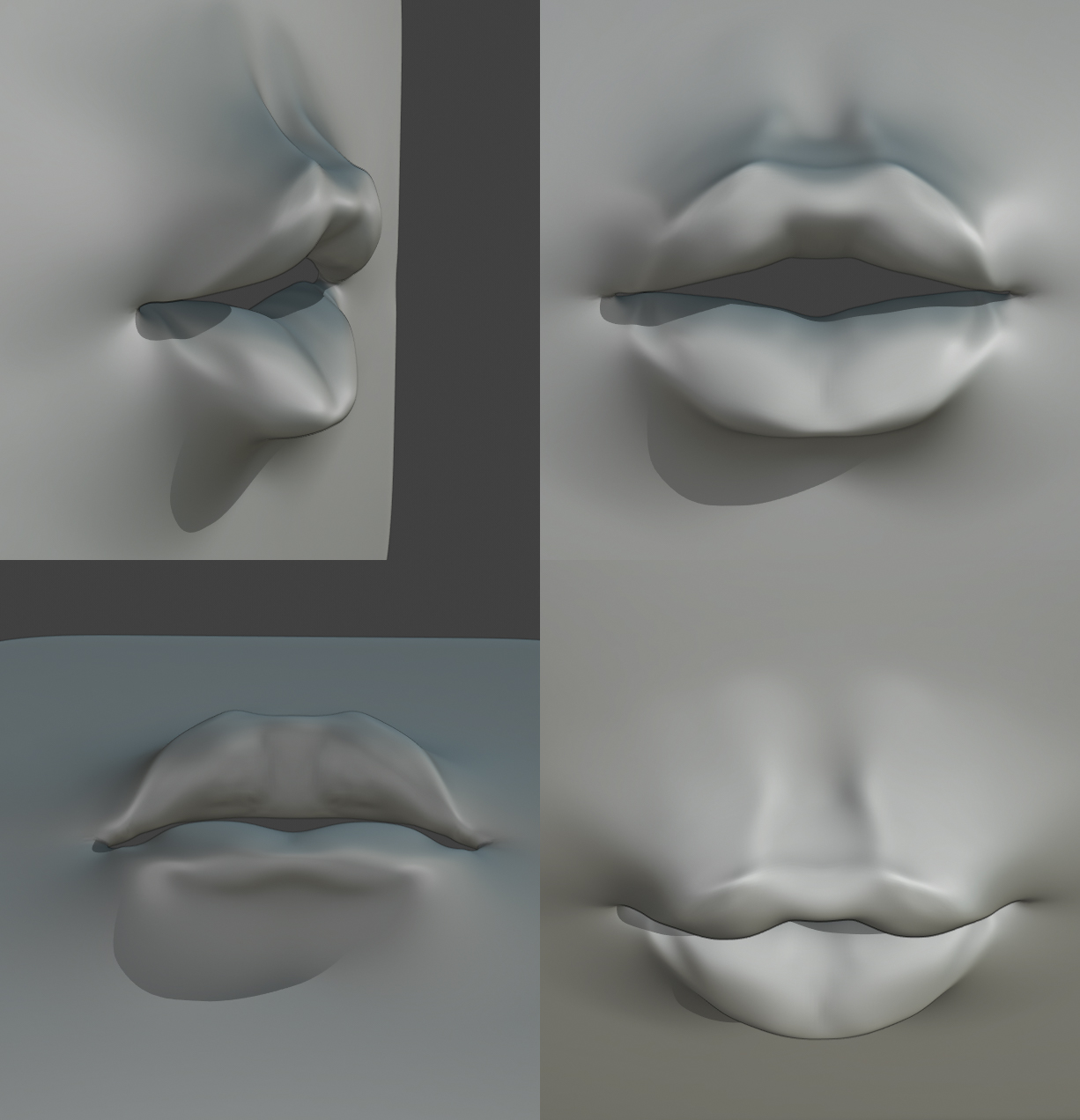
The definition of volume caused by the teeth changes a lot depending on facial structure, but it’s always there. It’s as if someone made a clay sphere, stretched it horizontally, pressed it against the skull then pinched under the lips. Stronger faces and faces with more forward jaws have a lot of definition on this area since the teeth press against the mouth while softer faces will have a very soft transition.
I feel the philtrum groove maximum depth is a bit too low, and it’s too narrow for such gentle cupid bow/round nose. The philtrum is kinda the impression of the under side of the nose on the mouth, so the way the groove slopes and how well defined is the crest hinge on nose and lips shape.
Example:
I’m making a point of emphasizing it’s not teardrop shaped because I see this a lot on 3D faces for some reason: Too much volume immediately where the underside of the nose connects to the mouth region creating a raised, almost flat area where none should exist, then a teardrop under it with crests lacking any thickness variation.
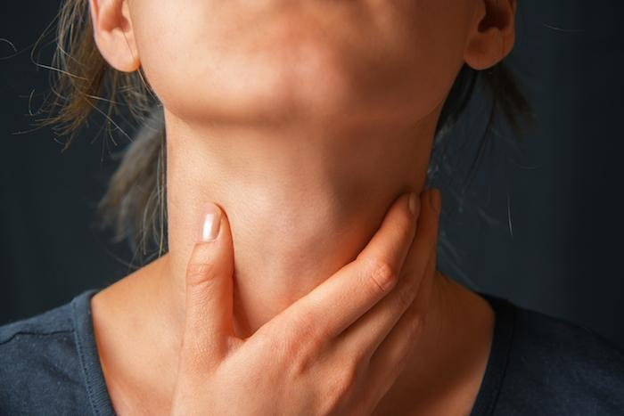
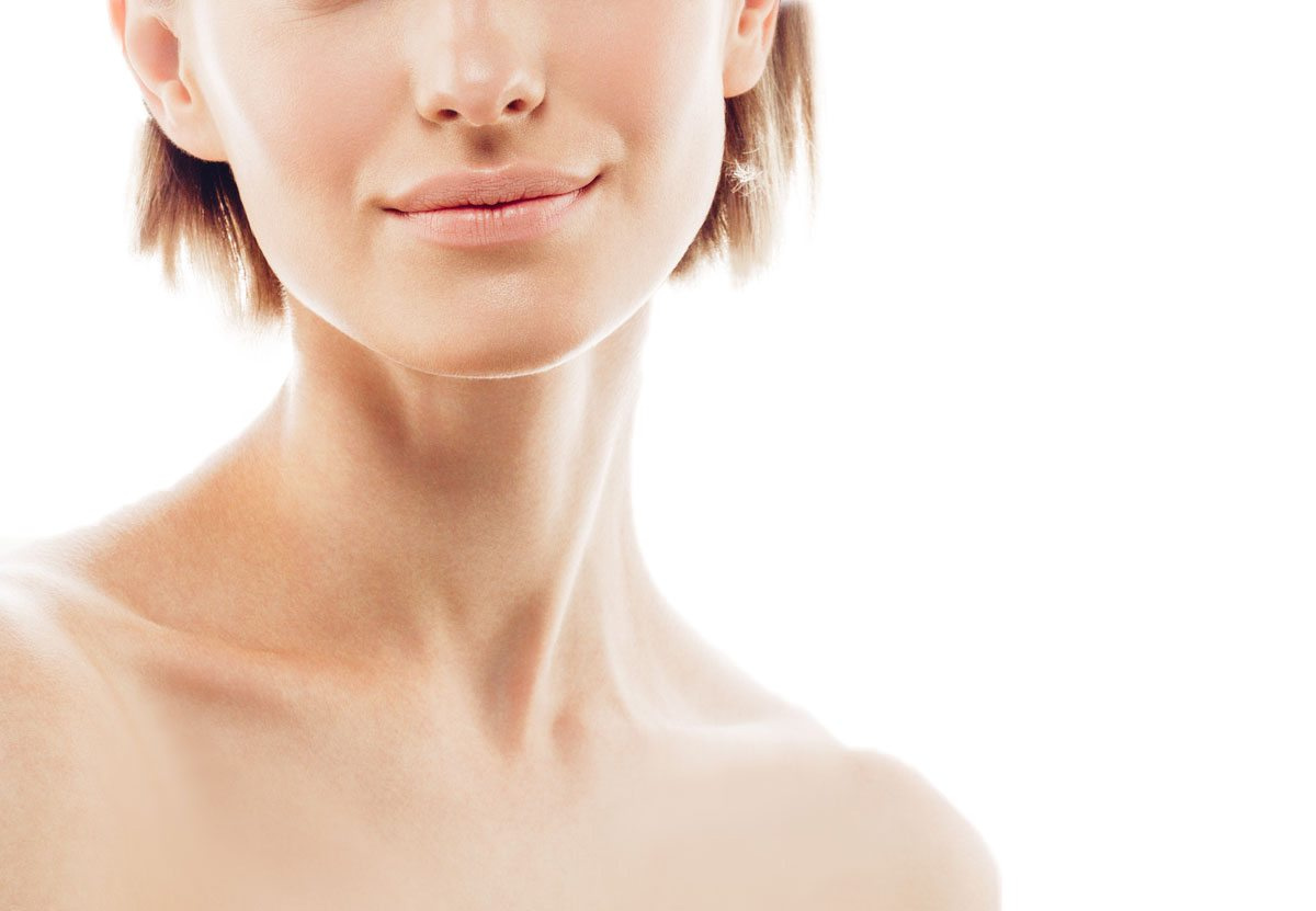
About the neck take a look at these references.
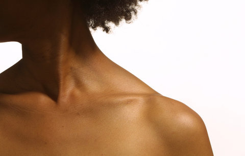
The thyroid and sternocleidomastoid are so important most artists work they topology to accommodate these changes. Otherwise the neck looks like a cylinder, breaking the illusion.
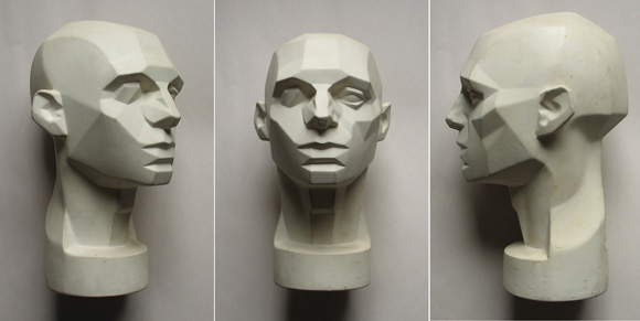
Lastly, Asaro’s Head is a great framework containing the major planes of the head you can apply to your references when analyzing them.
I hope this helps and keep up the good work!
Hey! Thank you so so much, that’s really helpful!
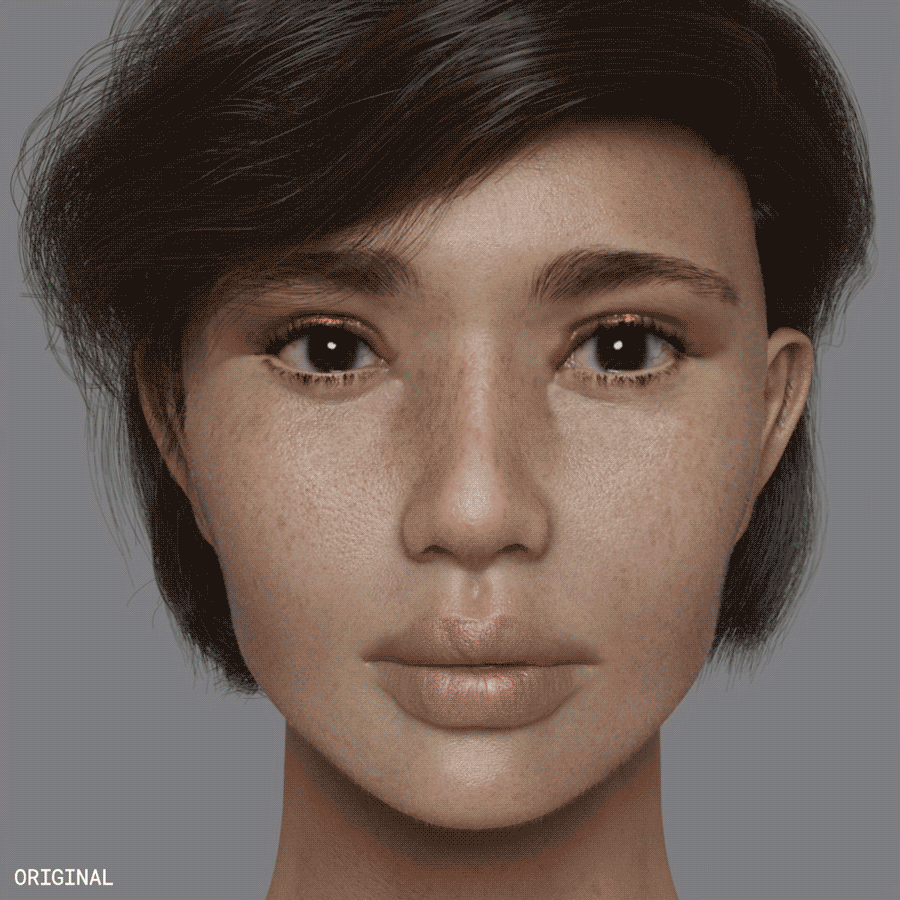
I’ve made some changes here where the eye socket is more obvious, curved the brows a little, worked on her nose a little, gave her mouth area more volume for teeth underneath, and also added more volume to her neck.
The skin is not yet perfectly tweaked to cater for lesser pore details but would love to hear what you think about the feature changes I’ve made!
Very cool model!
As for realism, the major issue I see with the model itself is that the distance from the eyes to the top of the head is rather short. Hair disguises this to some extent, but even with hair we see some hints of how compressed this is. Her level of symmetry is rare, as well.
The real issue with ‘realism’ here is in terms of everything BUT the model- posing, lighting, scene (or lack thereof), expression (or lack thereof) and so on. Taken together it just screams ‘3D modeling!!’ I think if you took her as is and addressed all these issue you could produce a render that many would find perfectly acceptable as a ‘real photo.’ It’s the flaws that sell such a product, though- focus or motion blur, lighting artifacts, quirks in the pose or expression, bad composition of the background elements, and so on. Remember that the ‘real’ photos we typically see in the media are heavily doctored to remove as much of this as possible
yeah, the pores seem a little deep. Other than that she looks pretty good! As honzo said a little posing/expression could go a long way. To begin with to my eye she appeared like a 19-25 year old. Somewhere in that range. now she looks a little more 25-35 year old. Other than you “smokey” render she looked kinda cute and pert (if that word is still in use). Now she looks a little more tired. Didn’t overlay pictures to see exactly what did it, but that’s just my impressions. It may be something you are totally going for. Its not bad or good. just a observation 
It could just as well be that the sss is not softening enough. Or the lighting just shows them enough. That is to say it might seem so but the pores might just as well be fine. Hard to say.
Please don’t listen to this comment… sorry 0451
Some things do need tweaking but this is all off
I just noticed I accidentally distorted the eye socket overlay in the overpaint, the outer side is supposed to go under the eyebrow, not over it. ![]()
You’re moving in the right direction but I feel her features are a bit unbalanced after you changed her facial structure. Her lips look better with makeup but still don’t quite fit the rest of her face.
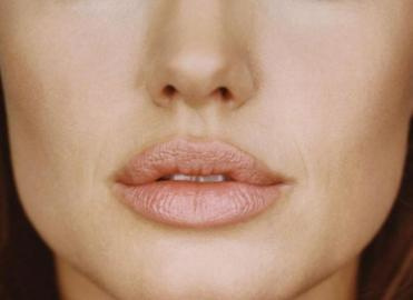
Resizing and reshaping them like samsmie showed is one option, but if you want to keep them fuller rework the upper-to-lower lip proportion as people rarely have both of the same size. There are two other common features of naturally fuller upper lips that aren’t quite present in this character:
Their edges are more pronounced and curved in the area surrounding the cupid’s bow, sometimes even casting a shadow. They aren’t exactly sharp, they just have an accentuated curve where they meet the face.

The middle of it (no idea what it’s called in English!) sometimes curves up instead of down creating an inverted V, almost as if it were fix sized while the rest of the mouth “grew” around it. It’s common, but a regular V shape still happens on fuller lips, so I’d just try both to see what looks more natural on this character.
About the lower lip I feel the transition to the chin still lacks a bit of volume to support it, and the edges are very sharp as well, particularly close to the corners. It doesn’t feel natural, this is the sort of effect you seen in cosmetic interventions.
Think about lips not as two clay cylinders pasted over a face, but as the inner surface of the mouth curving outside.
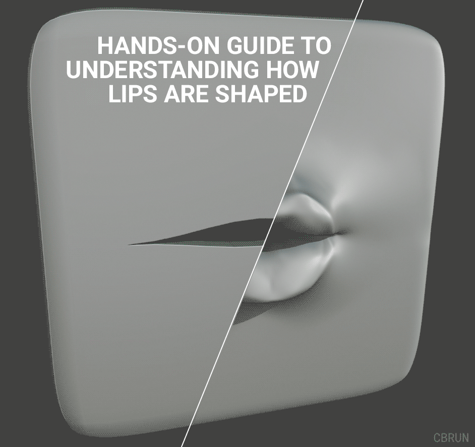
(Not a sculpting guide!)
I fucked up the masking so the mouth is pretty wide until the end, but this is basically good way to rationalize the shape of the lips. The main differences from thinking of lips as something added on top of the face is how their edges become smoother towards the corners and the way the corners of the upper lip folds over the lower lip.
What’s the reference images your working from? I believe the area under the eyelids is too flat. The lower lids looks too short and lack volume. The filtrum over the lips seems too narrow. I could do a paintover if you have the original references.
Scalp texture & subtle facial fuzz.
Do you make these models from scratch or do you base models. Also in terms of texturing, curious what your workflow is
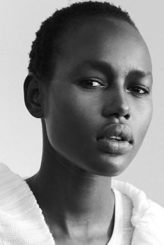
I think lips like many features of human body come in many shapes and colors. You are showing american african lips where here models seems from asian decent. You dont see asian with such full lips that much. I cant say for sure of ofcourse, i dont live there. But ive seen these fuller lips before, they dont seem to have that “sharp” slight tilted or curley edge you talk about.
I’m not an expert at all!!! But I think the eyeballs need more life. I’ont know how to explain it well but maybe the Iris of the eye should have more definition or rather more prominent. I’m speaking from a viewers perspective not a professional’s. Me as a person, I’m really Keen on people’s eyes, I kind of like read them. All I see when looking into your models eyes is nothing. I can’t direct you on what steps to take but I think you should look into that. But, MEN!!! You’re a genius wanna be like you someday, great job.
Hey Zhiffy,
This is the first time I saw this post. You asked what could be improved in this portrait.
I see now that it is already an old post, I don’t know if that question still applies, but I would like to clarify my opinion.
First and foremost, every person and every human head has different proportions. So there is no right or wrong, everything will exist somewhere.
But there are a number of common characteristics. We usually do not like large deviations (but there are certainly exceptions to that rule).
For example, the eye line is usually in the center of the head. With cartoons, the skull is usually much smaller than the face and this is also the case with your head. Not extreme, but it is.
The features of the face are also quite large on your model. The eyes, the tip of the nose, the wide mouth with the full lips, all a bit too much. But it could possibly be, it could be personal taste.
Still, I notice 2 things that are rather unusual. The space between the eyes is a bit too wide compared to the width of the eyes and compared to the space on the outside to the temples. Usually these are all (about) 1/5. You can check that in any anatomy book if you want.
The space between the nose and the upper lip of your model is also very small, the space between the lower lip and the chin is rather large. So I would put the lips a little lower. You can check that also in the anatomy books.
I now also notice that the area under the eyes is very flat. Usually this is rounded off somewhat softer.
Those are things that I notice because you ask for them. I hope it helps you somewhat. These are not errors or necessities. You are free to do whatever you want with it.
I wish you the best in your further quest for your ideal face.