Guys, since this is my first post here in the community, I would really like your opinions about this work in general. Lighting is not my best quality, but I’ve been studying a lot to improve.
I hope to read things here to learn more and more.
All done in Blender, Substance Painter and the final composition in Photoshop
there isn’t much to critique. It’s already really good.
I guess you could scale the bloom effect back a bit, and add a vignette, maybe.
Yep. Lighting’s lovely, composition’s good, nicely limited hue pallet, grain effect works with the subject. Gotta say I like the bloom as-is.
If you don’t have a specific reason to name this “Suzy” you might wanna change that, it’s a bit on the nose for something made in Blender that isn’t a monkey. Oh, and you should tag this NPR.
It’s pretty cool !
Here are a few thoughts :
On the composition side : everything is kinda concentrated in the center and you have a lot of free space on the borders were there is less visual interest :
You can use that to space out things a bit more and make each element breath a little more, or add some details that helps frame the subjects a bit better.
On the lighting : it’s great, colors are nice, we just miss a bit of readability on a few key elements :
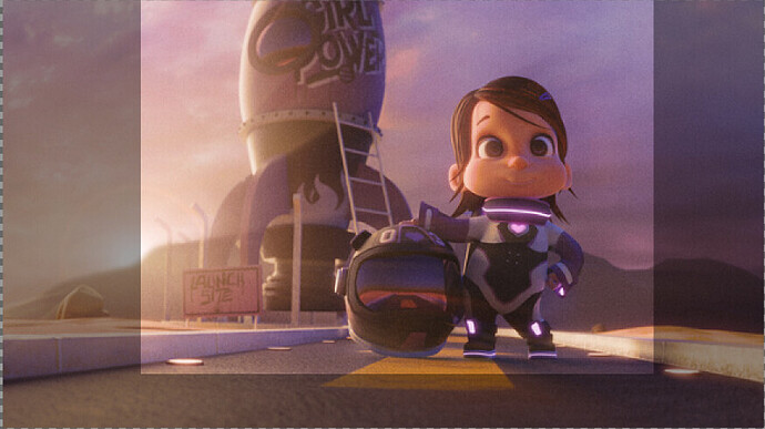
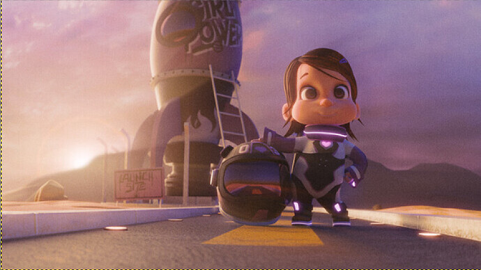
before :
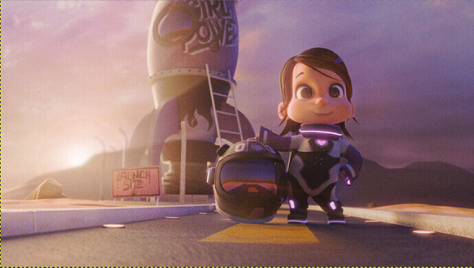
after :
It’s done in a very crude way but you get the idea,
I’d also dim the glowing things on the suit, since eyes are attracted to strong contrast and the face of the character is of lower contrast there is a conflict there, making the image slightly harder to read than it can be.
All that said, on the overall it’s really good !
Hi! Seconding @sozap on all the suggestions for composition and lighting. I would take it a bit further ahd suggest an even stronger contrast in lighting, which honestly you could do in any editing program like Krita. To me, the issue is visible when you greyscale the work:
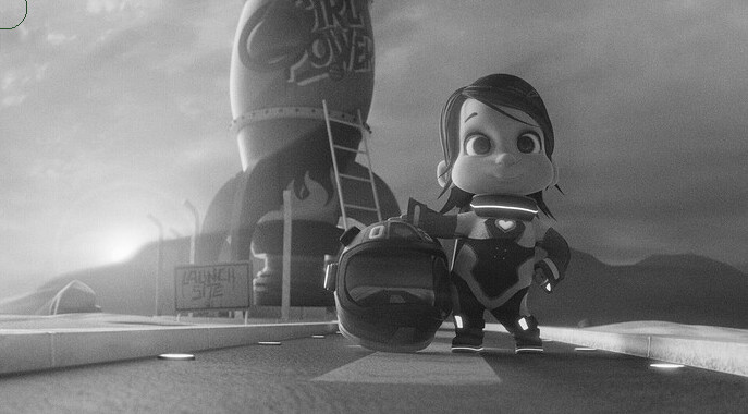
Now, this still looks pretty good to me, with just a slightly-noticeable lack of separation between background, midground, and foreground. To test this out a bit further, I blurred the image:
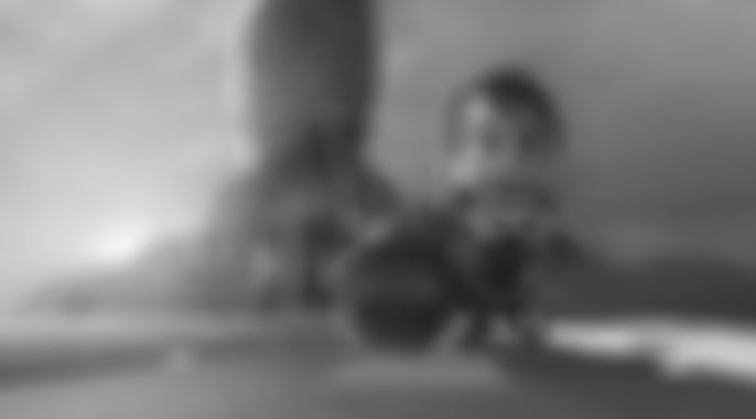
Now here, the merge of the rocket (midground) with the mountains (background) is more visible, but the foreground seems to remain pretty solid!
So, I think it would be beneficial to make the rocket be a bit darker to contrast the mountains, and in turn that will require a bit of darkening on the character, so that they also remain contrasting from the rocket.
Hope this helps w/ lighting ![]()
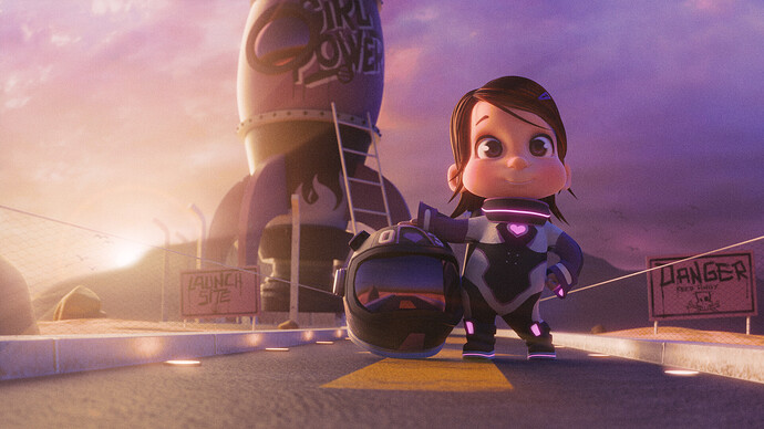
Guys, thank you very much for the answers and for all your observations. As I have little time left in the middle of the week, it took me a while to try again to finish this scene. Well I tried to add a few more elements to balance the composition and adjust the contrast on the main character, as well as some color grading. I wanted to tag you here in the answer, but I still don’t know how to do that, lol…
Hahahaha…I didn’t realize that before reading your reply!! I started this scene while I was still studying C4D, however, as I decided to switch to Blender, I kept using the same name which was Suzy and the Rocket
I like everything except the guide wires (or whatever they are) – they’re not working with the style, IMHO. I was going to suggest some sag, but don’t think it’d help much – more thickness & surface detail, maybe? I can see why you did it, but . . . ![]()

