Hello this is my first artwork post on blender artists,
I have been learning Blender for nearly a year now and
did this scene for a school project.
Please give your honest thoughts on how I could improve it.
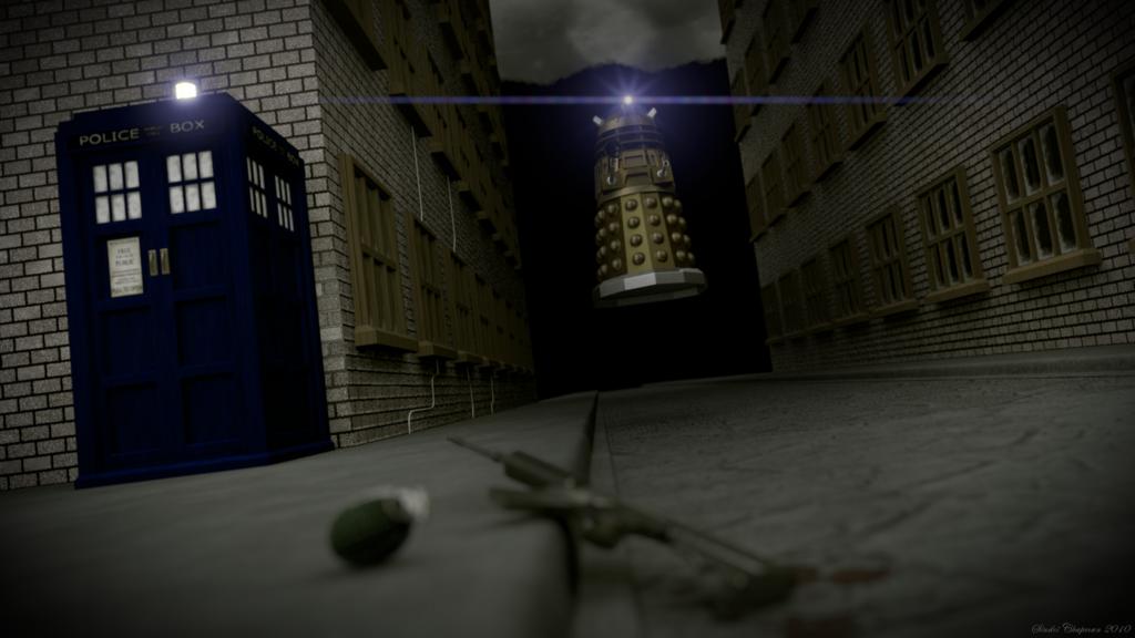
The DoF, texturing, and modelling all look great and match well, but I don’t think the background fits right. Its very black and makes it seem like the world just ends at the far side of those buildings.
The texture on the TARDIS looks off, especially the color. Too dark/deep of a blue.
The Dalek itself look wonderful, you make the model off the plans at Project Dalek?
hey this was on andrew price’s focused critique 
I think the DOF is a bit strong but looks great 
Easy fix would be to use bump/normal to give bricks some depth.
You have two visible light sources, the TARDIS and the Dalek, but neither of them appear to be affecting the illumination of the scene. Also, so far as I can see the only true lamp is white-- never a good idea.
looks good. you need to work on lighting. that seems to be what i say about most posts.
I think the buildings could use more character. The Dalek and TARDIS are beautiful and the lens flare cast by the Dalek itself really makes it kinda’ ominous.
Perhaps the windows on the buildings shouldn’t be so uniformly laid out (and some panes may be shattered or cracked). Secondly, the buildings look like they should be semi run down; You could make the bricks dirtier and more ‘worn’ as well as putting some graffiti on the wall behind the TARDIS. It may be mainly covered but gives the wall a bit more detail.
Aside from that, this looks really neat.
when I first saw this. it looked rather amature, then I started noticing details and realised you’re actually very competent with blender.
So what I think needs to be improved is composition; if you moved the camera to the right so you can see everything, then rotated it so the end of the street is out of view, then it might stop the viewer from noticing the obvious end to the street.
finally, I feel there needs to be some variation to the bricks, maybe some cracks or bits of dirt… [as said above]
overall, it looks good though- as I say, your individual skills are brilliant, but combining them needs some attention…
I love it
IMHO, the bricks seem too perfect and the windows look to be identical. The TARDIS is too saturated a blue.
Beyond that, I’d ask what’s the story here? Where’s the Doctor? Why are the gun and grenade lying there? Why are there … solid black mountains in the background?
Just my two cents.