IkariShinji
May 8, 2018, 7:57am
1
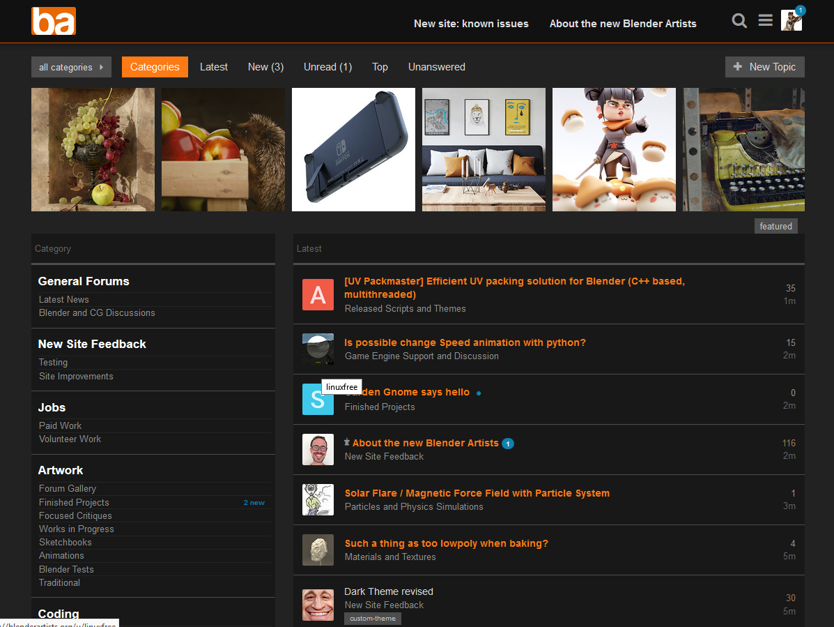
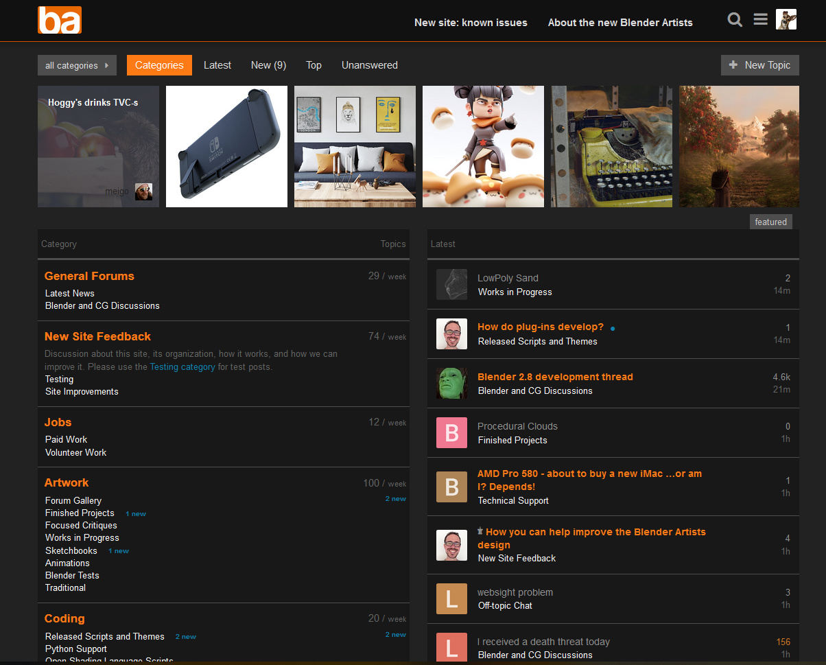
Here’s my current live code homepage (dark theme):
List of changes:
NEW (2018-05-12): Section headlines recolored to white
NEW (2018-05-12): All sub-section names recolored to grey
NEW (2018-05-12): Font color of indicator bubble on the header avatar changed to white
NEW (2018-05-12): “New” and “unread” indicators on hp’s category overview now right aligned
NEW (2018-05-12): Added horizontal dividers between subcategories on hp
Color of “last visit” divider adjusted to blue
Category statistics and “new”/“unread” removed
Category descriptions removed from homepage
Category column on homepage reduced in width
Titles of read topics (white) are now clearly separable from ones with new posts (orange)
Colored bars on the left of the homepage’s category list removed
Color code squares for categories removed
Indicators for new posts on the homepage’s left column have been given a blue color
Avatars changed to a slightly rounded square
Top menu button + hover colors adjusted to orange
Weird alignment of text in topic lists with thumbnails corrected
Timeline in post view changed to orange
Line spacing and overall font sizes significantly decreased in size
Post views might not work so well on mobile devices, as the fonts could be too small.
Find it here on Stylish (Updated 2018-05-11, 21:20 CEST):
5 Likes
Gumboots
May 8, 2018, 9:07am
2
“I removed the colored bars on the left and the color code squares altogether.”
Lol. I did the same on my quick and dirty stab at the light theme.
Anyway, don’t mind yours. You can always throw media queries at mobiles, so the text size would be sortable.
IkariShinji
May 8, 2018, 3:22pm
3
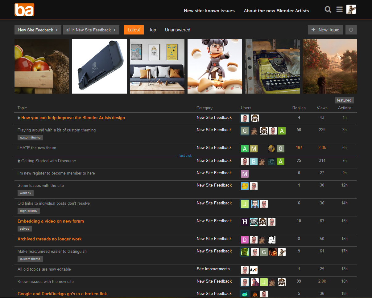
Now: New and improved - with square avatars!
bartv
May 9, 2018, 7:12am
4
How does that look in the posts look? Did you change the avatar size too? That’s known to cause some layout issues in posts.
IkariShinji
May 9, 2018, 7:31am
5
Nope. Didn’t mess with the avatar sizes at all.
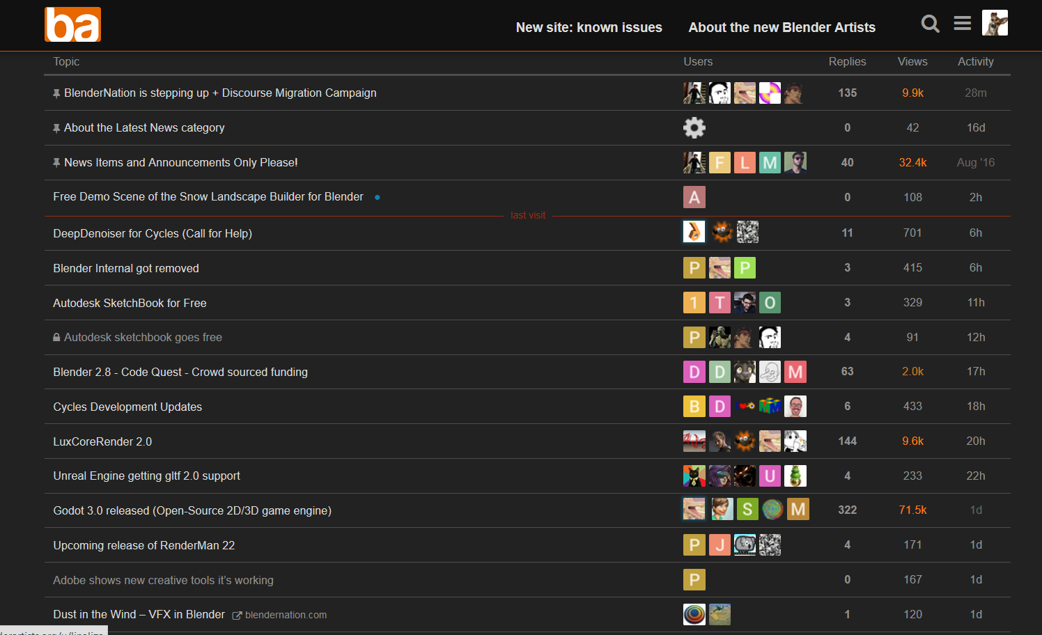
Here’s the posts view…
…and the topic list view:
1 Like
IkariShinji
May 9, 2018, 8:30pm
6
Next revision, small updates:
“Latest topic” alignment issue on homepage solved
Top menu button + hover colors adjusted to orange
Color of “last visit” divider adjusted to orange
Titles of read topics are now not only lighter in color, but also in italics (in list view)
I think I will keep the square avatars
2 Likes
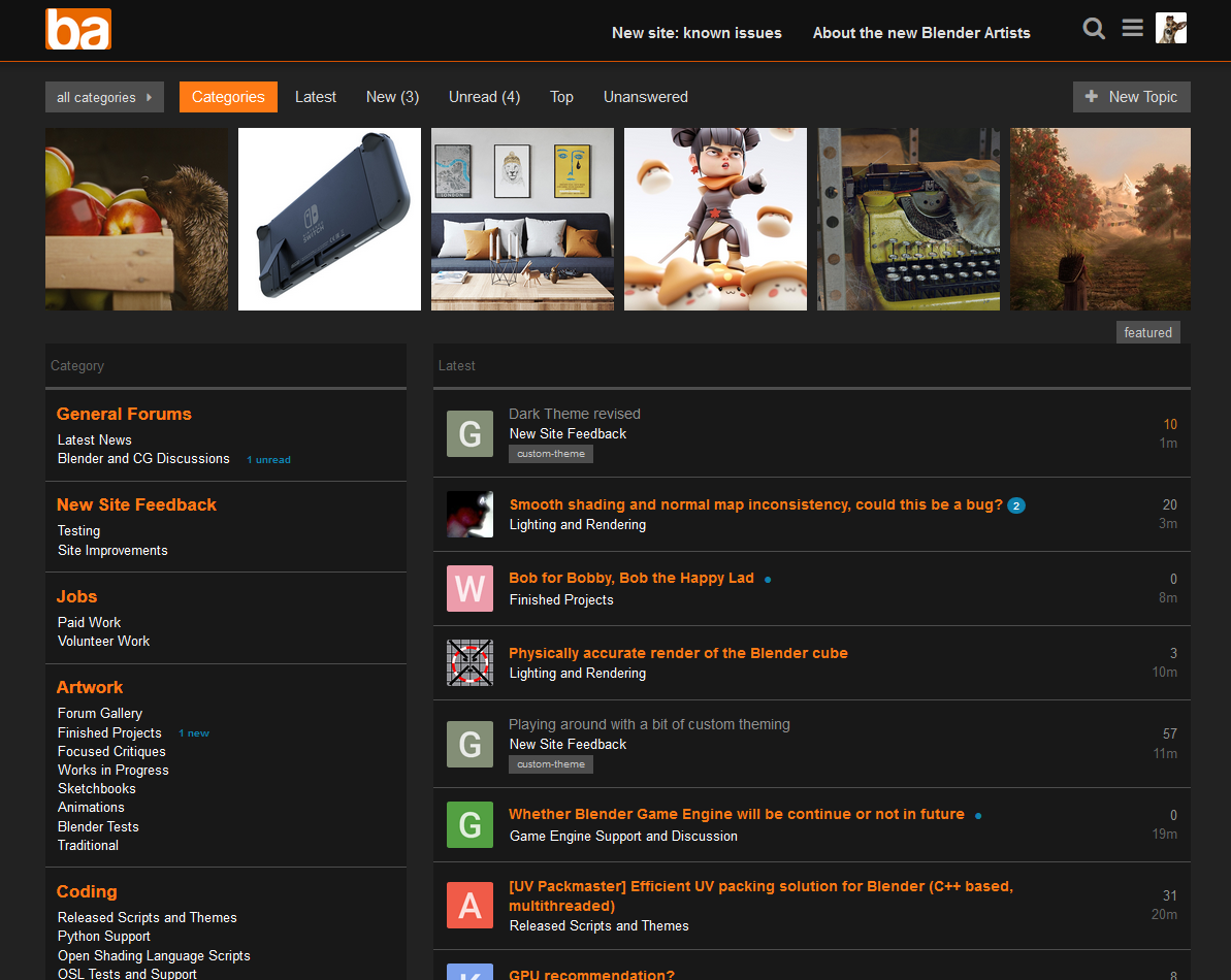
IkariShinji
May 10, 2018, 8:59am
7
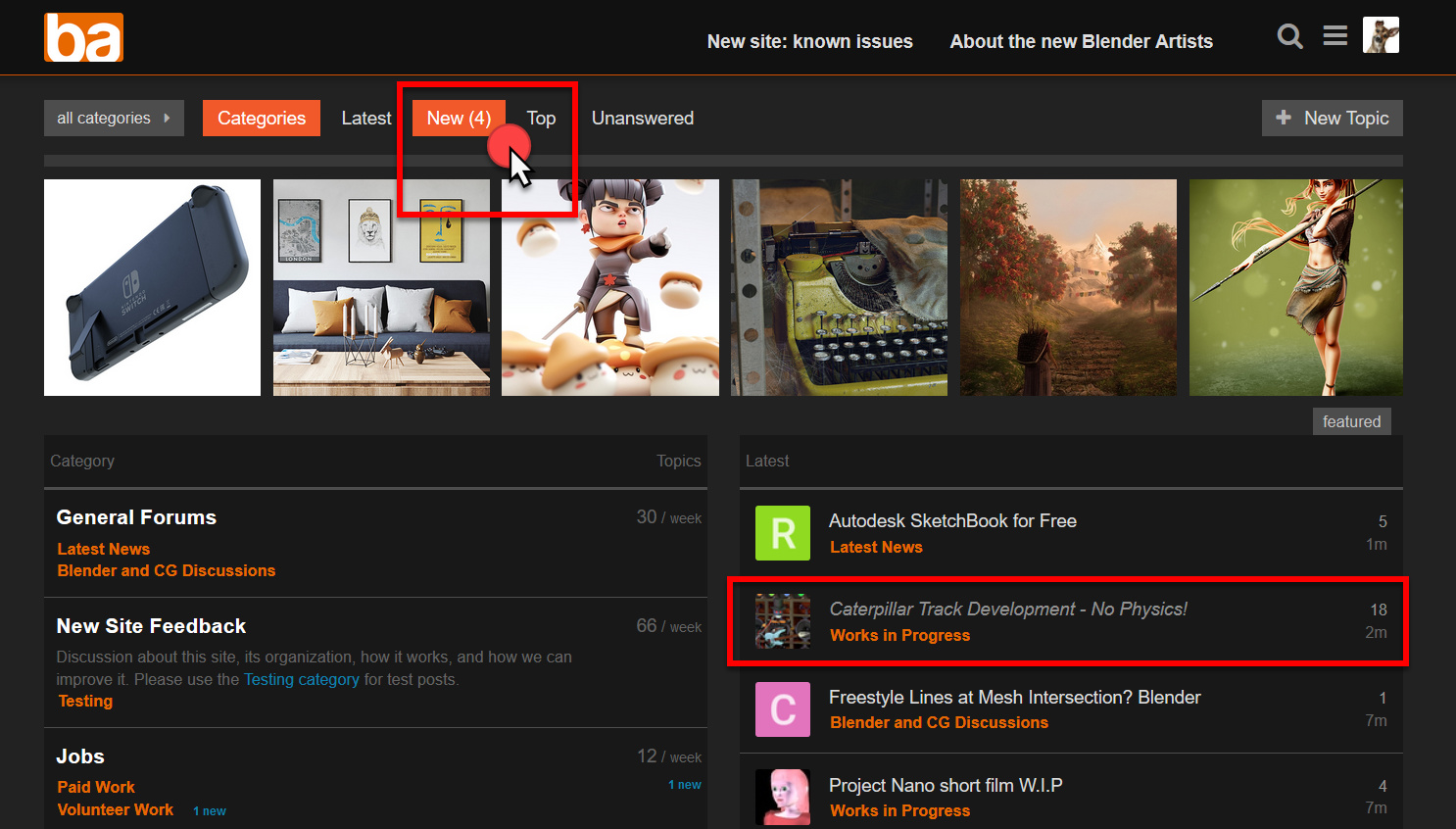
New: Weird alignment (or rather lack thereof) of text in topic lists with thumbnails corrected.
1 Like
IkariShinji
May 11, 2018, 5:52am
8
New: Color scheme change.
4 Likes
Gumboots
May 11, 2018, 6:55am
9
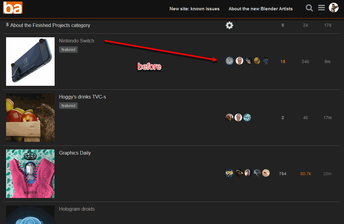
That’s quite tidy. I could live with that.
Minor detail: what’s up with the inconsistent alignment of the small blue “New” text, in the left column of the first shot?
IkariShinji
May 11, 2018, 7:36am
10
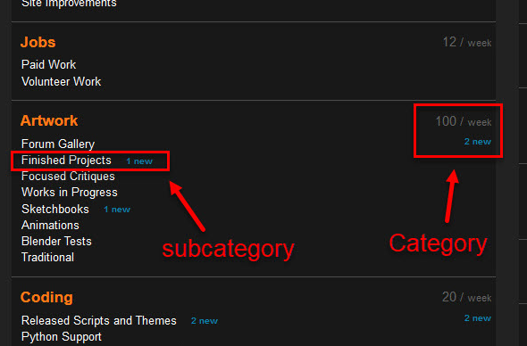
You mean the one for the category and the ones for the subcategories?
Actually I would like the ones for the subcategories to be close to the subcategory name, otherwise it might to be hard to see which subcategory they belong to at first glance without adding additional divider lines…
But I see your point. I would go so far as saying that the “new” texts for the category are more or less redundant and the statistical data (xx / week etc.) is irrelevant to me anyway. So I removed those entirely for testing purposes. Of course then the entire left column can be massively reduced in width:
Thoughts?
Gumboots
May 11, 2018, 7:54am
11
Aha! Yes, my bad. I had actually ditched the category stuffz on my tweaks, because I didn’t see it as useful, so didn’t pick that up from a quick look at your shot. No prob. Personally I’m not a fan of unnecessary stats on GUI’s, but some people like them.
Getting those close to the subcategory name is going to be a little tricky. The buggers have gone and used tables all over the place, for some weird reason. I have nothing against tables for tabular stuff, but using them for laying out all sorts of crud makes no sense to me. Still, no point getting into arguments about it at this stage.
You can use some dastardly tricks with tables, and set cells to absolute positioning to haul them out of their usual locations. So by using that, and a bit more trickery, you could have the presentation with the subcategory name and subcategory stats in the same header bar. It would need a bit of care, particularly on smaller screens, but shouldn’t be too hard to sort.
But I’m fine with ditching them too.
IkariShinji
May 11, 2018, 7:58am
12
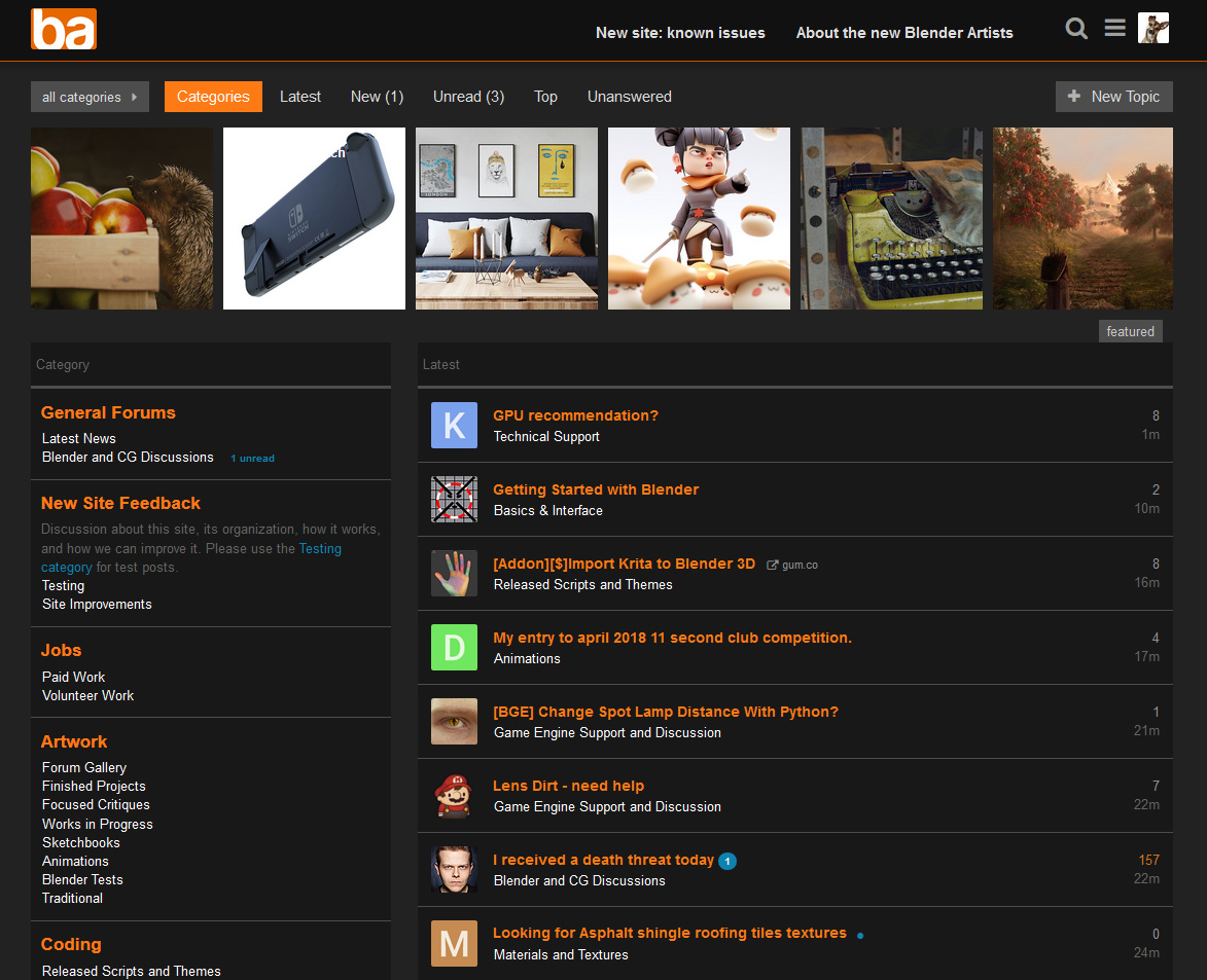
Also ditched the display of the category description for the “New Site Feedback” category:
2 Likes
Gumboots
May 11, 2018, 8:09am
13
Admins tend to waffle on with board descriptions. They’re a themer’s nightmare.
bartv
May 11, 2018, 8:16am
14
Do you have this code on Stylish? I’d be interested to start trying this and help you with feedback.
IkariShinji
May 11, 2018, 8:27am
15
Hope this works, as I am completely new to this Stylish stuff…https://userstyles.org/styles/159793/blenderartists-2-0-dark-revised
And beware: I’m not always exactly sure what I am doing, CSS-wise, so I assume that code is messy as hell…
1 Like
Gumboots
May 11, 2018, 8:31am
16
Yeah I was just looking at it. You could clean it up a bit, but it all seems valid at glance.
bartv
May 11, 2018, 8:31am
17
Works! I’ll use it today to see how it works for me.
Gumboots
May 11, 2018, 8:36am
18
With hiding the bullets on the main page, you have this:
/* No Bullets for Categories */
  .badge-wrapper.bullet .badge-category-parent-bg + .badge-category-bg
  {
    width: 0;
  }

  .badge-wrapper.bullet .badge-category-parent-bg, .badge-wrapper.bullet .badge-category-bg
  {
    width: 0;
  }
I got away with just using this:
.badge-category-bg {
		display: none;
}
IkariShinji
May 11, 2018, 8:39am
19
Hmm. Just tried it: Somehow that does not work for me…?
Gumboots
May 11, 2018, 8:43am
20
Maybe we’re talking about different bullets.
Edit: I’ll load your one up as an alternative for Stylus and see how it goes.