Dealing with Aces , AGX, Srgb

But they have 16! :smiley:

No, kidding aside, I do agree to all the things you say. My point was supposed to be that what a monitor emits is different to what our eyes react in reality and therefore the whole digital color representation is more complex and one should talk about things “that can be objectively measured” more carefully than KickAir_8P in this context. If only I could word it in a coherent way…

There are so many levels of convolution going on in this conversation

-Electromagnetic radiation exists as a smooth spectrum, including any possible blend of any number of wavelengths
-Imaging technology is severely limited, and those limitations that have existed for 100+ years still inform the ways that we use our state of the art technology
-Brains are incomprehensibly complex, as soon as light starts interacting with brainmeat, everything is explosively complicated.

AGX seems to do a decent job emulating the inherent flaws of photographic technology. So, for photorealism, it’s great.

Photos don’t look realistic though. to @rawalanche 's point about his rgb light that looks red red red no matter how bright it is. Because human eyes and brainmeat don’t have the same limitations as photo emulsion or digital sensors (they have their own fantastically complicated limitations)

If I want to make a render that looks like what I see when I am staring at an OLED tv, Then I don’t really want my renderer to be pretending it’s a camera and putting in all of those simulated limitations.

I remember there was a bit of a kerfuffle on the forums when they added in rolling shutter emulation to cycles motion blur. Some people were horrified that development effort was going towards recreating a nauseating limitation. Some people want to composite VFX into footage shot with a rolling shutter.

Photorealism != realism.

2 Likes

The gamut compression with AgX has a fixed curve at which stop it kicks in and increase with more light strength as you know.
I repeat it again,AgX has a fixed curve for gamut compression and a fixed curve for the compression of the light range to get a usable SDR of the HDR.

This means your eyes maybe see it as bright red,but for AgX the red light is that bright that it is in the range of the gamut compression curve.simple as that, no esoterik or what ever.

Right, that gamut compression is a great example of the imaging limitations that are embedded into our technology.

2 Likes

pool-balls-hdri-test in 4.0b p6.blend (1.6 MB)

how about this?
It’s not perfect though I’d argue a lot of that comes down to not the greatest lighting. A grey sky plus a single white plane aren’t that strong.

I’d probably also go with a slightly more reddish yellow from the get go. That particular hue is not very appealing (no matter what color management option you use)

All I did was brighten the other materials and reduce how intense the lighting is.

Also I don’t have Sanctus’ materials so that’s why that wood texture failed

Another exr export from Resolve.AgX med contrast,saturation nodes

4 Likes

I’ve said it before. I’ll say it again: Pictures have been researched, and the stimulus that is present in a picture is not a byproduct of limitations. There’s something else going on here. Many folks have researched this.

It’s a seductive myth.

MacAdam, D.L. “Quality of Color Reproduction.” Proceedings of the IRE 39, no. 5 (May 1951): 468–85. https://doi.org/10.1109/JRPROC.1951.232825.

Bartleson, C. J. “Some Observations on the Reproduction of Flesh Colors.” Photographic Science and Engineering 3, no. 3 (June 1959): 114–17. https://cir.nii.ac.jp/crid/1573387449718190976.

Bartleson, C. J. “Memory Colors of Familiar Objects*.” Journal of the Optical Society of America 50, no. 1 (January 1, 1960): 73. https://doi.org/10.1364/JOSA.50.000073.

Bartleson, C. J. “Color in Memory in Relation to Photographic Reproduction.” Photographic Science and Engineering 5, no. 6 (December 1961): 327–31.

Bartleson, C. J., and C. P. Bray. “On the Preferred Reproduction of Flesh, Blue-Sky, and Green-Grass Colors.” Photographic Science and Engineering 6, no. 1 (February 1962): 19–25.

2 Likes

So, what is the ‘something else’ that makes @rawalanche’s LED lightbulb turn much whiter in a photo than in their eyeballs/brain? Isn’t that a consequence of the limitations of photographic technology? Isn’t building a renderer that reproduces similar imaging artifacts embedding those limitations into the renderer?

I feel that inside of a computer, the set of limitations on our ability to store and represent color are not the same set of limitations imposed by a cmos or ccd sensor. They are also not the same set of limitations imposed by our human eyeballs which are not the same set of limitations imposed by our unique brains. Am I wrong here?

I was trying to be pretty specific in disclaiming any absolute statements about what color is and isn’t. I didn’t think that it was controversial to state that the legacy of limitations continue to influence our modern technology.

Also, If you want to educate people, lobbing links to paywalled articles isn’t the most effective way to do it.

1 Like

Nothing to do with the LED, and everything to do with the colourimetric primaries position in the working space, and the nature of the non Luther-Ives absorptive profiles of the digital sensor filtration.

The more perplexing questions are:

  • Why is this phenomena mandatory within formed pictures?
  • To what neurophysiological cognitive mechanic does the phenomena speak?

No!

The medium that a picture is formed in plays a key role, but how we heuristically come to read what is within a picture remains an elusively complex soup. There has been quite a bit of research on this subject, and what is even more fascinating is watching folks using other software bump into the exact same conclusions! For example, it is easy to find examples where a chromaticity linear attenuation of purity toward the achromatic centroid leads to folks noticing the peculiar cognitive impacts over at Pixls.

How we read a picture is a unique task, and tasks have a tremendous impact on how we actively cognize elements within a picture.

For example, notice how the squares modulate based on how we actively focus our minds on which “square” is “darker”? It is like a Jedi mind trick where we can will either “square” to be “darker”.

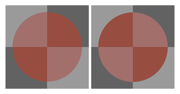
Another example of how active our visual cognition is is how the identical tristimulus leads to a wildly different higher order cognition. Notice how we cognize one disc as “opaque” and the other as “layered”? The only difference is that the discs are rotated 90°. Our visual cognition is active, and we are actively parsing the articulations of the receptive field, and subtle cognitive adjusting of the “hue” and “value” between the two identical tristimulus discs.

As a final example, consider how we cognize the following picture. It is a wonderful demonstration as to how our visual cognition leverages lower order neurophysiological signal polarity as “boundaries” as well as Gestalt principles to arrive at what is ultimately encoded in the picture. The demonstration helps us to realize that the picture is an active cognitive reading with active participation from the reader.

image

So when folks try to convince folks that a picture is “reality” or an ideal is “as though I was standing there”, they are sadly missing the rather glaring evidence against this seductive notion.

A picture is likely closer to reading a book. Visual cognition is cognition, and the task of picture reading is incredibly unique.

The idea that how pictures work is merely a byproduct of limitations carries an a priori assumption that is flatly false; the idea that an “idealized” picture is a simulacrum of the stimulus. Vast bodies of research and evidence suggest the contrary, including from companies that were heavily invested in pictures such as Kodak.

I don’t really care to “educate” people, as it’s mostly fruitless to try and make a horse drink. The best I can hope is that folks find the rather “obvious” nature of pictures more interesting with a few breadcrumbs from a long research history.

As much as I am a supporter of the idea of research being open to anyone who is keen to read them, I am also not at liberty to paste illegal links to papers that companies seem willing to sue folks over. Although I suspect that there might be some sort of hub for those who are keen.

9 Likes

Linking this post here because of the comparison filmic/AGX

Just a thought…

So isn’t this the problem… even you suggested to tonemap two images by the individual perception of one person but then also says it would be best to measure the physical wavelength… ( …which of course would be displayed differently on the viewers device id not calibrated… and even then…) ???

Real physical wavelength (and intensity, strength, energy value) and reflection of sun or artificail light
vs.
Individual perception of the three cone cells differently distributed over the (for humans) visible spectrum…

No, you don’t understand. If you take a raw picture of a vivid OLED screen with a good camera, put that image on another, identical, identically calibrated OLED screen right next to it, and tonemap it so that it matches the first OLED screen as close as possible, the color perception of individual people doesn’t matter. If the both screens look same to you visually, then they will look same to all other people, as long as you are not color blind or something.

Even if the other person’s brain perceived what you perceive as red as something you would perceive as green for example, they’d still see the exact same shade of “green” on both screens, since you tonemapped the screen with the raw photo displayed to emit nearly the same photons as the screen with the original image. So if the photons get translated to different stimulus for another person, they will still be translated nearly the same coming from both the screens.

1 Like

That’s what i meant… color blindness is a very very extreme of the individual perception of light… so if you compare those “original” image and somehow “processed” image then you might see two slighlty different “color coordinates” as the same… but maybe i don’t… (assumming none of us is “color blind”)…
So only a physical measurement system would reach the wanted goal: two equal “color” images…


(Not a direct reply:)

Also: someone mentioned something about colors already used and studied on paintings for several centuries… I also read something about… once there wasn’t a name for the color blue ?? ( or something like that ) …so it’s all about perception and so developed vocabulary…

So in the end it’s all something about a model used to descripe “colors”… and models do change when we ( humankind ) know more about it… so also some do know more and/or are more familiar to one model or the other…
…and so… finding the best suited ( not the best ) workflow to reach the wanted goal.

So: choosing one “default” also is not simple or easy and also is only suited for a special use case… because we do not have the perfect color system… matching the real thing for every individual human…

It’s in the eye of the beholder… :wink:

A word of caution… not a person in the world can define “tone”. That is, countless have attempted this, sometimes by way of luminance or other paths of folly, but all have more or less failed.

Leaning on a term that has no meaning is precarious. Until we understand how we cognize a picture and what the gradient differential relations are, we cannot reasonably suggest what “tone” is, or how it works.

Let me be clear; the path of picture forming is littered with happy accidents. Few if any can provide suitable analysis to refine the slippery and elusive leprechaun of “tone”.

Folks with uniquely diminished absorptive profile differential responses still manage to read pictures and propel their bodies through space, catch balls, and such. While individual, we can suggest that the mechanics of visual cognition are robust enough heuristically that the regions of differentiation where these folks see ambiguity are somewhat limited. That is, the foundational neurophysiological mechanisms still supply their cognitive heuristics with ingredients in the same manner as less diminished folks.

We desperately need to pin down what the “thing” is. As the examples above hopefully showcase, the folly of the scientism of “visible radiation” is not how pictures “work”.

Cutting past all of the bullshit nonsense, all we have are our phenomenological vantages, and those phenomenological vantages are assemblages of sensorium deployment. There is no “light” PBR model running. There is no simulacrum of a high resolution picture that we keep deferring higher and higher up the food chain to a little person who is our cognition. It’s just neurophysiological signals, and the perplexing manner that we assemble the signals into meaning.

The differential gradations within a picture are incredibly important to this heuristic assembling, and it is that mechanic that anyone who seeks to understand how colour cognition “works” in a picture likely needs to drill into. And that cognition mechanic is broadly the same between diminished responses and folks with more granular absorption profiles.

Color cognition is definitely a snake pit.

But in @rawalanche’s thought experiment of measuring the output of a machine with another machine, then using a 3rd machine to process that collected data and output it on a 4th machine… there is no ‘cognition’ outside of code and engineering.

I can understand that expecting a brain to act like a machine (or vice versa) is foolish, but is this mechanical task physically impossible? isn’t that just an extension of how these work?

1 Like

Well, there must be some meaning, otherwise we would not have “tone”-mapping. We could just be viewing raw linear untonemapped rending output. Despite the fact people may be disagreeing about tones, we have overwhelming majority of people agreeing that a Cycles render tone mapped with either Filmic or AgX is much more pleasant to their eye than seeing raw Cycles output without any tonemapping.

So I strongly believe than in the same sense, overwhelming majority of people would be able to tell if a computer display managed to display image that appears real life like to them. And I really think that we can get a lot closer to monitors/screens that really feel like a window into alternate universe with the combination of improving hardware (OLED/microLED screens) and improving software (better tonemappers).

1 Like

Its all about the medium.I our case we need a TMO like AgX or Filmic to get our HDR content “curved down” to sRGB SDR format,to be displayd on our sRGB Monitors.

In the past days i tryed to find different methods to get the saturation or “chroma” better graded in Blender compositing.I saw a Resolve video with 5 different methods.The first was to simply increase the saturation slider,the problem with this method was,with increased sat values the overall color brightness is increased as well.This is something you dont want.
A saturation like a Analog film has is more the goal today.I want to post a DCTL plugin that does this in Resolve.I think this is some of the low hanging fruits to get such grading method with maybe AgX as basis in Blender.
One of the HSL HSV method i posted before,but this DCTL has way more finecontrol.

With this Film color density in mind i found this interesting study about Technicolor and Eastman color dye Specrophotometry.Unfortunately,the database link in this study does not work.
https://scholarworks.rit.edu/cgi/viewcontent.cgi?article=10015&context=theses

If you look at classic Techicolor Motion Pictures you see this color density look all the time.I am not talking about quality like grainyness or something.Just about Film color density.


The question returns to “How do we assemble the stimulus in a picture”. That is, it is well researched but poorly understood that the stimulus present in a picture cannot and must not be a “match” to “as measured” in front of a camera. Even though our mediums as bound to a closed domain, there is a plethora of other details within the picture that govern the rates of change etc.

For example, as pointed out by @rawalanche, there is an incredibly strange purity continuum within a picture. While commonly referred to as “filmic roll off”, the rate of change of purity in a picture is incredibly complex. If the rate of change of the neurophysiological signal is “too fast” in a given receptive field, we cognize “otherness”, and the region will be cognized as a “boundary” instead of belonging (Gestalt) to the adjacent region. Worse, if there is little or no purity, the heuristics of picture decomposition also tends toward a “boundary”, as opposed to continuous “form”.

These devil’s instruments forward a very specific brand of stimulus analysis that falls under the banner of colourimetry. The idea that we can measure stimulus under an umbrella of trichromancy is fraught with nuance. I won’t wade into the waters, but the accepted orthodoxy of colourimetry’s territory is at least contested. I like this passage from the preface of Gilchrist’s Seeing Black and White:

The discovery of the detailed laws of Trichromacy is one of the great triumphs of visual science, although—as David Hubel noted— its practitioners study it with a passion that seems grossly out of proportion to its evolutionary importance.

The TL;DR is that there’s more going on in the articulation within a picture than deferring to some “origin” data. For example, think about an X-Ray picture. It’s most certainly not a simulacrum of the “as though we were standing there” for we’d not cognize anything, and we’d be suitably jeopardizing our retinas! Beyond that, how an X-Ray picture is sculpted relates to the meaning that the engineering seeks to communicate, and to whom the audience is who will be reading the text. Is the formed picture to encode a meaning of bone structure, of weakness in metals, or some other use? How we structure the picture is forever entwined with the meaning we seek to encode, and who will be decoding it.

Folks use words all the time, and use them poorly, inadequately, or improperly. “Tone” likely has an origin in the work of L. A. Jones, whilst working at… wait for it… Kodak!

We can look more recently to folks who slap the idea of “tone” onto curves or luminance mappers, and realize very quickly they all shit the bed pretty hard pretty rapidly in terms of the pictures formed. It is this phenomena that we ought to be attacking with force. In fact, I’d go so far as to say that all of this buffoonery gets it backwards; we aren’t mapping colourimetric tristimulus to a picture, but mapping from the neurophysiological cognition backwards. That is, we have to start with what we are trying to achieve in a given field articulation before we can figure out how. And this is where “tone”, or more specifically the erroneous and slippery definition stymies all attempts.

This is ultimately impossible, because the medium will always form the data into a picture. And even if we did this, we segue into the research papers I cited above; the colourimetry derived from a camera will inevitably lead to uncanny pictures in the cognitive sense. Folks will scream about “salmon coloured fire” or “meaty Caucasian skin”. This has been known since at least the 1950’s when researching photographic colour presentation, yet we seem to keep having to rediscover it time and time again. If you want evidence, read the three links I posted to the Pixls forum, which has folks more or less rehashing the same peculiarities present in the David MacAdam citation.

I would completely agree with the premise. However, none of this explains why. And that’s where we cannot avoid spelunking into the perplexing nature of how we arrive at meaningful interpretations of the neurophysiological signals.

It’s a region of thought that more than everyone here can engage with, knowing that zero people on the planet have any real clue. There’s some incredible wisdom out there, it just lives outside the scientism of “light” and the orthodoxy of colourimetry.

Dare I suggest that the craft folks who paint and render and create work are likely more in tune to discuss the matters than the dweebs making up scientism of plots and numbers. History cleaves this way if we look to the Gestaltists and folks who have explored colour cognition in the past. The number fornicators tend to poop the sheets here.

Folks who read a book have a visceral response to the encoded material, and it is a legitimate cognitive process. However, labelling the decoding as “appearing real life” is perhaps a dubious claim.

Please re-read the entire point I’ve been trying to make here; it doesn’t work this way! Caucasian skin, fires, and many, many, many other things look uncanny as hell when presented as “accurate” stimulus. This is why I waded into this discussion here, because I have a pretty damn good deal of respect for some of the minds around these parts that participate in threads like this.

The idea that an idealized picture is a perfect simulacrum of the stimulus present in front of the camera is false. Those citations above are the tip of a much deeper iceberg. The quotes from
Pixls are a straight line to the exact same phenomena. Further still, I have spoken with people who have done experiments along this axis, and they too back the claims up! Something else is going on in how we cognize pictures.

The best I can do is to draw awareness and suggest at least a degree of caution to avoid the belief that Judd, Plaza, and Balcom also assumed back in 1950 in their Condon Report.

Pictures are weird human artifacts.

3 Likes

Imagine following thought experiment:
You put a person into a room sized drywall box that doesn’t leak any light. This box is placed somewhere with a nice view of some scenery (mountains for example).

You cut out let’s say 32x18 inches window into a wall of this box, so the person can look outside. Right next to the cut out window you put identically sized cutout with a OLED screen inside, which you calibrate using radiometric tools to match the exact same exposure and color as the real window next to it from a fixed point of view.

You position the person at that exact vantage point. Given they are sufficiently far from the windows (both the fake and real one) to not perceive the parallax, they are not allowed to move their head around, and angular resolution of the OLED display matches or exceeds eye retina, there’s no limitation in terms of physics that would dictate the image of the OLED screen should appear not real compared to the real window next to it.

No matter how much subjective weirdness is happening in the human brain, it is physically possible to emit photons of nearly identical properties (energy, wavelength) from artificial screens as the ones that arrive to our eyeballs by being emitted from the sun, then bouncing off some objects on earth and arriving at our retina.

1 Like

Tasks influence visual cognition.

I know folks who have done a similar analysis on a picture, regarding measured stimulus within display levels and comparing against a display medium, side by side with the actual “scene”. The result was problematic.

I believe Rafal Mantiuk had a recent research position open to attempt this sort of experiment using a 3D display medium.

No doubt however, that whatever the outcome, the presentation as a picture would be deemed unacceptable.