So recently I was encouraged to remember that I am using a theme that I made like more than 10 years ago and it’s terrible and I should fix it for myself.
Originally it was supposed to solve 2 problems:
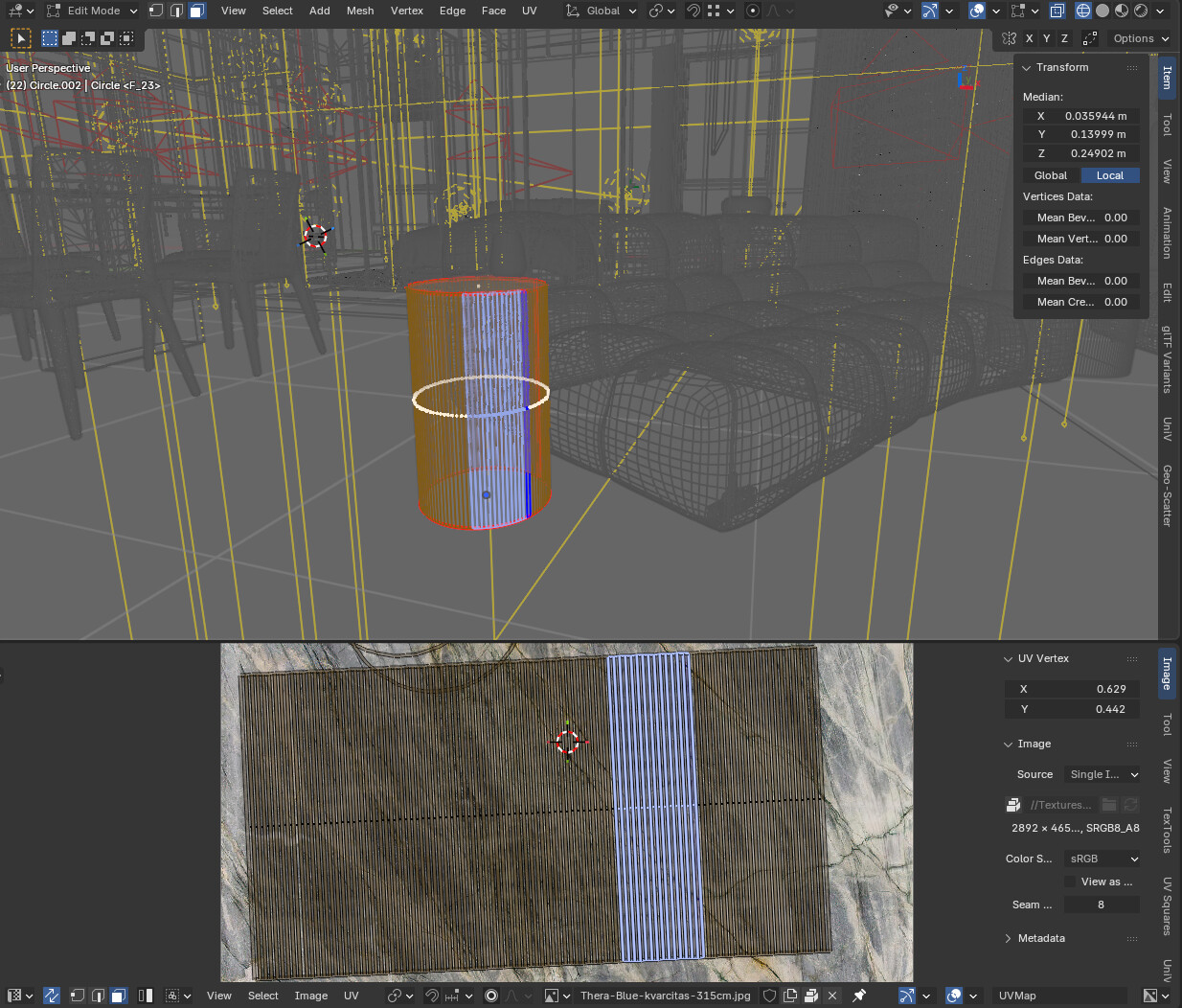
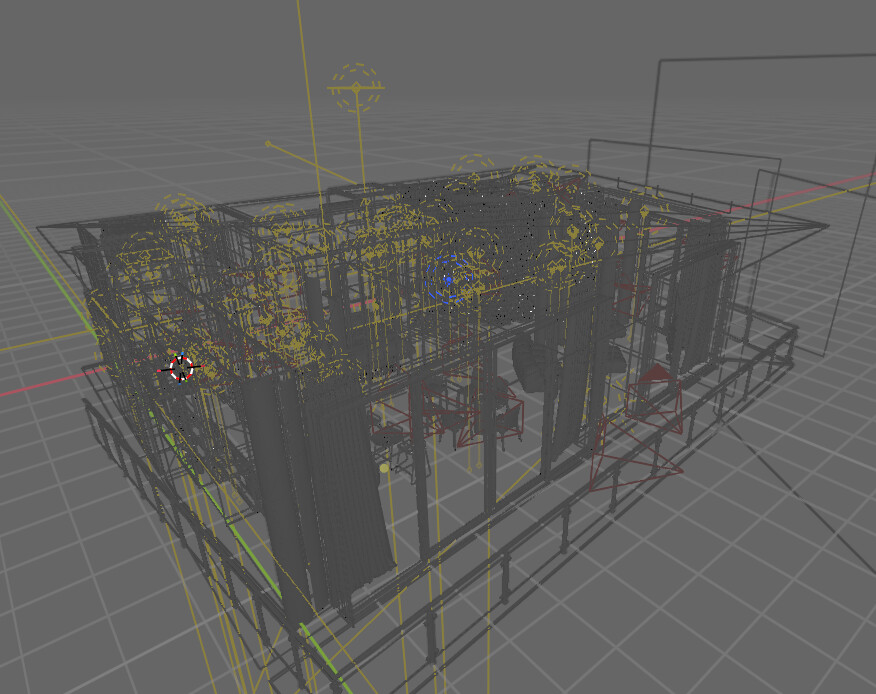
Visibility in the viewport, so that it’s easier to distinguish wireframe and mesh elements and all the stuff one works on in the viewport while in a busy scene. The default all black wireframe leaves a lot to be desired(at least for me) and so I thought I could attempt to make things better for myself. As far as I am concerned I did succeed in this and my viewport colors are a bit more pleasant to work with for me for quite some time
Consistency. The default theme has various selection colors all over the place like orange in the viewport, blue in some input fields, grey in others, grey for text, white for nodes… I thought it was inconsistent and wanted to fix that.
Of course many years went by, many versions changed and my theme got a bit… outdated. So I am trying to fix it up and then maybe I could upload it to extensions platform or something.
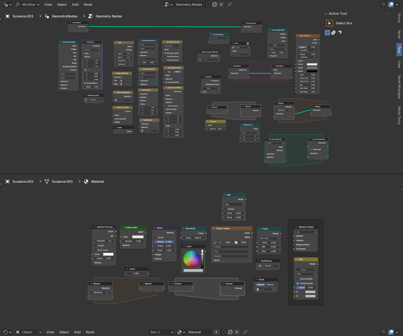
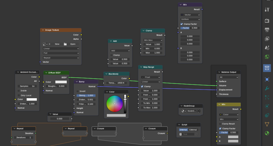
I played and played with it and I think I quite like it with some differences in color and UI elements removed. Like the text or node editors look quite nice as just some text on monochromatic panels:
Hey man, I am a big fan! Very clean and sooo plane. Personally I really love removing section lines: I did so in Obsidian and VS Code. Very curious about your project.
Adding:
Why are the XYZ fields of different colors? The theme reminds me a bit to the Nord theme, which I also like. I am not so much a fan of different colors for empties and cameras, and many colors in general. Graphical semantic separation is enough for me. But I like the choice of your colors.
And, I really like the Cursor Midnight Theme for VS Code. I themed a view apps in that colors - for blender this would be way to dark - probably.What I like about that theme is the decent use of color.
Oh, they do that when animated, keyframed, keyframed but changed, driven by a driver…
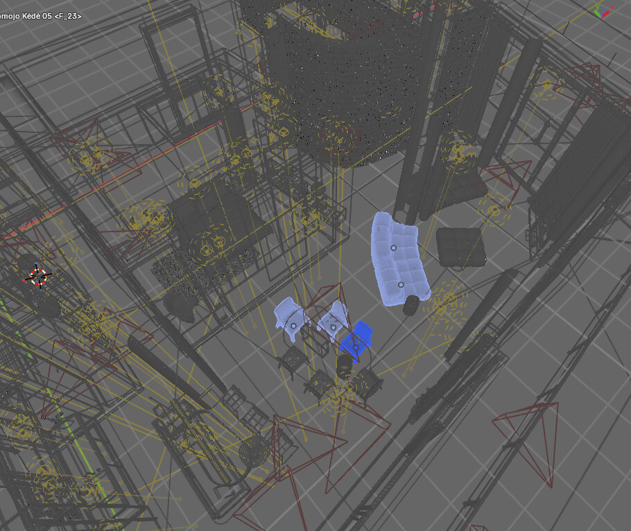
Well, that’s sort of the main thing for me. I want everything in the viewport to be as distinct as possible. So the ideas are a bit weird - I do want contrast and for things to be distinct and easy to see at a glance, but I want it only where absolutely needed and for it to not be vivid and tiring. It’s a hard task, I guess. Too little contrast may be tiring as well. Maybe the colors in the viewport are a bit too much now, I am still experimenting. I would like to make them less distracting, but still as distinct as possible. I guess that will need more testing. I work in that theme and if I notice something or think of something I still keep modifying it. I have been using a milder version of those colors for many years, but I am experimenting with it a bit at the moment to see what works.
It just all requires so much time… I am determined to play with it until I am happy though. It’s going to be a few months at least I guess.
But at the moment I find it to be more in line to my idea of things being distinct. It seems to be more pleasant to work with than to look at at first. I am keeping it for now.
Color coding makes sense, but the colors should make more sense and be less vivid maybe.
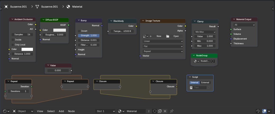
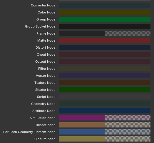
This is a lot. My first instinct is that I don’t really need that much. Do I really need to distinguish Filter Nodes from Distort Nodes?.. i will never remember all the colors anyway… Maybe they can be simplified.
I haven’t gone too indepth with it, but my initial impressions are that it’s not half bad. The only thing I’d suggest changing would be to add the alternating colored blocks back into the outliner, since I think the divisions makes things easier to parse through.
That is a concern, yes. A “brave choice” I am still seeing if that might be a problem for now. But actually, alternating lines make a whole lot of sense if the lines are long and difficult to follow. The thing is… I never view the Outliner expanded so that the lines get long. I haven’t tested how it feels when using the Outliner in all circumstances. Maybe when browsing the Data API mode or some other circumstances it may be a different story. I am sticking with that for now to see if it’s problematic. I am keeping it in mind though.
I was really surprised how the Text Editor is still usable. It feels OK to me. I did not expect that.
I will say that, overall, it’s a good, gentle color scheme, and is very easy on the eyes while still being readable.
Though that lack of contrast might end up working against you when you’re working with busy scenes, especially in the viewport. Like the color of your camera icons, lights, etc look good, but they don’t stand out enough. I could see them getting easily lost among the noise when you’ve got a lot going on.
The blended look works well for the UI, but the viewport probably needs to be a little ugly for it to be functional. Making it so that every individual component type stands out from the others while not searing everyone’s eyeballs out of their head is the big challenge here.
I am gong to see if this works. No idea, if it does. This needs a lot of testing. But I suspect, I don’t really care much about input, output, script, group, group socket nodes differing from each other as well as matte, filter, converter nodes. I don’t think that makes much difference. I have no idea if that is actually so, we will see…
Actually… Shader nodes should be red shaders are red after all:
Oh, but… geometry… it’s pale orange in my theme… but…
OK, let’s go all in. Might not be smart as those colors are probably quite established in everyone’s heads and few themes touch those, but the same is true for wireframe colors probably… let’s see how it goes…
It’s a pitty node socket colors cannot be changed…
Actually, let’s do shaders green, because shader node links are green, then, modifiers can be blueish green and all the nodes that modify something can also be similar:
blender\source\blender\editors\space_node\drawnode.cc has the drawing bits at around line 1020
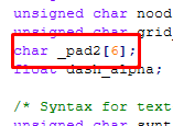
You got to change whatever is called DNA in blender\source\blender\makesdna\DNA_theme_types.h and it has weird padding bits:
that you have to change depending on how many new colors you add or it doesn’t compile, which I have no idea how why and how it works.
Then you have to add some names to blender\source\blender\editors\include\UI_resources.hh
and also connect everything in blender\source\blender\editors\interface\resources.cc
define interface bits in blender\source\blender\makesrna\intern\rna_userdef.cc
and set some value in blender\release\datafiles\userdef\userdef_default_theme.c
and probably in some theme as well.
It’s ridiculous when you think about it. But it’s been interesting finding out about this.
I could share when I am done. But I am completely new to this. No idea how to use any development tools like for example git properly.