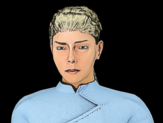
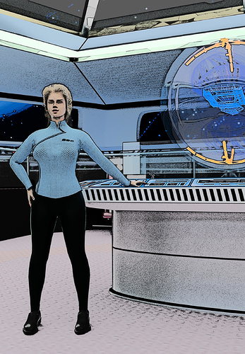
Here’s a page comparison showing the original renders done in Blender (thrown on one page just to more easily compare them with the finished page).
Finished page has 20 layers (this includes panel images, panel borders, lettering, balloons, backgrounds such as stars if used and any touch-up that might be needed). This page also shows the latest font I’m using…compared to my first post, it’s a big improvement. This font has closer line spacing, smaller point size and of course looks more like comic or graphic novel lettering.
There is something that bothers me with this page. I think this is because of the camera angle. There isn’t a frame where the camera is at a character’s height.
This is a page of a french sf comic, “Sillage” (it’s an excellent comic, through). Even in this tensed evacuation situation, there are frames with a character’s height camera, and I find it involves the reader.
I don’t know if my comment is justified because I’m not a comic author, or if it makes sense because of my frenglish, but I hope it helps you.
Hi Papounetman, thanks for your comment. I’m not sure I understand, though, the first 3 frames are at pretty much at character’s height. although one with a wider focal length. There is also a bit of context missing as well, for example if I displayed the pages leading up to it, maybe the angles would make more sense, but I’m definitely no expert, so I welcome any thoughts on it. There are a few rules I have used along the way, which have to do with camera/angle placement in film, but also some artistic choices as well.
Hi dvnobles. I would agree with Papounetman that something looks strange but I would pin it on the poses and face expressions of your characters. Poses are somewhat rigid. Especially, the woman in blue (middle of upper picture) looks very stiff. People would not turn their head so far but move there shoulders in the direction of view. Arms should be a little bit more relaxed. Your main character looks fine. The person on the lower picture looks like he would start crying. Face expression needs some tweaking.
Look at the example comic page. The characters there have much more dynamic in their poses. These are subtle differences but they make a good comic. If you are Blender Cloud subscriber watch some of the animation/posing tutorials.
Otherwise, this is a very good start of your graphic novel.
Hi seawolf, thanks for those comments! Yes, I’m afraid you’re right…the two characters you mention are the only two still using the OLD MakeHuman rig and I have been hesitant to convert them over because I am worried it will be hard to reproduce their facial appearance having already many pages done, but sigh it has to be done…I have so many problems posing those rigs. The red-haired woman is an example of the new rig and makes poses so much easier. Thanks again!
Lt. Gina Estelle is a young, bright-eyed astrophysicist. Due to her eagerness to learn new things and high mathematical aptitude, Commander Jackson takes her under his wing to learn more about Hyper gravitational propulsion (the system the ship uses). She doesn’t appear (physically) in the story until the second part. Since she was made with the old rigging, it is another character that I will need to redo.
Hi dvnobles,
I meant at exact height. In the first frame of the page, the camera is one head higher than the characters.
I am eager to see the what you will show us next :eyebrowlift:
Here is the beginnings of the “Rust Bucket II”…this is the Pilot character’s ship - it’s a shuttle she uses to run…er…cargo. I think this is the first time I’ve ever started with an interior area (in this case, cockpit) and started building on the ship from there with only a vague idea of what the ship would look like.
somewhere I remember seeing some really cool concept art of a spaceship cockpit that looked really cramped and ‘lived in’. That was kind of in the back of my mind when I started this one.
Some shots of the finished shuttle. First one is cockpit view. Second one shows the rear area using the old Pilot character as a reference and then an exterior view of this (not so) lovely ship…
ok, this is really weird…figured I would post it here to keep a history of it. I needed to redo one of the panels, so I brought up the scene and to my surprise find the Commander Jax bent over with his head stuck in a console and Captain Massey not in the position he was in this scene, but standing over by the holo table with one hand behind his back, one hand held up as if in protest, his eyes looking off to one side and mouth open. I never posed these characters this way…ever. This is REALLY strange. The 4 other characters on the bridge are exactly as they should be. I keep a copy of my files on a USB stick as well as my PC. The one on my PC looks fine. The one on the USB stick looks like this. One could say the file got corrupted, but that wouldn’t cause pose changes! Just a couple of low-res to illustrate.
Your characters must secretly run around their .blend files whilst your not using them. Whats funny is that the dude at the bottom looks like he’s reacting to the pose of the one at the top 
haha! for sure! I just don’t get it. I’ve also notice the characters from time to time looking into the camera when I know they weren’t. I think I’m losing my mind…![]()
This woman has been kind of a pain, but a labor of love.
BACKSTORY:
Miss Arroway - she comes aboard the Destiny as a liason for the Earth Space Consortium (ESC) who basically owns the ship and feels that their interests are not being looked after (it appears the crew is more interested in exploring space and furthering science than finding mineral resources for the ESC). Miss Arroway is cold, intelligent, beautiful and comes aboard to interrogate the top crew members to determine if they really should be the ones running the ship. The captain of the Destiny is, to say the least, not too happy with her presence on the ship.
BLENDER:
Like I said, she’s been a pain. Much like the Pilot character, every time I thought I had a good looking model, my co-creator basically said “uh…no.” And eventually I would see it and admit he was right…
So, here are some of the early progressions of Miss Arroway…
So…the first image is the original uniform I created for her. Later on, I decided to revamp the uniform (image 2) because she wasn’t there to show her cleavage, she was there as a cold delegate type, but still needed to be sexy. The final image is a test to see how she would look in the graphic novel.
OH, THE PAIN…
Well, I was ‘ok’ with how she looked and eager to get going with the graphic novel, so 32 pages later, we had to admit that she was ‘ok’, but it just wasn’t the Arroway we envisioned…besides, she was one of the original characters that used the old Makehuman rig and that caused problems too. So, I’ve been going through the painful process to redo every single frame that she appears in, but I can say that, even though painful to have to redo things, it is well worth it in the end to not settle, but to be true to your vision. Shortly, I will post some updated shots of the NEW Miss Arroway…
…and here is the new Miss Arroway along with a couple of comparison panels showing old and new. I am happy with her now and her uniform actually fits now showing off her figure…although it is a bit big around her breasts, but what can you do… What do you guys think?
One more for tonight…character shot of Miss Arroway. Sleeves kind of messed up - had to fix those in post on the graphic novel page.
Well yesterday I spent some hours doing some renders to see if I could come up with what I was visualizing the cover to look like. I really didn’t expect to complete the cover, but it came together…really happy with it. Here are the first 2 ‘raw’ renders:


