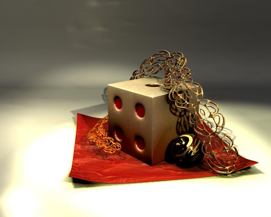
So my goal was lighting,
I spent 2 hours on this (instead of working on my physics hw)- most of it was tweaking.
blender internal, I didn’t use the compositor (due to suddenly realizing two hours whizzed by)
I just need some good critiques so I can justify spending that much time on it.
Thanks
render is good.ive been tring to get that metal effect.would u mind giving me an idea on how u did it?if not, its ok.i still think its a very cool render.peace:D
ive been tring to get that metal effect.would u mind giving me an idea on how u did it?if not, its ok.i still think its a very cool render.peace:D
Thanks for the comment .
for the squiggly things, it’s a texture mapped to the reflection coordinates
for the dice, it’s a rust image texture mapped onto the UV coordinates (Cube projection)
with either the compositor, pshop or gimp, turn down the saturation and contrast a little. with that kinda light burn the colour saturation will be more washed out. info has some really useful stuff for getting more scientifically grounded results instead of guess… if that dice supposed to be metal, then the face looks like its slighty pillowed. this isn’t consistant with the brushed look the texture has or the ‘machined’ corners. if you’ve got a subsurf on that, your edges are still a little too curved…
lastly, 2 hours of render tweaking is really nothing in the grand scheme… as long as it was a progression and not 1.5 hours of trying to sort out the first .5 hours screwups…
The lights are too strong - look at the floor, it seems to glow (on the contrary - the shadows are too dark). There are too many hard shadows and light sources (at least 4?); have you tried to use only two lamps? One from the desired angle and the second located 90 degrees to the first one (in order to lighten the shadows)? Try more soft shadows, add subtle AO with Both option on. To simulate GI try to add some reflections to every objects at your scene (as the matter in fact all the materials in a real world create glossy reflections). To get nice realistic reflections add a HDRI texture to AO.
I like the metal effect as well. I think the lighting is a little unnatural though. Look at the shadows and light on the ground. That just looks weird. Maybe you could try a simpler approach for your lighting. I’m no good at lighting in practice though. That’s just what people say. Like that one interview with pixar…
Your shadows look rather odd and too dark, the image as a whole also looks a bit dark on a fairly accurately calibrated monitor. Try re-doing the lighting with only one shadow casting lamp and possibly enable soft shadows as well.
Okay, I just put one lamp there.
it’s still going through the compositor ,
the light is at a 45 degree angle to the right of the camera
the less saturated one on the left is just using a different node setup.
which one looks better? (or do they both look crappy?)
thanks
-amdbcg
The one on the right looks better. Excellent render! The latest images are better, my first thought is that the shadows seem a little too harsh still, but I seem to remember seeing similar lighting before and I think they are actually spot-on.
I like the paleness of the left image, but I also like the richness of the right. My one problem is that the specularity on the wall is right at the tip of the chain thingy.
the spec hotspot on the backwall is ugly, the lightings much improved though…(ignoring the very first image now) i think the saturation is way to high in your second image, but the midpoint for the first is way off. saturation and the levels midpoint are not directly related so you can fix both independently.
Either you should have a nice evenly lit background and no darkening in the corners, or you should have all 4 corners with the same level of darkening. There is a lens effect that will darken the corners and a lighting effect that will darken the background, at the moment you’ve got both, but not consistantly.
that slight rumpled texture you have on the background surface looks like a cheap and nasty studio roll of paper. its necessary to texture everything, but if a studio had something that creased as their backdrop it would annoy anyone shooting onto it.
the shadows are still a little dark. i would put in a low intensity hemi or area light in conjunction with your single spot