Literally the first reply in this thread is:
“I voted yes, because in principle i am in favor of a major UI revamp, IF the drastic change is an drastic improvement.”
Romanji did not actually answer the question asked, but the equivalent of this “silly question”. That’s not a misunderstanding, that’s willfully rejecting the question.
Either way I’m totally fine with the result, because I’m looking for the general sentiment. Complete ignorance is part of the general sentiment, so the above answer is still entirely valid, even though it doesn’t answer the actual question.
No, it doesn’t. The shortcut for “view selected” has always been numpad-dot. It’s like that in every editor, consistently. In this video, all he does is change it to the tilde key for every editor, because that how he had previously set it up for himself in the 3D editor.
He uses a spreadsheet to keep track of everything, but he could’ve just typed “view selected” in the hotkey editor and would’ve gotten a list with all the hotkeys for all editors, because those operations are all consistently named, as well.
Very good point. As an example, if it would have been possible to make something like bforartists just through a “plugin” UI mechanism as opposed to a fork, that would have been ideal.
Ok, I agree that it’s a horrible analogy, as bad as mine hehehe
BUT I’ll bite the bait, I understand what you say, I just think the question is not explained so it’s left to people to understand what they are being asked about, I think a better question with a bit more explanation could be great, but as I said… BUT I’ll vote YES hehe Improvement always come with an effort, so I’m all for this.
It would depend on the nature of the drastic change. I’ve been around Blender for a long (LONG) time… been through nearly all the changes. If things are being re-positioned or renamed, that’s tolerable. Blender is still Blender. However, if the workflow changes, I’d have a problem. For instance, if Blender were to adopt an exclusively tool-based workflow (pick tool, adjust settings, use tool) rather than it’s current workflow (select item, perform operation, tweak results), that would fundamentally change the application in a way that I’m not excited about.
Since ‘drastic change’ includes that possibility, I’ve voted “no”.
The poll is a bit binary, there is also plenty of reason to support improvements in Blender UI and workflow without massive and potentially disruptive changes.
It’s already being seen in 2.8. The collections workflow, wiggly widgets, Blender 101, ect… They all slot neatly into the Blender paradigm while bringing some much needed improvements.
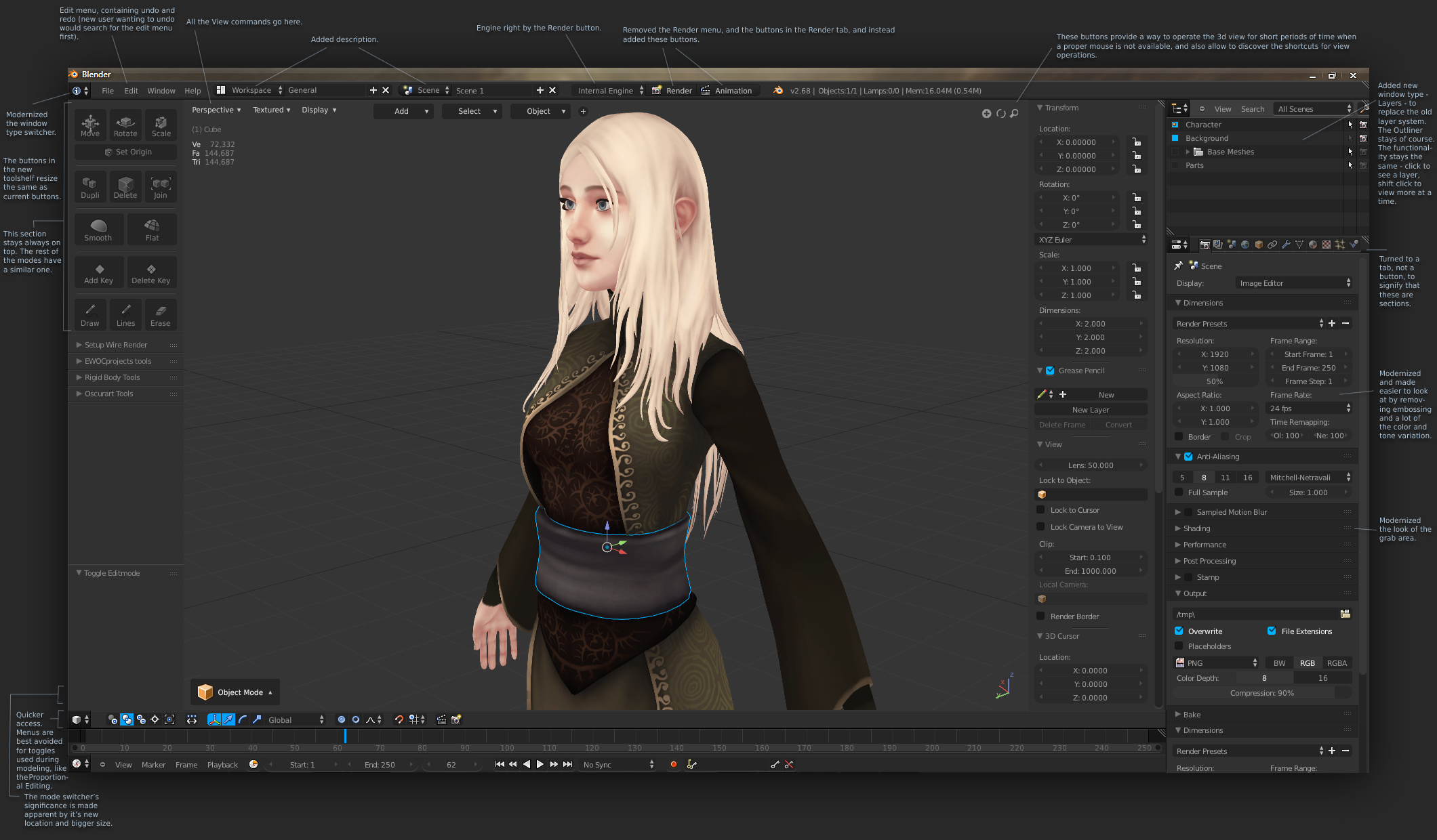
That said, I would support things not being considered at the moment such as replacing the text in the tabs with icons (because sideways text just doesn’t work well), it might also be nice to have an optional horizontal mode for the toolbar and the ability to have floating panels like in Blender pre 2.5 (as more examples of improvement without tossing the UI altogether for a new one).
I think Blender’s current interface is pretty decent. It could do with a few tweaks, QOL changes and a bit of harmonisation here and there (many of which were discussed in the aforementioned UI thread war) - but I don’t think a fundamental redesign is needed - as it was pre-v2.4
I voted yes. I think it’s important for software (and artists) to be flexible and able to improve. The interface is like any other area. It accumulates cruft and needs refactored at times.
I’d also add Blender UI changes are drastic because we wait so long before fixing them. For example, Cycles baking has sat in an alpha state for 2 years. If it had been finished quickly, the disruption would have been minimal. Changing it now will make a lot of training material obsolete. That is why I think fixing UI problems early is way better than waiting. UI problems don’t go away if you ignore them. They grow and metastasize.
The thing is that fundamental workflow decisions like the one I’ve described (which I would argue fall under the category of User Experience… which is often conflated—rightfully or not—with User Interface) are often a driving force when it comes to user interface choices later in the design. For instance, this is why tool buttons in the Tool Shelf behave as oddly as they do… it’s an attempt to bolt a different workflow on top of Blender’s. Blender’s workflow immediate and operational. It’s not fundamentally tool-based. So when you try to impart a tool-based UI on it (like selecting a tool from the shelf and then working with that tool), the behavior feels unexpected and wonky (as it currently does). There are, of course, solutions to this and they’re working on them for 2.8… but I’m digressing.
My point is that there are fundamental design decisions that are very much tied to user interface and user experience. So when someone starts to discuss “drastic” changes, I expect that to mean a modification of those kinds of fundamental decisions. Otherwise, the changes are more or less window dressing (if you’ll allow me a little bit of oversimplification) and can be handled in a more iterative fashion.
What trade off? People working on Blender are not idiots. They are smart and educated people with comon sense. This kind of decision is not taken lightly. They are not going to mess things up. A complete unrecognisable UI redesign with hotkeys and UI concepts to be relearned with “users not consulted to greenlight specifics” is never going to happen. User consulting in design is called user feedback. User feedback is not going to be ignored. It cannot. They know what they are doing for quite some time now.