dose my mesh is correct

well finally we can see some results
render with yafaray

me
i dont like it i am trying to achieve something but i cant

see this link to my reference image
http://qisheng.win.mofcom.gov.cn/www/1%5Cqisheng%5Cimg%5C200852515246.jpg

any suggestions will be welcome

(for models repository you have this

http://e2-productions.com/repository/index.php)

Attachments


very nice!

stainless steel looks good. i would say shadows are too dark and maybe the knobs need more specular, or maybe to be whiter?

thanks :slight_smile:
yes the knobs need some work ,just made a little fix

why cant i achieve same results for the stove steel same as in the reference image
its driving me crazy :slight_smile:

Attachments


you need a brushed metal texture. look at this tutorial

http://3dnoob.com/tutorials/brushed-metal-textures-blender

and this also:

http://www.blender.org/development/release-logs/blender-242/material-features/

good luck1

well i played with brush metals before
the main concept is
a textured starched , and allot :slight_smile:
increasing one of the map input Size [axis] value

i tried the same setting as in the first link

the second link , had broken reference to blend files

well what do u think about it now ?

Attachments


nearly there…too much brushing now!

can you reduce the scale or the intensity of the effect? it’s not easy to get it perfect

yes … i have to go to sleep now
will reduce the brash tomorrow

thanks , good to get your help again :slight_smile:

shay, i played around with this a little. i got better results with the settings from the first link when i mapped the cloud texture to color only and not to normals. will try some more later. can you post your latest blend please? also, the lighting set up makes a big difference!

Attachments


looking good

how come the Black bar to support plates are so big?

i don’t remember seeing theses like that!

is there any other elements on stove like some ligth fixture above it to light up the top
or may be some Ventilator for smole m timer ect…

salutations

i am back with a new render
what i did was turning of the NOR as you said
and in “Map to” color i set it brighter

well i am starting to be satisfied with the result :slight_smile:

enjoy

Attachments


very nice!

what is your lighting set up?

i tried to make another form of stove more modern
electrical type

but i got a color problem or the faces withsubsurf

any idea how this is happening and to correct it

see pic

Thanks

well i use this tutorial
http://www.yafaray.org/documentation/tutorials/studiolighting

just made a simple plane at the bottom.(flat plane)
block the light from the left and right with two more planes (they are not in the same location in the z axis)

and two area lights as the tutorial says

thanks steeve :slight_smile:

i think for a modern stove
just a plane with a good texture will do
since its flat

take a look at this image for example
just something like this with more resolution :slight_smile:
http://www.touch-plus.co.il/var/604/83264-CK481%20%D7%92%D7%93%D7%95%D7%9C.JPG

unless you want to animate the stove turning on some heat

also for your mesh you can add loop cut
in places where they go to round

hope that’s help

the pic you’v shown is more like a flat ceramic stove
which is another type of stove

the one i’m doing is the ordinary electrical heater element stove type

so there are cavities as your original one

the problem is why is the red color not being rectangular following the faces

there are some rounded corner for the color which is weird?

i tried to redo the corner by adding some vertex to make it look more square but it does not work !

so how do yo correct the red color to get square color faces ?

i include a dwg have a look

Thanks

ricky, there are some strange things in your mesh. these areas need fixing:

Attachments


well just open your file
sorry i had to go out
and i have two things to say

  1. i hate tris :slight_smile:
  2. try to separate things to different objects
    all of this is one big mesh
    separating make life much more easy

i will work on it a bit and look more

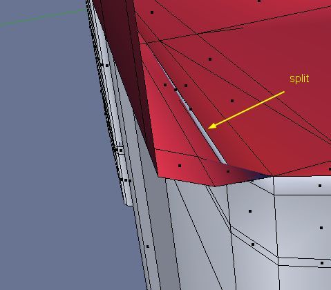
well i tried to fix it
but when i made W->remove doubles
i had 240 doubles there ,
removing them makes the mesh really weird
and i must remove all doubles to make sure i don’t have any F-GON there
(see the blend file what i did so far ,and stooped cause of the doubles)

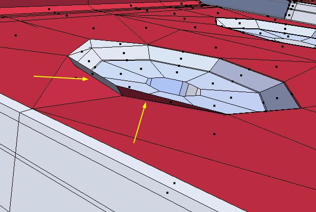
since its not organic ,it makes life more easier
u can model each part separate
and achieve maximum result
when focusing on one thing at a time

modeling them as objects make more sense (to me at least)
cause each one has a different material and different topology

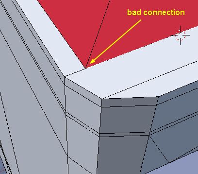
see attached image for example
where u will see the red arrow means i was making it as a separate object
(you can join them latter when done ,(what i was not doing to keep minimum changed).)

i found thous image using google
here are the links for them with out my editing
http://i.ehow.com/images/GlobalPhoto/Articles/4750092/stove1-main_Full.jpg
https://www.kitchensmadeuinstall.com.au/shop/images/uploads/Bargains/CIMG0853.JPG

Attachments

stoverj2.blend (169 KB)

you have to limit the effect of the merge or that will remove verteeices you don’t really want

but i think there are some faces taht are not properly made not certain what happen tehre

but i begna to modify it and it’s beginnign to make more sense

i’ll complete it tomorrow

Thanks for all advices

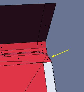
i did remove all doubles and corrected some of the edges

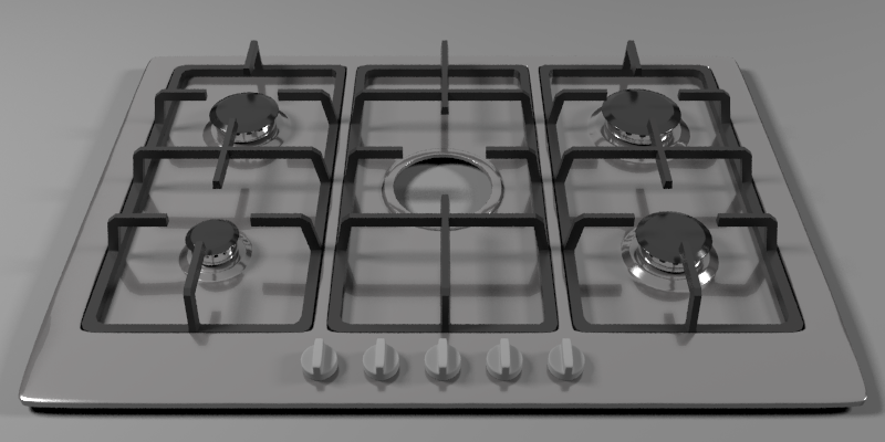
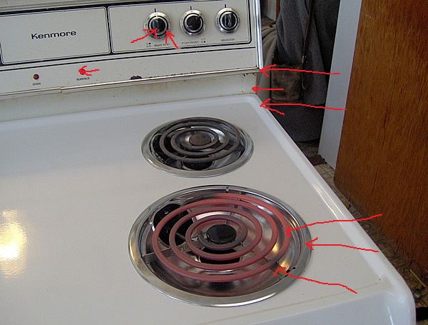
i did a test and repeated the holes on top of stove and applied subsurf to it

with a 8 segments circle see pic

looks very good with 2 colors
but why i cannot get that on the stove top?

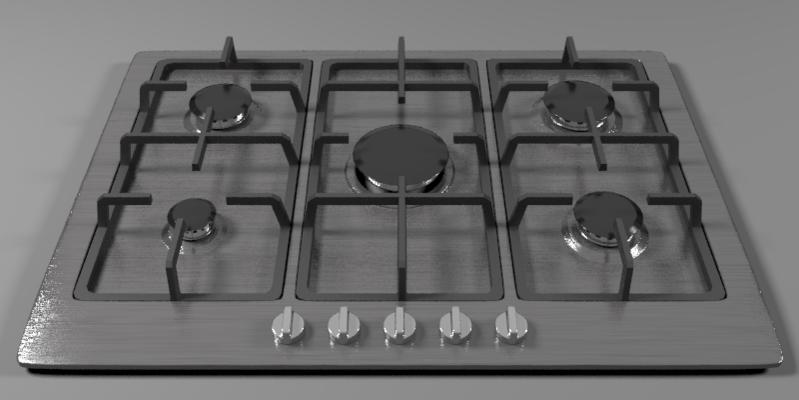
i redid the top with this new cirlce and see second pic

i get again some distoriosn in circle whis i that?
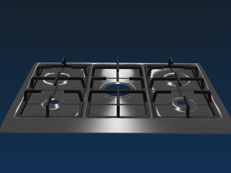
i did add an extra vertex per corner to reduce distorions on outside edges
but this does no change the distorions on the middle circles!

any ideas welcome

Thanks