Here is a WIP I started a while ago, now I wanna finish it:

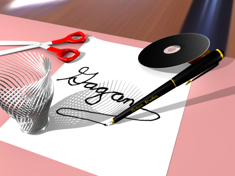
The only thing I would change is the position of the little wire cup - the shadow is blocking out the pen’s shadow such that I don’t see it, and it makes it appear to not be in 3d space.
If it was further forward or to the left, then the pen would seem to be standing on its tip.
Well, depending on the style you are going for here, I would say that some serious texturing is in order. With the name of the thing being tictoon, does that mean you would like it to be more cartoonish? Then I think you should work toward some sort of stylized look with some interesting shaders, etc. If you would like it to look more real, then you are going to need to put some work into bump-mapping your materials and replacing simple one-color jobbers with deeper procedurals.
And the pink desk just doesn’t work for me. Also, it seems to not be receiving some of the shadows, although for the scissors it does.
Also, you have a hot-spot in the top left corner that doesn’t need to be there.
I think tha hot spot is the cause of HDRi, I’ll get working on everything else.
A pen would be smooth so do i need bumb mapping for that?
EDIT: I fixed the shadows, the bias button stopped the table from showing shadows. I also changed where the light was coming from.
I’m now gonna presume you are trying to make this photorealistic.
-The material of the pen is too unreflective, too black.
-Nice metal, but pretty much everything else needs some textures. I think ive seen pink desks, but never a desk that clean and … uniform. Add some dents, blemishes, stains, whatever. It wasnt that perfect even brand new 
-The metal on the scissors is too grey and is not reflecting anything.
-The handle of the scissors looks like its painted metal, due to a “seamless” transition to the blades.
-shadow of the cup/pen is only visible on paper, not on desk
-Is that a flying black cd?
-hot spot in left corner
- composition seems a bit …random. I cant come up with when i’d arrange my things like that.
Nitty-picky:
- scissorhandle a bit bumby (might be lighting?)
- paper is too flat and too close to the table, ordinarly you’d see a shadowy edge, so a cube would do better than a plane.
-The cup looks really delicate, u might want to add some cross-over bands.
Hmm quite a lot, but well, you’re in focused critique, so i’m trying my hardest to find all the details that you could improve.
btw, is this surrealistic or are you going to add a hand?
The pen doesn’t need a bumpmap, but it needs some shininess - like a tangential specular ‘reflection’ down the length of the shaft. I just held up one of my pens and it gleams all down the center with reflected light. Give it a try. You should try to replicate that.
The CD should have a very fine bumpiness and if you give it an image-mapped label, you save yourself the trouble of trying to do anything too difficult there (like trying to recreate the multicolored shine).

Maybe add a touch more spec on the pen and a lot more hardness to make it really shine like black plastic.
I am not quite sure what that blue streak is at the top right corner. I got the impression that the pink was like a place mat type of thing you’d but on a desk. If it were me I’d extend it to the end of the picture frame and get ride of that top part. It creates a diagonal across the space that to me makes it unbalanced and awkward. If you wanted to keep it I’d say move the camera up a bit so that you crop out some of the bottom of the paper and the diagonal is more or less centered. And then touch up that material at the top. I assume it is wood grain for the desk but it looks blurry. Also curious as well if you will add a hand. If you don’t plan on it you could zoom in some and focus on the word mainly so you only see part of the pen.
the blurry stuff you are seeing is my poor attempt at HDRi 
maybe i should add a real floor…
You know, I’ve seen that and I never really concentrated on it much, but I just now realized that I have always subconsciously thought that this picture was in a bowling alley, because that brown streak looks like a gutter…
stupid HDRi mumble grumble
EDIT: I changed it, here it is

Oh and I was bored so I tried waermarking it.

these are getting really big now…
a quick bump, in case you didnt realise, I put up some new images
cmon no one like it?
I like it. How did you do the ink? Is it particles or a texture?
the one on the page, texture
I was never good at making materiels so could someone give me some hints to head me in the right direction?
which material are you trying to improve? A lot of times a good material comes on mistake because you were messing around with some settings and like the result. A lot of it is trial and error.
well I kinda already knew that and I came up with this:

I changed the material on the scissors and the cd
Hey, I like the CD label (go Ubuntu!), but now the CD needs some thickness. Yours it too paper thin. Also, if you put whatever material is on your cup onto your scissor blades, they will probably look a ton better (and a little tweaking of the handle shape wouldn’t hurt either).
Now, after all this, I have to ask: What’s this for? That may help the rest of us know how to direct our crits in the future.