Factually incorrect. I will provide some examples that are perhaps subjective, but also some that are undeniably downgrades.
Sure. I apologize in advance if this post is a little hectic and unorganized but I have a lot to cover.
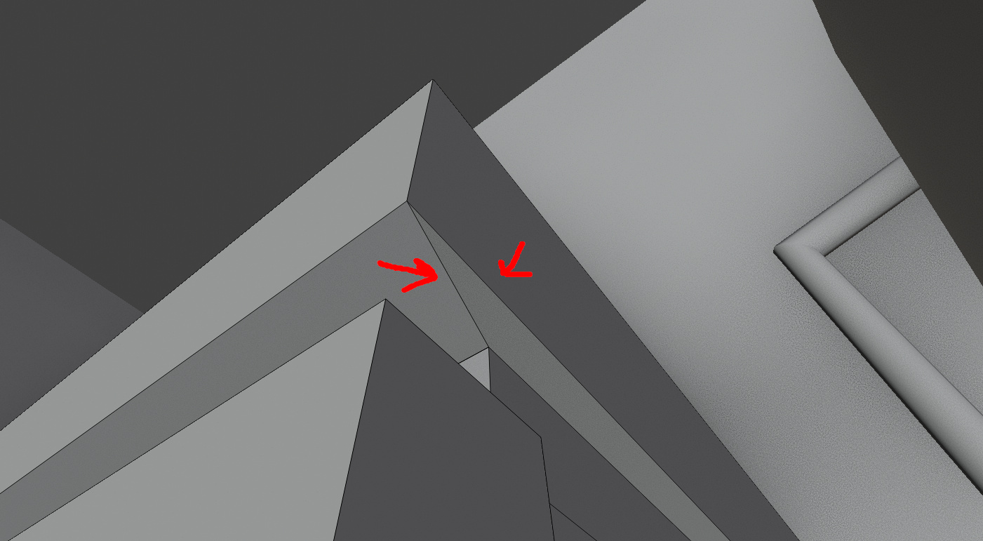
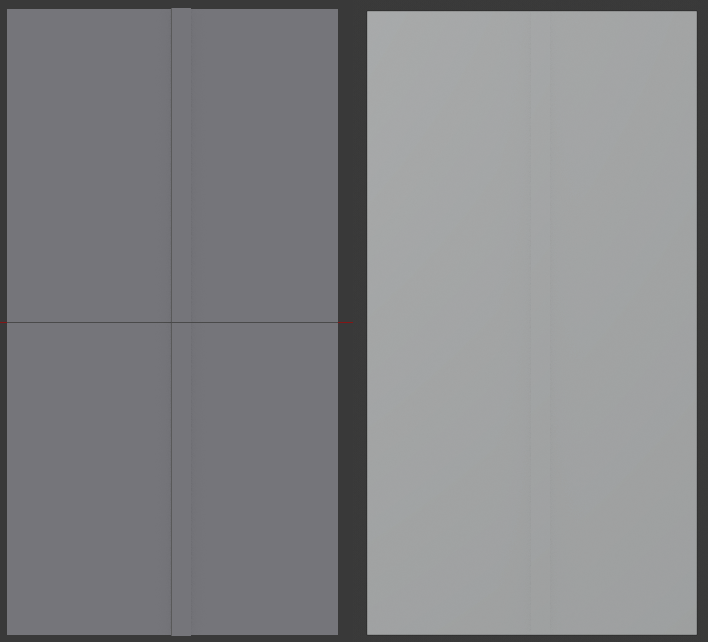
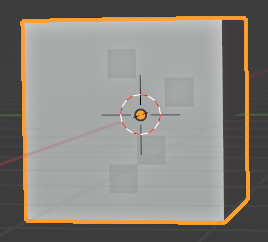
Let’s begin with a little game. I like to call it “face or not a face”.
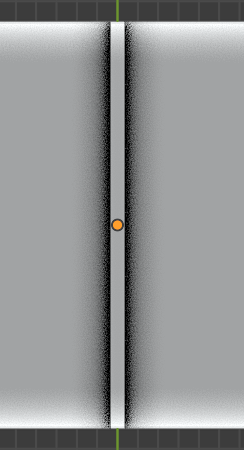
The triangle area the arrows are pointing too, is that a face or a hole? Now there’s a slight give away in that there is a tiny visible difference because, silly me, I left AO on, but no there is no face.
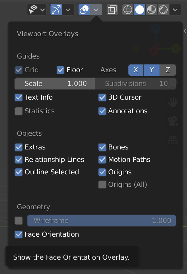
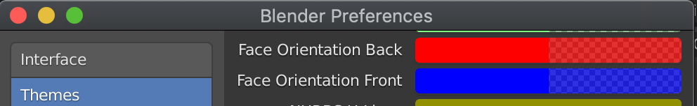
It’s really difficult to tell because they removed an invaluable feature - backside faces being darker. If I want to see backfaces now I have to go and turn it on in the render options. Which, by the way, while you can see the result in both edit and object mode, you can only turn it on in edit mode. Totally nonsensical. Then when you do have it on prepare to have your eyes burnt out.
It is harder to model without this and it makes me wonder if the developers even tried working with 2.8. A glaring omission.
In fact the shading has changed the colors entirely, and the decision was made to make them closer to the background color. That makes sense right? Who wants their geometry to be clear and visibly distinct from the background?
Left plane is harder to see no? And it gets worse as the angle increases. I know, I can change the background color, but guess what, I like the grey background at it’s current brightness, and I can’t change the mesh color. It’s just plain stupid to have this at default.
Texturing. Remember when you could just grab a mesh, load a texture and it appears in the viewport? You can’t anymore. You have to create a material setup just to view a texture. Not everyone is using Blender to create renders in cycles.
Speaking of which, baking. EEVEE was supposed to replace Blender Internal in every way when it comes to functions. It can’t bake. Anything. To be specific let’s take the example of baking ambient occlusion.
In 2.7 you created an image, selected the object(s) and clicked bake - instant result by the way. Now you will have to create a material and add an image texture node with the image you want to bake to, select it, then click bake. The real problem is the result. Internal did it differently to cycles and the result was a really smooth AO map. Cycles gives you this shitty noisy mess and takes a good 10 minutes to do it. I literally have to keep 2.79 installed just to bake AO (jokes I use 2.79 over 2.8 all the time).

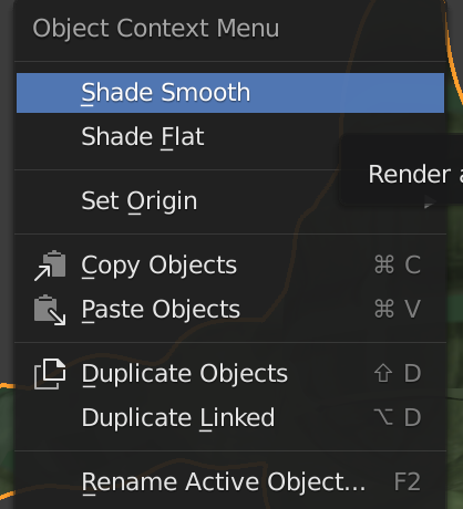
Let’s talk UI. All those things I used all the time, you know like remove doubles, flip normals, shade smooth/flat - gone. But tools like sheer and mirroring options are there to stay? I, and I’m willing to bet most other people, use functions such as remove doubles and flip normals far more frequently. What is the logic behind this??? What’s the point?
It’s okay though, you now have your own quick favorites list. Great another key used up. Oh and joy of joys, you need to re-add them all every time there is an update. Added them in the wrong order? Tough shit you can’t reorder them without removing all those before.
But don’t worry, instead of the left hand toolbar having over 20 tools listed purely by name, we now have nameless icons that I have to mouse over to find out what they are. And the best bit is images take up more screen space, so we have less tools there! This is flat out stupid.
Sure, this looks prettier, but that’s the problem. It’s a professional tool and I don’t care what it looks like, I will always chose function over form. Seems they only cared about making it look pretty.
And what about the setting I use frequently on the footer? Well we’ve decided to spread them out across the entire width of your screen, leaving giant blank spaces in-between and moving them further away from the most likely place your cursor will be (will be working - the center):
No idea what the point is in moving them out towards the edges - oh wait it’s trying to make it look pretty again.
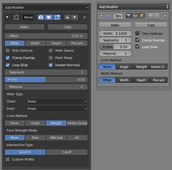
I also liked how the deselected options text was black, and selected white, as shown in this bevel modifier, and how buttons/boxes are outlined in black:
It makes it, whats the word, clearer. But no, our monotone low contrast fancy looking new scheme is more important.
Also, important point, when you read do you read right to left, or left to right? This is why we align items to the left, it makes it easy to quickly read them as we scan the options. In 2.79 they are also seperated by high contrast simple black lines. 2.8 aligns everything to the right, and uses every shade of grey under the sun making instant interpretation harder, it’s a total mess:
Going back to AO quickly - AO is extremely useful when modeling to help let you see extrusions and so on in your geomtry. Let’s take a look at 2.8 vs 2.79 - in this example we have a flat plane with a small extrusion in the center pulled towards the camera:
It’s barely visible in 2.8. I’ve played with the settings (again, it should be optimal out of the box) but can’t seem to match 2.79’s look.
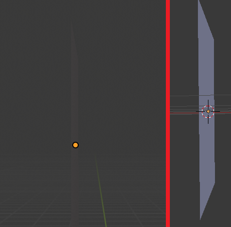
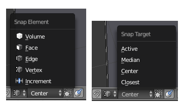
Going back to UI and mouse movement, let’s take a closer look at snapping and the options.
As a result of merging options into the same panel, you now have situations where given a certain choice, other options disappear. The result is a large empty space, which will vanish if you open the menu with this as the current choice. This means that buttons now move depending on your choice which ruins your muscle memory for clicking frequently used buttons:
This is terrible UI design. They should not move. And again, look at the amount of extra screen space we are covering for no good reason compared to 2.79s more compact design:
When you use a tool, in 2.79 the options would be instantly visible in the bottom left. Not so in 2.8. Now we have to click an extra button to open them:
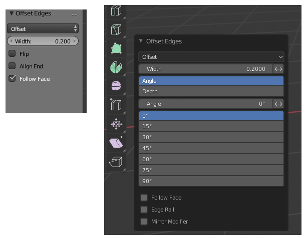
More importantly though, look at the positioning. Because the left bar is gone to make way for the child friendly pictures, the option menu now starts further to the right, covering more of what I am working on. Cool.
I could literally sit here for days doing this. Ultimately though 2.8 is a change designed and making it look pretty, not at professionals/skilled hobbyists who want to get shit done. Also the lacking feature set of EEVEE makes it pretty clear that they only see Blender as a tool for renders and it has screwed over those of us using it for game development to some extent.
You don’t know enough people
Or maybe you should look around more. Try googling ‘hate blender 2.8’, there’s plenty of posts on this forum outlining peoples issues, but they are becoming silent because it’s fallen on deaf ears - form over function is the new mantra.