Punchy would be AgX’s high contrast equivalent and really isn’t stripping down colors much at all. And compositing is always an option that’s being used practically universally.
Sure, but not the current implementation with how dark it looks I think.
I don’t think the brightness is a fundamental issue. But it might be nice to have one that’s “the same as Filmic” in this regard in order to compare just the color aspect of it all. - Like, have “medium grey” be mapped to the same value?
Here a comparison of an old splash scene:
AgX, Filmic Very Low Contrast, Filmic None (or Medium), Filmic Very High Contrast, and Punchy.
In this case the colors don’t actually change that much, but Punchy is indeed quite dark. (Note, however, that the scene seem to have been literally built with Filmic Medium in mind. If it had already been built with Punchy, I’m sure it’d have been built brighter from the start)
Either way though, the grey point is, as I understand it, quite easily adjustable.
You are correct, at least in terms of cel-shading, any cel-shaded work is done with Standard transforms and No look to maintain color consistency. It’s for this reason that I whole-heartedly support development of better color profiles for Blender, so that the photo realistic side can get better results. Us NPR artists already have exactly what we need ![]()
I wonder about the gamma final used from colorist ,and the mastering for showing as streaming TV etc.
The standard for SDR is rec709 with 100nits and a gamma of 2.4
Vs Most PC Monitors have a hardware display gamma of 2.2.like typical sRGB gamma.
I dont know what hardware gamma the lcd and old TVs have today.But i think they are also at 2.2
A few years ago i loaded some gamma testpics into my samsung lcd TV and its looked like perfect 2.2 gamma.
The question is,if most of this content is viewed on a modern TV or Monitor,why its not mastered with gamma 2.2 ?or do i miss something?
The thing is,all TVs and Monitors have a hardware Display gamma.If you use more or less gamma then the midtones gets shifted.I guess everyone wants a perfect midtone displayed.
here i found a explanation (is english written)
This has been a misconception for a long, long time.
Most NPR needs the data of a basic image formed before it can be properly NPRd. Using a display’s inverse EOTF to encode here is hugely problematic.
What would benefit NPR most significantly is attenuation of the chroma that holds some semblance of the intended / desired colour, so that the NPR processing can push it back in, or distort the specific mixture as desired. Essentially permitting NPR processing to “pull the key value”, which is lost when using an inverse EOTF encoding or anything that would more greatly distort the desired / selected mixtures.
I strongly believe that NPR benefits at least as much, or more, from a more robust interstitial image formation step.
Modern TVs would require the replication of the formed image to target BT.1886, which is essentially a pure 2.4 exponent function. The specification has some other variables, however in most cases it is a pure 2.4 exponent as a decoding EOTF.
I don’t think you’re wrong at all in this, but I think it really depends on what kind of NPR we are talking about. Note that was a reply to my post mentioning a constant predefined palette with no algorithmic shading at all. Just selecting precise, fixed colors, most likely from the sRGB gamut.
That is a pretty small use case though. Most modern NPR involves actual shading and nontrivial lighting calculations at which point this immediately becomes much more relevant again.
I personally wouldn’t agree with this. I suppose it depends on how you define NPR, which is admittedly a nebulous term, but again, for cel-shading, you use Standard with None look exclusively. In my experience with NPR, most people are interested in cel shading. This is definitely veering into off-topic territory though so I’ll let it rest at that ![]()
The point I would make is that all of NPR benefits from “dense information” that the processes can mangle / massage downstream into a final NPR image. This could range from rather conservative re-rendering / replication of the formed image, to far more radical creative twists and distortions.
In both cases, having an interstitial image formation that packs a good deal of information into the signal matters. For example, using the blue spheres case above, the “blue” of the ball in relation to intensity is lost. If the blue were compressed and attenuated on the other hand, this entire axis along the curvature of the sphere would be exposed to the NPR processing. From there, the NPR processing could use that information to perform any number of NPR flourishes.
This is exactly the case that I’ve been making for a long, long time; the image formation processing should provide the maximal creative opportunity as an entry point. Where “image formation” includes subtractive-like medium chromatic attenuation. This is not only an absolutely vital component of our historical aesthetic landscape, but is also a tremendously invaluable form of formed image signal compression I believe.
Which is problematic.
The point is, a cel shading would be able to take a “range of values” and assign them a cel palette value. In this way, attenuated chroma for a “bright” region can be keyed accordingly, and indeed returned to flat cel appearance. However, if the image maker perhaps wanted a duo tone in the cel, where there’s perhaps a “highlight” painted region, or shaded etc, that information in the interstitial image formed would be either not present, or distorted in fundamentally different ways that would betray an object’s surface constancy.
In this way, starting from a more robust image formation as an interstitial entry point benefits both categories of NPR, while using a mere inverse EOTF encoding limits the creative output.
Here is a frame from monsters university movie.
lots of eye Poping colors o
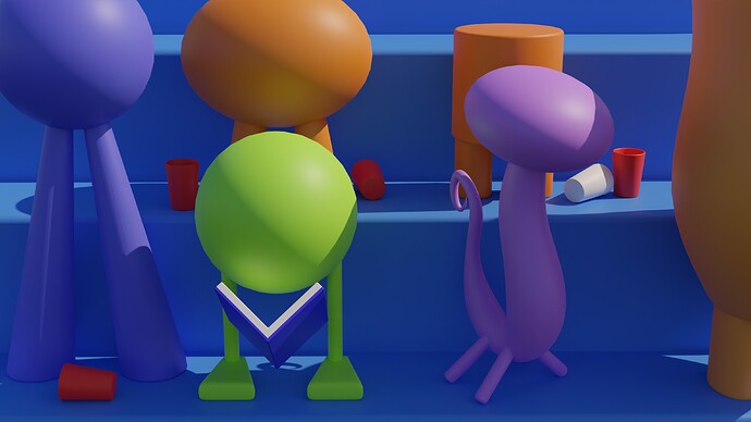
And here is my “very accurate” representation of that scene…(let’s focus on the color reproduction okey ?)
this is straight out of blender using filmic (no look, no post processing)
and here is the blend file if someone wants to play with it (feel free to improve it):
test.blend (1.7 MB)
I would like to see how Agx would manage to deliver something just as colorful while being more “accurate”, we can then advance the discussion further.
PS: notice the red cup on the buttom left corner, on my cheap’o srgb monitor the reds look clipped on the sides of the cup, I guess it would look better on a proper monitor.
If you happen to be using one of those cheap LCD monitors, then it is definitely skewing your opinion on color transforms (because the color you are seeing is not accurate at all due to the very limited viewing angles and the relatively bright blacks).
LED monitors meanwhile (which I use) do quite a bit better on viewing angles and color fidelity, but to have the most accurate colors require high-end professional displays that cost thousands (which I can’t afford so an LED IPS display is the best I can do).
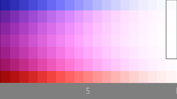
Using two of the images posted above, I can’t see any different shades on the framed parts (they all look the same):
Filmic:
Agx:
My monitor is a TN panel with 72% sRGB (as terrible as it can get), but it doesn’t stop me from comparing with what has already been mastered with wider gamuts (like the pixar screenshot from above) and aiming for something similar based on what I see on my screen, and it doesn’t take a super accurate color monitor to spot the de-saturation in the Agx config.
I never commented about which shade of red is this, but how saturated it looks.
PS: the monitor description didn’t specify any color gamut, it just says 72% so I’m assuming that’s 72% sRGB.
I think it might be your monitor, I see a huge difference between those two images
I do see a huge difference between the two images as well, but the parts inside the rectangles are where i can’t see any difference, in other words, I can see all the shades on the Agx image expect the last line of whites.
If you meant you can see all the different shades on the filmic picture, then ignore this post.
On my monitor, I do see some difference, but it is clear that the lack of HSV compression in Agx is a solid argument as to why it should be used as the base for your color pushing. Raw Agx itself was mentioned by Troy_S as simply a robust foundation from which to generate looks from (case in point, Punchy).
I’m viewing this on an Android mobile device, so god knows what colour mangling is going on, but with reference to the filmic table the big block of purples does have subtle variations in colour. The bottom row of reds does as well, though the right end ones are indistinguishable. The middle of the blue row is a solid block. Apart from the top row those purple columns look identical top to bottom.
But maybe this is also a test of how good my colour vision is.
I think that should be somewhat “normal” as the point of those two images was to point out how filmic still have clipping in those regions and the Agx test doing a better job at not clipping them, hence why it’s shades are easily distinguishable even on cheap consumer screens.
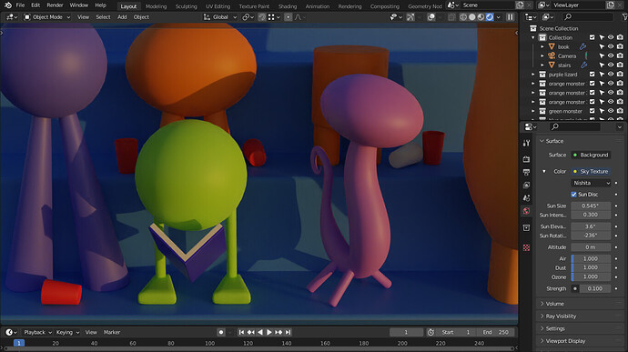
In that almost noon-like lighting it doesn’t make that much of a difference, but if you just change the time of day when the sun is at a different location, the comparison is much more pronouced:
Filmic High Conrast Look:
AgX Punchy Look:
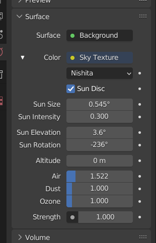
Nishita Sky setting:
Look at how both orange and green are shifting towards yellow in Filmic, and how they get to be orange and green themselves in AgX.
Yes I can see it, but at the same time there is the option to not use high contrast and get a less blown-out result while keeping some color in there.
Also idk about you but a sun elevation of just 3.6% should not look that bright ! that’s illegal… (I noticed you cranked the strength back to 1 instead of 0.1)
This is how it would look:
PS: I do get the idea of Agx (not shifting or clipping colors at high luminosity values) and i’m all for it, I just find that it lack extra punch, “it’s not punchy enough”, with filmic one can pick from 7 looks to adapt to most situations, with Agx, it’s either de-saturated or slightly de-saturated ^_^, even if you push the saturation values all the way to 1 (which implies updating all materials) you still don’t have enough of a “colorful” result, (my honest opinion).
For me:
Agx = filmic low contrast
punchy = filmic medium
we need “at least” one more:
super punchy = filmic high contrast
Nishita sky is supposed to use real-life sky intensity so 1 is accurate real sky strength, so 0.1 instead should be the “illegal” one haha.
Well I guess you can try to modify the look stanza in the config file. Punchy Look is just a CDL transform with 1.35 power curve and saturation 1.4, you can try to modify it if you want.
