Hello everyone, I’m trying to tweak the brightness of this business card render, and I’d like some advice on how to go about that. I am also wondering why there is such a massive discrepancy between the preview render in the viewport and the actual render in brightness? I think the render looks too bright no matter how far away i take the light source/ change the wattage.
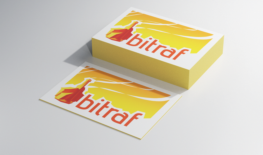
Version 2 with postprocsessing in krita (upped the contrast). This one looks dull to me so i tried to redo the lighting.
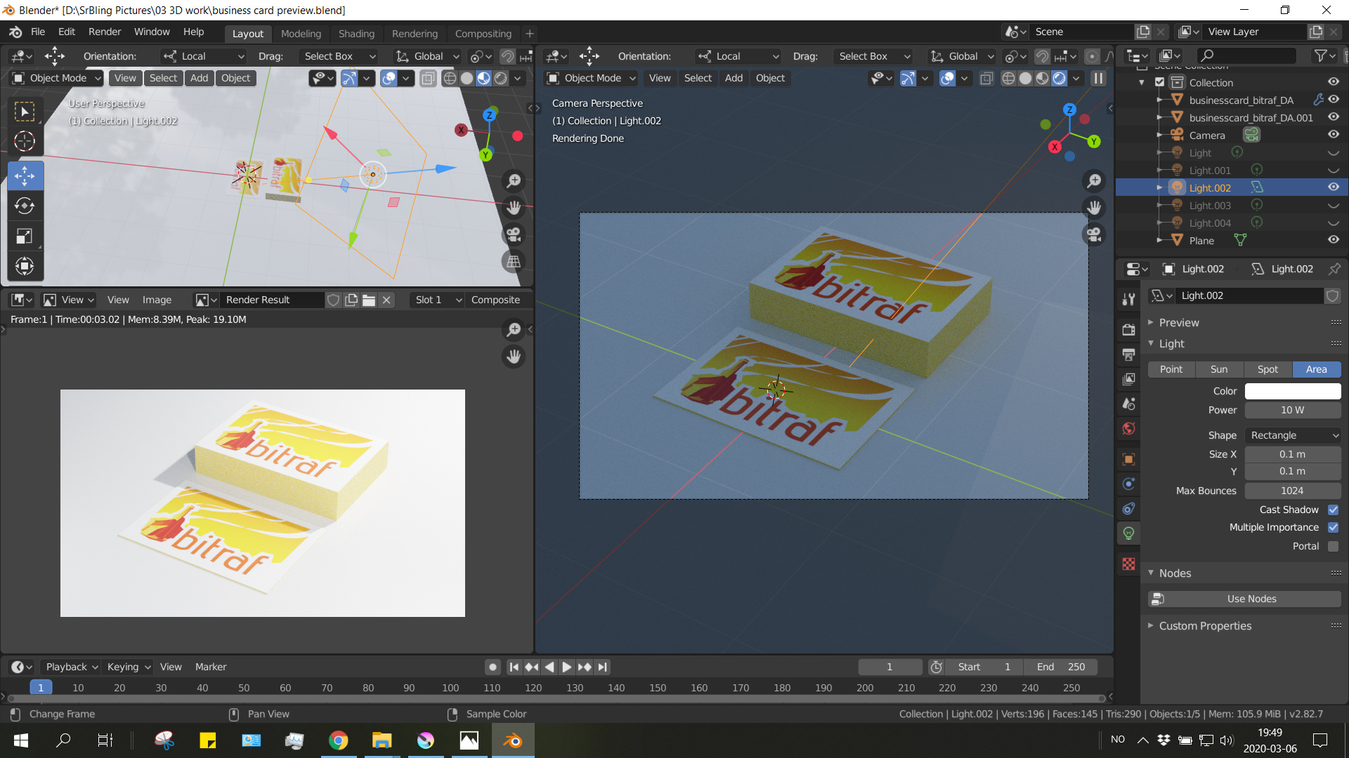
You have many lamps hidden in the viewport. They’re probably still visible in the render and that’s where all the extra light is coming from.
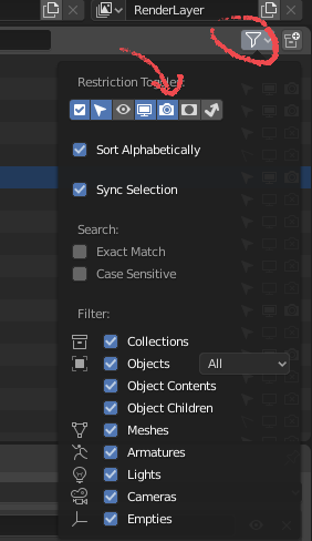
You can select which toggles display in the 2.8+ outliner by clicking on the filter icon. You’ll want to enable the render one, then disable rendering for all unwanted lamps in the outliner so they match the viewport visibility.
Hmmm… I don’t know what you’re aiming at here, realism? A pro product photo shoot look? In any case I don’t think it’s about brightness exactly, but the light setup itself. The sharp shadow happening due the small lamp size and the light falloff aren’t really flattering and easily give away its 3d render nature.
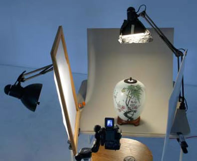
Reading about how photographers set their lighting can really help with both issues. One thing they often do is use a screen or equivalent in front of lights to get gentler shadows. They also either setup either a secondary light or a surface to bounce the light and fill in the shadows.
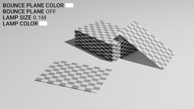
I’m using a single 4m point light + a plane to bounce some of it back. I also changed the light color to a very subtle golden hue, and used a bit of green tint on the plane (they’re tertiary colors) because a fully white light in a gray world looks sterile and unnatural.
Alternatively, you can use a HDRI to get a nice reflections and shadows and a touch of natural lighting colors. About the contrast, you can tweak it straight in Blender if you wish: Render Properties > Color Management. The Filmic option has looks ranging from Very Low Contrast to Very High and you can also further adjust them using curves, Gamma and Exposure.
Thanks for the feedback. I was trying out with 3 lamps in the start but because I kept having brightness issues (due to them being hidden) I thought I would simplify it to make it easier for me to understand. I didn’t know that the lamp size corresponded to how diffuse the shadow will look, I will try that, and add a screen to bounce light. Its cool to see that “real life” light set ups also work in cycles, makes sense now that you point it out
Your explanatory gif is amazing by the way, but I had to run it through a program to look at each frame by itself because it’s too fast for me lol I learned a lot.
You’re welcome! Blender has come a long way since they first introduced cycles, you can use all manner of real-life techniques and they look incredible. It’s more about finding a way to implement them with a good performance, I think. Eg, I used a ridiculously large point lamp instead of shining it through a translucent white screen. Being completely true to the technique would be both noiser and slower and faking a gigantic light is the spirit of it anyway.
Oh, and sorry about the gif speed, I had a “comparison by contrast” in mind when doing it.