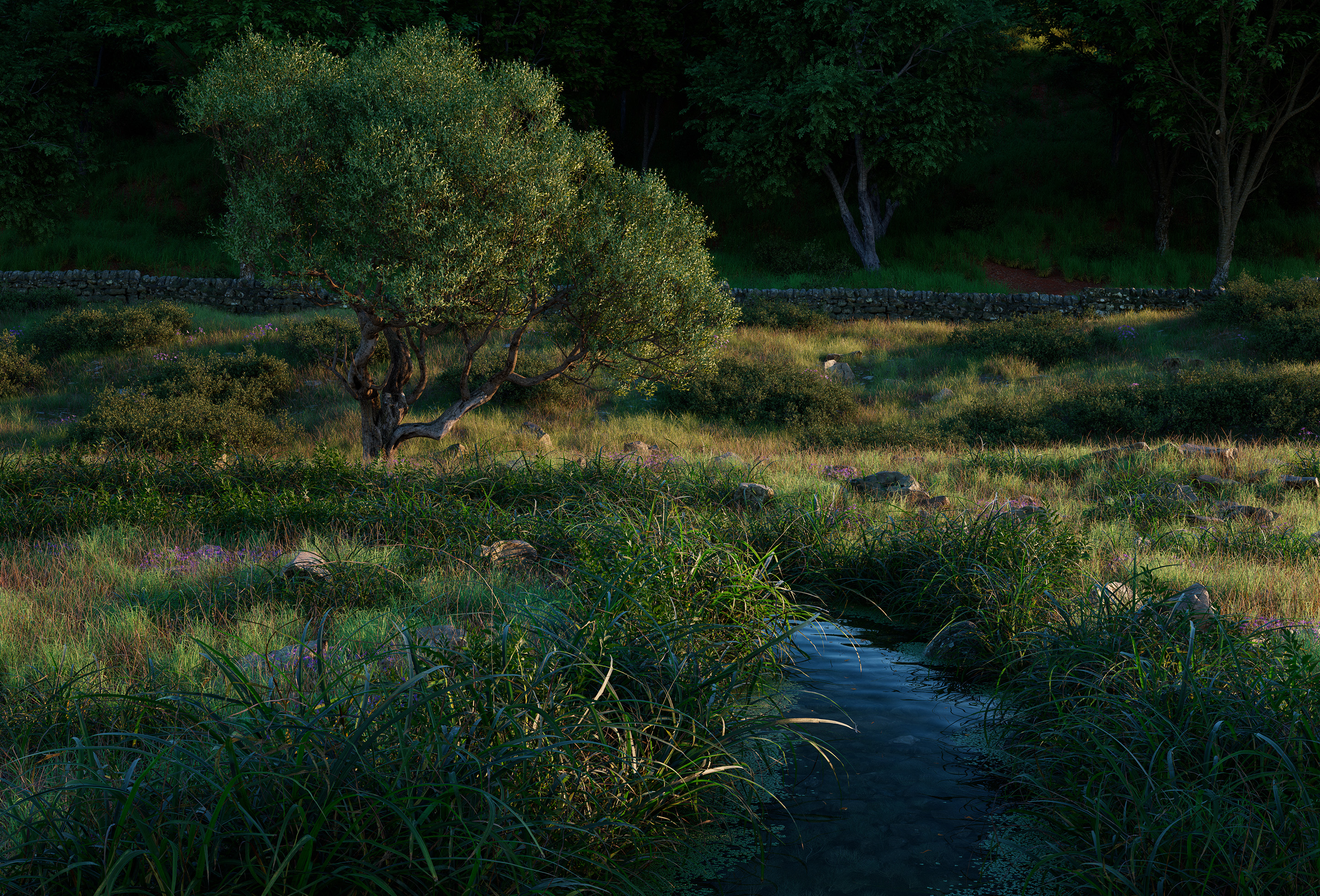
I based this project based on a painting by Ian Roberts (I got this off the cover of his book on composition) and would like your critique and thoughts about this. Is there anything I can do to improve the the vegetation on this? I’m new to landscapes of this scope and I would love some direction on this!
The vegetation are from graswald, quixel megascans and Forestation. I rendered this using Octane (my first time using this render engine and I’m still figuring it out). This is a raw render and I haven’t done any post on it.
It’s a beautiful render.
The dark background looks strange to me. I don’t see enough vegetation so I feel it’s a dense forest, and the lighting is clearly during the day.
You may want to use depth of field to help the readability of the image and introduce some subtle layering.
On the subject of composition, there might be a little bit of negative space lacking, which I think you could easily do using a sky.
The dark background looks strange to me. I don’t see enough vegetation so I feel it’s a dense forest, and the lighting is clearly during the day.
I think this is the color profile on the render engine. I notice that it gets really dark at a short notice. I’m trying to use the ACES color profile and I’m not very sure if I’m doing it right. I mean to ask about this in the octane forums.
On the subject of composition, there might be a little bit of negative space lacking, which I think you could easily do using a sky.
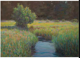
I agree with you. I would not have chosen this for myself. I just wanted to learn scatter V and octane through this project and I just copied the composition from this book. I’m including below the painting I’m basing this on:
I clearly have to do a few more changes to make it look like the painting
and introduce some subtle layering.
I’ll see if I can do this. I’ll try and change the colour of the grass in the midground and see if it increases the readability.
Same for me, the background feels out of place. There’s also something about the ‘sharpness’ of the image that bothers me a little - perhaps not everything needs to be in focus?
I see. I may have to check with the render settings. I still think it’s the color profile that’s doing this. If not, I’ll try to reduce the number of trees in there and let some sunlight in.