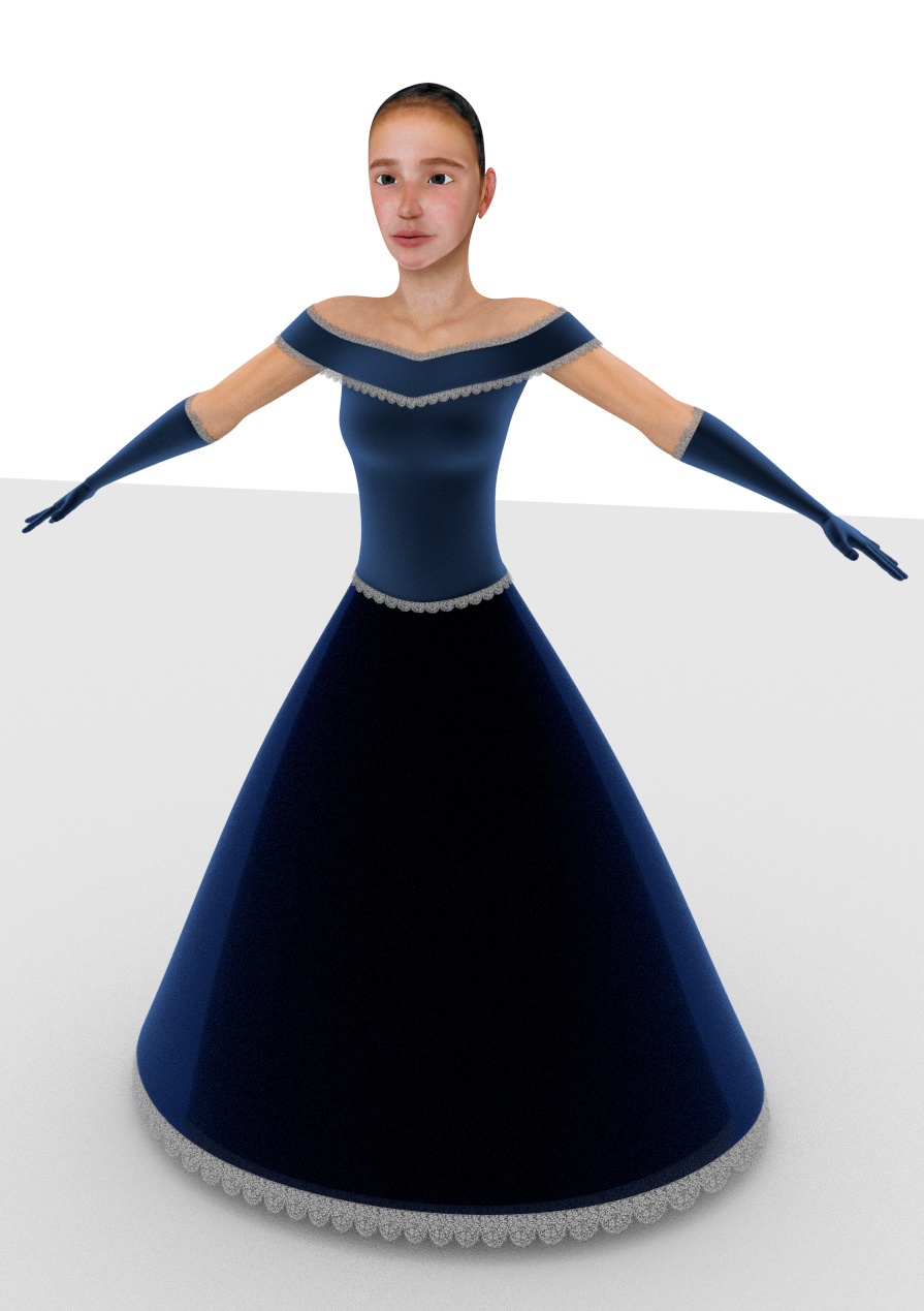
I recently finished my first complete character and want to know what I did wrong. Ultimately I would like to use this character in a short animation. I am aiming toward a semi-realistic style, similar to dream works.
This character is supposed to be Vin from the book Mistborn. I didn’t use a specific reference but I would like to approximatly match this painting.
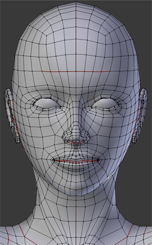
I would like critique on everything although I would prefer to keep the current topology. Pushing verts around isn’t a problem.
Without subdivision she has 10800 verts, 10964 faces.
Render is with Cycles, 100 samples.
If you want to see different angles and LODS I am happy to provide them.
in my opinion, her head is too large in proportion to her body, making her appear child-like. also, you should use the cloth simulator to make the skirt drape naturally over her form.
(edit) also she seems like she could use a little more fatness in her lower belly.
Thank you! I totally forgot to check the size of the head! I’ve made the head a smaller and added cloth to the dress. It is supposed to resemble a simplified Victorian era dress but I think I need to work on the way the skirt falls a bit more. Also added hair, eyebrows, and eyelashes. The eyebrows aren’t right and the hair needs some more work. Suggestions on adjustments for this would be greatly appreciated.
I have made adjustments to the eyebrows and hair. My main focus now is on the shape of the face. Something is off with it, specifically around the mouth/jaw area.
I agree with simonKinane. Your chin is too sharp, the face is too long, and the tip of the nose needs to be sharper. It’s difficult to tell exactly from your current renders, and if you could possibly match the same angle as your reference, that would make it much easier to spot the differences.
Also, I think the shape of the eyes could use a little tweaking. On your model, the eyes are too rounded, where your reference has more diamond shaped, and are narrower. Well, that’s my 2 scents anyway…


