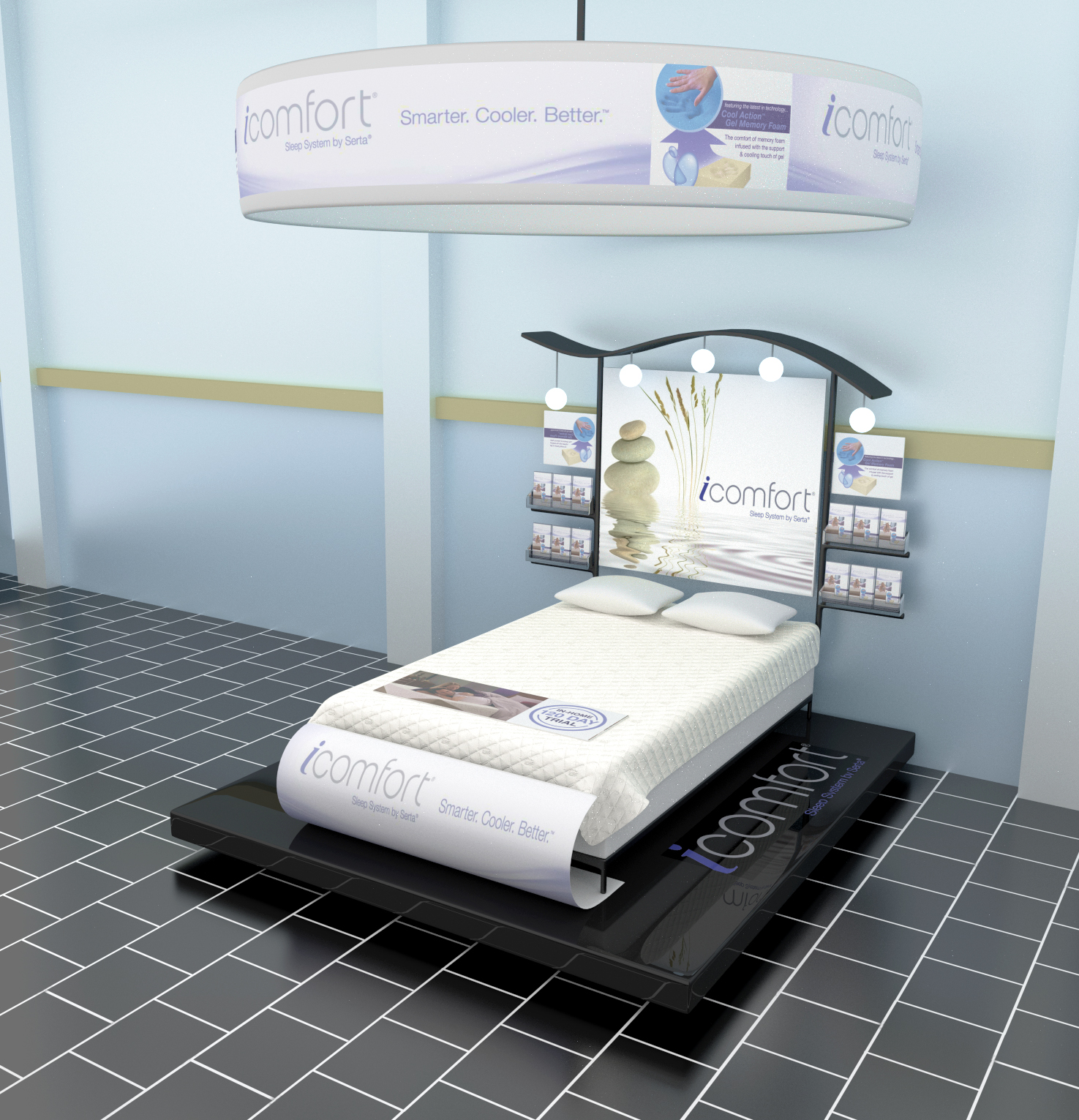
Hi folks. I was challenged by a prospective client to design a POP display for a mattress company, and based on my results I may or may not get gainful employment.
So I researched for a while and this is what I came up with.
Design wise I like it, it’s nice and simple. Render wise, the only thing I can see that could be wrong is that the posters don’t seem to be getting much of the light coming from those lights on the top, as I’d expect them to be a lot brighter than they are.
Nice, i think the environment light is to bright/uniform and cold may add a red/orange tone.
The tiles also to cold (bathroom :)), may try wood/parquet to get more contrast.
I liked the black tile, as I would not want to see a bedroom type floor underneath the bed. At least in not this scene. This screams sales floor picture, which is why I think the tile goes here, and not a typical bedroom floor. It looks like how a sales floor would look. I also think I should be seeing a tad bit reflective/diffuse mix on the sign where the lights are so close to it.