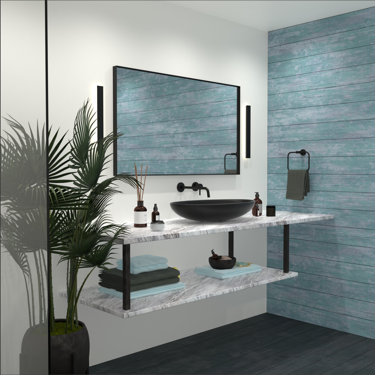
Can i have some tips on how you would improve this image. I am open to any type of feedback. Thank you.
3 Likes
Hmmm…I’m guessing you used Eevee for this, as opposed to Cycles? If so, you’ll need to play around with the shadow settings (check both the Render tab and the Properties tab for each of your individual lights.) I’m no expert with Eevee, but generally it’s the shadowing/shadow calculations that you really need to tweak on a scene-by-scene basis to get good-looking results. I think the main thing in this render is just that the lighting is very flat and borderline ambient; clearly there are shadows under the counter and the shelf, but they feel too soft to be convincing.
Also, keep in mind that World Lighting/Global Illumination works differently in Eevee than in Cycles. In Eevee, GI will just make everything brighter. Which is fine if you know what you’re doing, and having a little bit of GI always helps (I usually stay between 0.1 and 0.3 of the default.)
Another thing you could do is add some trim or baseboard along the floor, plus some cornices along the ceiling. Might also help to put a bevel modifier on the room to help smooth the perfect 90-degree angle of where the walls meet. Little details like that have a disproportionate impact on the final render, something I learned the hard way when I was just starting out. ![]()
![]()
![]()
Good luck, and happy Blending! Looking forward to see what you make next.
1 Like
Thanks for this feedback, I greatly appreciate it.
The image was actually rendered in cycles ![]()
However i have done a few changes now with the lighting mainly.
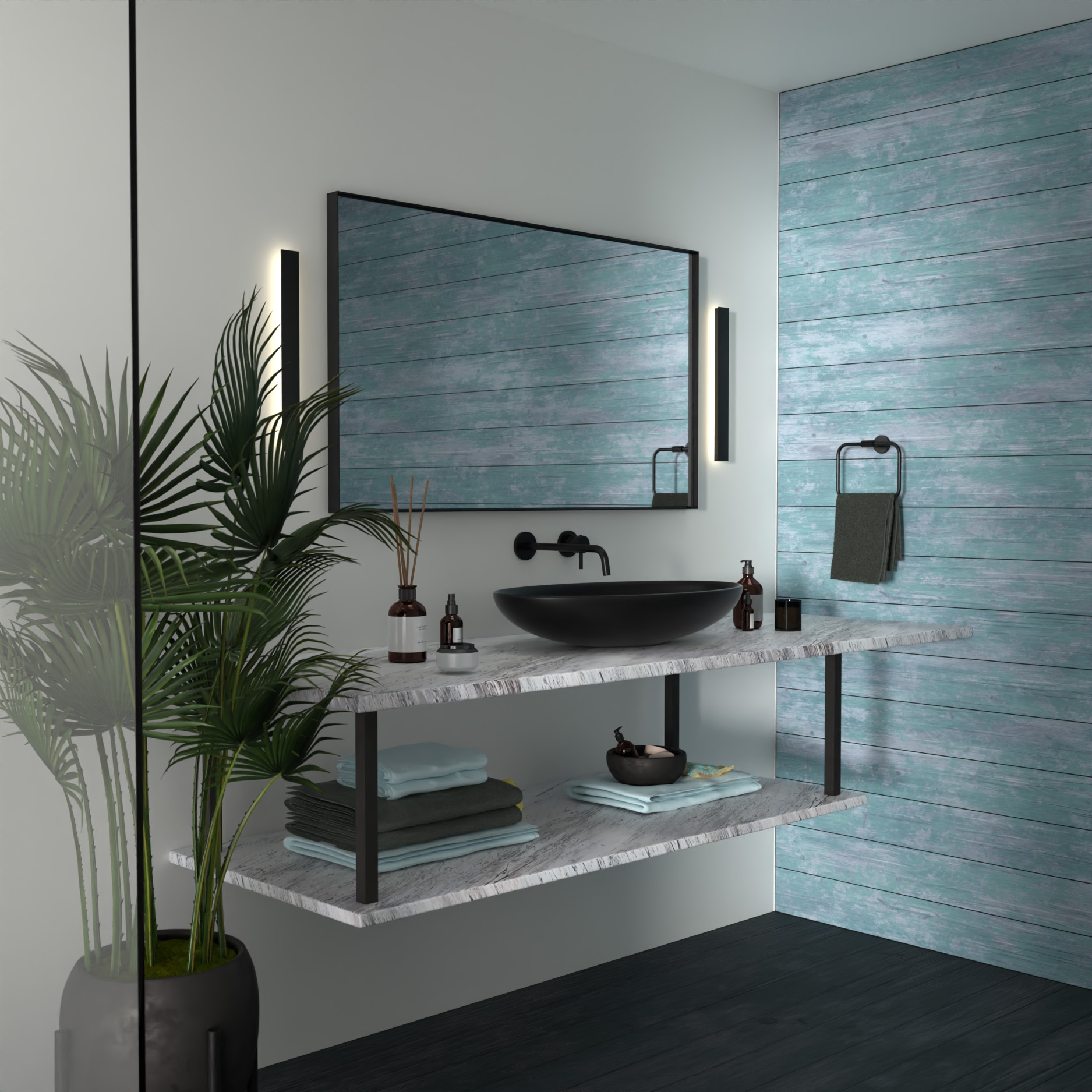
I deleted the wall on the left and put a sun light outside of the room. It seems to have improved it a lot.
I will try and add some edging to floor and ceiling and see how that looks, but is there any other things that can be improved for a more realistic look?
Thanks
3 Likes
![]()
![]()
![]()
The room definitely looks a lot better with the stronger directional light. However, I feel like maybe it could still benefit from the light source being more clearly defined as a window. I’m not sure if this makes sense, but right now it’s not immediately apparent that the light is coming from a “window” in your scene. So maybe try changing the location and rotation of the camera, and get the window to appear in the mirror. (Additionally, you could get a backplate image from ambientcg.com or from one of the HDRIs at Poly Haven, then import the backplate to make it seem like there’s a whole exterior to the room.) If nothing else, moving the camera will allow you to experiment a bit with composition. ![]()
On top of that, try adding decorations to the wall so the morror has mkre to reflect than a blank wall. As it stands, the room looks pretty empty. Also, maybe try to do something with the glass by the left of frame. I think it’s supposed to be part of a shower area, but again this is just a guess since all we really see is a sliver of glass. One thing you could do is add some water droplets or condensation, just to make it seem more “used”.
Hope this helps. ![]()
First off, good job! I think you are well on your way to a good render.
I have a couple things to add, some coarse and some finer details.
1.) I think this scene would benefit from some compositing, you can add lens distortion and maybe a hint of glow with the glare node, additionally on this point I would set the camera focal length and an appropriate f-stop for the render settings and add an empty where you want the camera to mainly focus on. I think this will help to separate objects into planes that makes the render look a little bit less flat
2.) the UV’s on the counter are distorted on the sides so maybe looking at references for similar counter could help and trying to undistort them.
3.) I’m not sure if there’s a bevel on the black support beams and the black lights near the mirror, but if there is I think it should be a bit larger.
4.) there is a hovering soap bottle to the left of the sink
5.) you might consider adding a cloth simulator to the towels, this can be tricky and both time and resource consuming, but it would help the layers of towel to not be hovering over each other or hover over the table. If you don’t want the headache then maybe some more sculpting on the towels would be good, they look too straight.
6.) a little bit of smudge and dust can go a long way, even if it’s not super obvious you added it, but adding just a little bit of imperfection on the mirror and maybe the sink and table in these cases can help make an image not so flat.
7.) Not sure if there is a texture on the white wall, but I think a more prominent texture would help make things a bit more real.
8.) It doesn’t look to me like there is displacement on the wood planks, so either increase the subdivisions or the scale of displacement?
I also struggle with lighting so I’m probably not the best person to give advice on that ![]()
I like the overall layout and design of the room. Hope this helps!
1 Like
Hi @em87 thanks for these great tips, I will impliment these into my next renders and see how it goes. I appreceate your time to give me feedback.
1 Like