Hi guys,
for the January contest (Movies from the 80’s), I’m working on a render based on Full Metal Jacket.
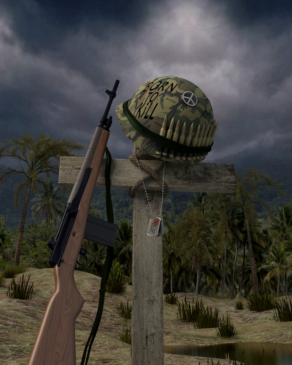
This is the first render of the entire scene.
Just much to do…
The writing on the helmet looks kind of like it was silk screened on. I would try making it look more like it was brushed on. Either by using a paint program that has bristle type brushes, or making it using an actual brush and paint, then scanning it in. Also, the ground texture looks kind of flat, and a bit fussy. I think you can get away with it from a distance, but toward the foreground you should break it up with maybe some particle grass and some rocks or something.
Hi Modron, thank you for your comment! :yes:
I’ll continue working…
One more suggestion: The cross is lining up with the structure in the background in a way that confuses the eye. If you moved and/or tilted either one slightly, it would give more depth to the scene.
This is a clean war. Wars are never clean! 
-Everything needs to be more dirty. use alpha dirt textures to add dust to your objects.
-Natural grounds are not flat. Add finer displacement and use normal mapping for your ground. Also, it’s war. Add greeble of multiple kinds. Add pebbles to the ground, add airplane stripes (from the exhausts) to the sky, add a smoke plume in the background perhaps? (easily achieved with alpha textures)
-The guy is dead, but his helmet is shining? Don’t think so :). Add dust, use a photo editor to roughen up the ‘born to kill’ text (and perhaps changge the font to something more bold and brutal, roughen up the helmets texture as well and perhaps add a dent or two (from bullet impacts). Some slightly corroded/rusty edges could work fine too.
- The puddles of water don’t seem like puddles of water. They should ALWAYS be completely horizontal (as that is how water behaves). Adjust mirror settings and place them so that the trees in the background are reflected into them.
-Your scene is very bright overall. Using contrast sliders (in the Texture => Colors panel) can help you with this. The compositor is VITAL as well. Add gloomy effects, and perhaps a vignette would be in place too.
- The gun has a shadow, cast on the cross. I see not a single other shadow, while your sky texture is so bright. Add shadows for all objects, including the cross. Like Modron said, it confuses the eye’s view of perspective. A shadow or a slight tilt would fix this. Also, the texture on the cross could be slightly more high-res, as it looke a bit like plastic print right now.
-Your trees seems to be palm trees, but don’t look like them. If they are, find a palm leaf texture (cgtextures.com has some, I believe) and map that to a v-shaped mesh (just add a plane, add 1 loop cut and move that edge down. Now you have the v-shaped mesh).
If you want these trees to stay roughly the same, do add some more leaves. war can damage trees, but not in this war.
-
Bullets: Too clean. add a metal texture (preferably an old, slightly rusty/bronze-ish one)
-
What is that building in the background. It’s very low polu and unrealistic. Is it a blown-up bunker? And what are the tiny red things on top of it? Add more resolution to the mesh, use higher contrast textures (a blown up bunker gets black areas from burning debree)
-To make your image more realistic, render it in a higher resolution. Do this easily by multiplying both your X and Y res values by 1.5 or 2.
- The scene seems WWI/WWII oriented, but the fences on the right side seem like futuristic ones (grey with a green eye at the top) Edit the texture and perhaps change it to wood or so.
Good luck, and happy blending :)!
Thank you Acromartsu! I like lists!! 
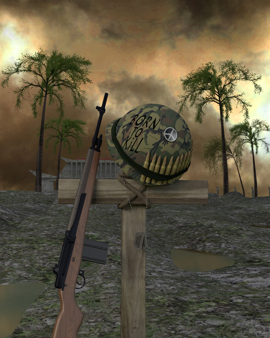
I tried to improve the render, primarily the materials…
i will added defocus to background