I’ve finally got a thread all the way here! yay!
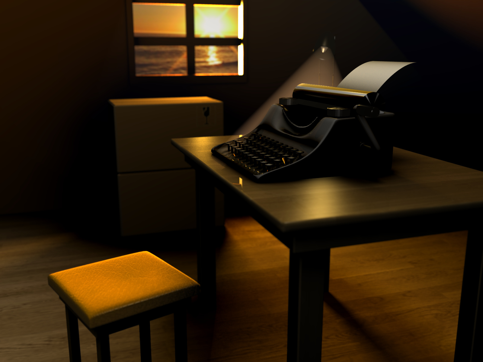
Here is a composition I’ve been working on since the start of summer, and it has come a long way. Enjoy! and feel free to crit, and artist’s work is never done 
I’ve finally got a thread all the way here! yay!
Here is a composition I’ve been working on since the start of summer, and it has come a long way. Enjoy! and feel free to crit, and artist’s work is never done
its wonderful, no crits that I can think of, to me the story is “just moved in, trying to find a quiet place to write, nothing so far.”
I really like the textures and feel of this image.

WOOOOOOOOW that is wonderful! The leather seems a bit stretched thought
Carbonflux: Thats not quite it, but you’re not far from the actual story!
mynameisoscarjo: I dont see where the leather looks stretched, it looks all even to me…
I’m very pleased with how this turned out, the ONLY thing that bugs me is the specular reflection beside the typewriter… I think there should be a shadow there. Anyways, yes, this has come a long way!
One of the most obvious things I can think of to crit is the background image. The horizon out there is way higher than the interior scene implies.
Still, nice work.
Good point, I usually don’t really crit on BG images, but the horizon is a bit high…
Wow I’d almost “forgotten” this render…crickets ok so lame joke
Anyway I like the image, the only thing that sort out of place to me is the curve on the front of the typewriter looks a bit funky, but other than that I love the image.
hmm… It appears BA scaled down the image 
big version:

nicktechyguy: I dont really understand what you mean. Do you mean the physical front, or the front from the render’s point of view?
Nice work. I really like the lighting. One thing that stands out for me is the material on the typewriter. For an old style one, the material looks like a very clean plastic whereas I would expect a more metaillic finish to it.
Its that little bend on the case just above the keys that just seems out of place. It’s just me though I think. I look at other typewriter’s on google and some have that, but are less curvey. It’s just my opinion though. You can ignore it 
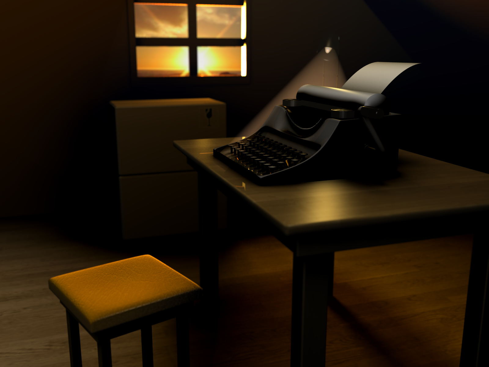
Nice, Tic… the second image looks a little better, since you lowered the horizon, it’s not so “glarey” or blurry (my eyes… gah…)
The overall mood of the scene is very… contemplative, if that makes sense (call me crazy, but I’m terrible at C&C on technical stuffs… I tend to look at the completed effect of the scene. :D)
I think the lightblub in the lamp should be brighter. Other than that, good job!
an update for everybody, beveled the edge of the rolling thing, darkened the stool. I think thats about it…
I like the concept of this one, very much indeed, but there’s more work to do…
Alright, fixed it a bit, rendering.
re: #2: I’m not really sure what kind of lever it has, then  can you explain it a bit more?
FINALLY got my laptop to spit out a render. tried to do something for the lightbulb, make it glow. Failed on that.
I’ve attached a simple scene that has some glare in it… hopefully it helps with that part. I really do love the mood of this piece though!
glare.blend (162 KB)