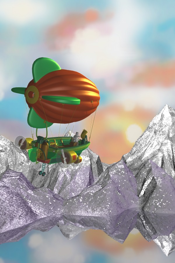
This started in WIP, where some people said the background needed work. After I fixed the background (hopefully) no one commented. So, here is the update, from the end of Girl Genius volume III.
It’s a cartoon, obviously, not meant to be photorealistic. I’m using the reference for inspiration, but I’m not concerned with making an exact duplicate. I’d like some feedback on the compostition, color, lighting, and so on. Agatha has just escaped captivity after a battle with aliens, saw her parents killed during her escape, dodged a murder attempt by tossing the miscreant overboard, and learned that, because of who she is, she will cause trouble where ever she goes. It’s a very dramatic moment as she flies off into the sunset. I’d like this image to capture that feeling.
Updated with very subtle waves on the still surface of the mountain lake. Also fixed the propeller. The dual disk with hard prop was an experiment which didn’t work too well. Motion blur usually isn’t a good choice for propellors, since they move fast enough to form that transparent disk like effect, unless photographed with very high speed cameras.
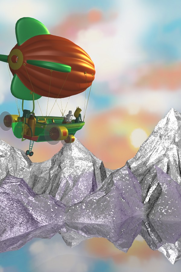
I’m not too hot on how to make an image better - but I must admit this is a good piece. I like the synergy of colours that make the fantasy even more fantastic. I’m not quite sure what distracting purple on the rocks is, but the valley at the shore line is begging for something mysterious, like a well worn path.
Maybe you are right about the propellers, i did the motion blur way because the props on my picture were much closer to the screen so i thought that it would look better, but i think that your way is better for a picture like this.
Anyway, have a look at my Battle of Britain scene in the work in progress section and see what you think of the motion blur on the propeller, i think either way is good, and maybe the disk method you have used is more appropriate for a cartoony style scene like yours. keep up the good work!
I toned down the distracting purple, which is there to give the rocks some color, since they looked really bad without any. I also added some trees at the foot of the mountain over on the left, to try to give a sense of scale: these are mountains, and not close.
Your composition looks good, and I like your concept. The blimp (ahem airship) looks nice, and the mountains are interesting, they look kind of like crystal to me.
However, it’s very hard to tell your lake is a lake. Right now it looks like your background is showing through. Every lake has some kind of ripples/waves, and most look a deep sort of blue. Compositionally wise, if you have a dark area in your picture, it will help add contrast and focus the eye more on the lighter areas, so don’t be afraid to make things dark or have strong lighting.
Also, be careful with the trees. Right now, it looks weird because there’s only a few in one corner. Either do a lot more of them and cover the lower ground, or leave them off entirely. Personally, I would scrap the trees and instead add some kind of shoreline to ease the transition between mountains and water.
Overall, it’s looking good, keep up the good stuff.
I think this needs more depth, the mountains seem like they are on the same plane as the blimp. Maybe kill their color intensity or detail a bit? Plus I agree that the reflection is too perfect, it needs to be broken up a bit.
I like the light and colors in the scene, very energetic and dramatic. The composition conveys a strong feeling of escape + anticipation.
Having the mountains in sharpest focus, in combination with their stark contrasts and hard edges, draws the eye away from the focal point of the composition (airship). The focus effect also makes the scene look like a miniature.
Also consider the motivation of the lighting. The mountains are very bright given that the sun is behind them. The mountains’ shading should match better the shadows on the airship to unify the composition.
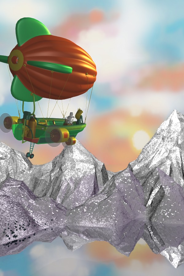
I thought the preceding attempt was a bit too dark in the foreground, so I added some light there, and put it just a touch more in focus. Nodes are great. The mountains and lake are in a separate scene, so all I have to do to tweak this is render the mountains and lake using the single setting on the Render Layers panel, then return to the main scene and the Render Layer Node set to the Sky and Lake Scene is updated.
It’s a nice picture. Assuming you haven’t already finished with this, there’s some things about it I would rethink if I were you.
The layout does not give the same impression of height and space as the original. If you look, although the panel you’re looking at was portrait, you’re only looking at the top half. Make the image landscape, with the ship one third of the way across the screen (like in the reference.) You might also want to shrink it slightly for scale and move it down a third so there’s a healthy amount of sky above it.
The materials on the ship are bland and really amateur-CGI, especially compared to the mountains - which in my opinion look really good. Maybe you could use toon materials instead.
Although the picture you’re looking at had a perfectly flat reflective waterline, I think this version could really do with more realistic waves around the shoreline.
Lighting: make the sun brighter! Even if it’s behind a cloud, it should still be the brightest white in the picture. Look at the light on the mountains compared to the sun that’s supposedly causing it. (But don’t change the light on the mountains - that looks awesome as it is.)
Also, I think you need a faint light illuminated the foreground (ie, the ship). If the sun’s setting, this light would be slightly blue.
If you’re finished with this pic and have moved on to bigger things, please excuse this late post. If not, I hope it helps.