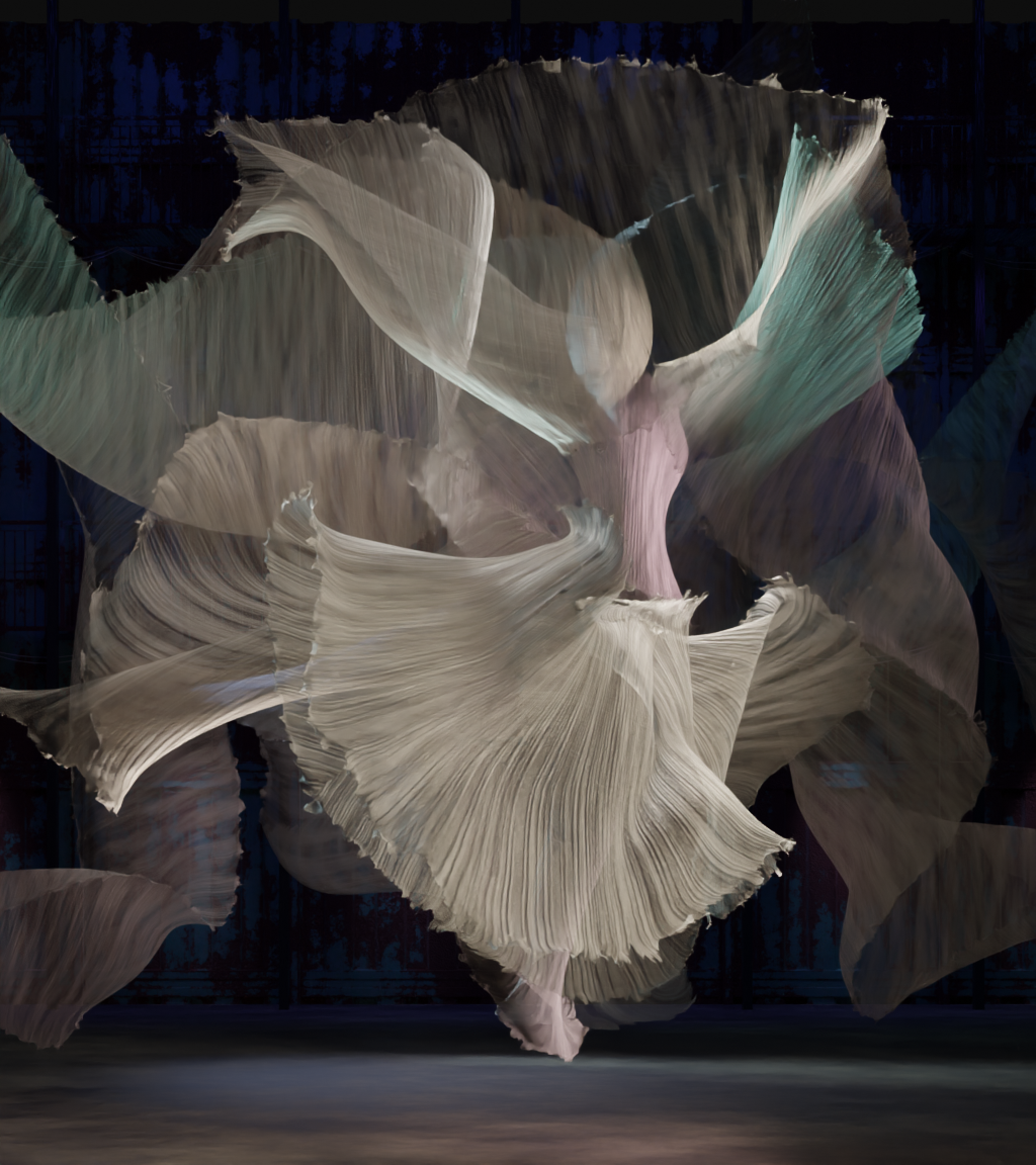
I’m nearly done with the modelling and the (high)lighting in this project. Texturing is very far as well, but I am not sure, whether my purely procedural fabric material is sufficient or not. And compositing etc is not yet started.
So I’m looking for feedback about getting it finished up:
General impression
Is where something else to add?
what can I do regarding compositing to give it a professional touch and to round it up?
This is really a beautiful work ! Well done !
On the overall I think you can use a painting app to better control shape separation.
For now everything is mixing a bit too much which I understand is the point but small tweaks can help.
The fabric material works really well, it might lack a bit of grain, but probably overlaying a very subtle grunge texture in comp can help to add a bit of “grip”.
I’m wondering about the set, it works but it doesn’t bring a lot actually.
The fabric in itself can be enough, or it could be cool to add more contrast.
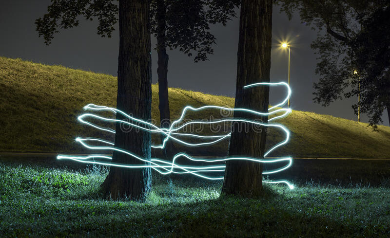
That reminds me a bit of light painting :
The contrast between the light trails and the set is quite interesting, and maybe a lead to follow here as well, or maybe completely get rid of it !
Maybe keeping only fabric and add some foreground element is worth testing.
You’ve got a really good base, if you have a bit of extra time and energy try a few things especially since you can always fallback to what you already have which is very good !
Thank you, sozap, for the feedback and the kind words! I really appreciate it.
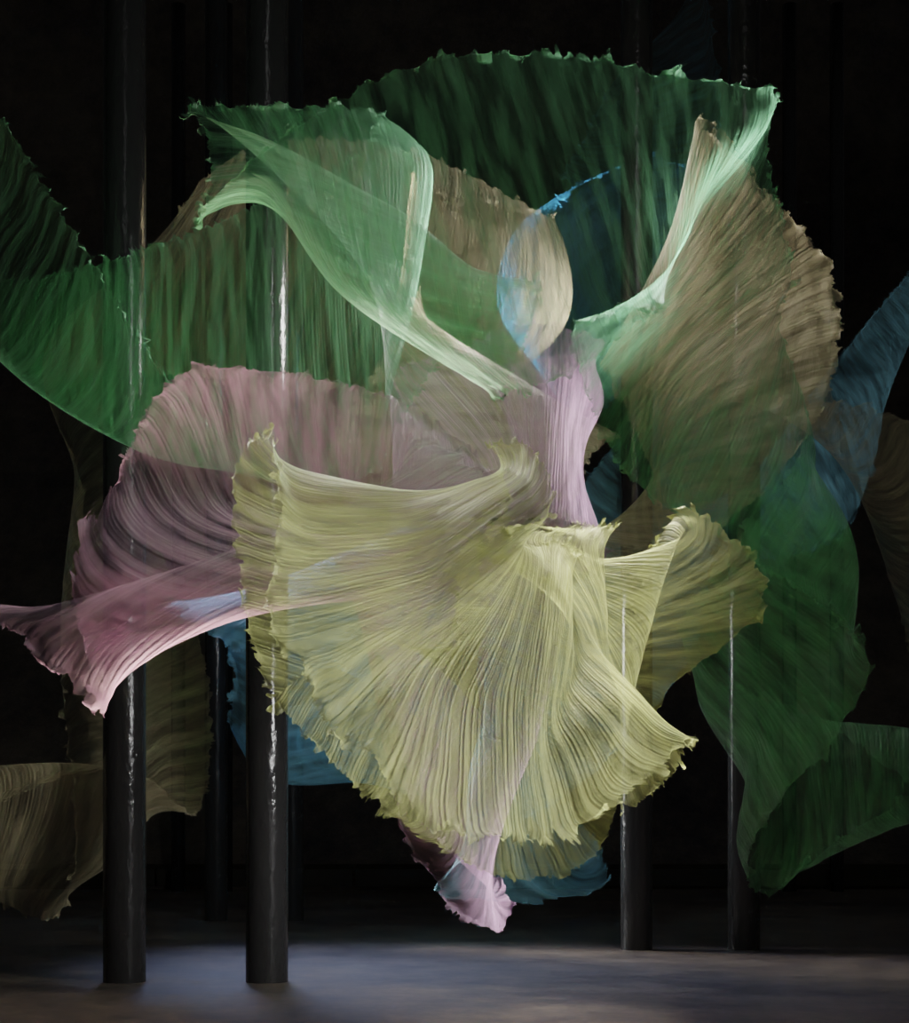
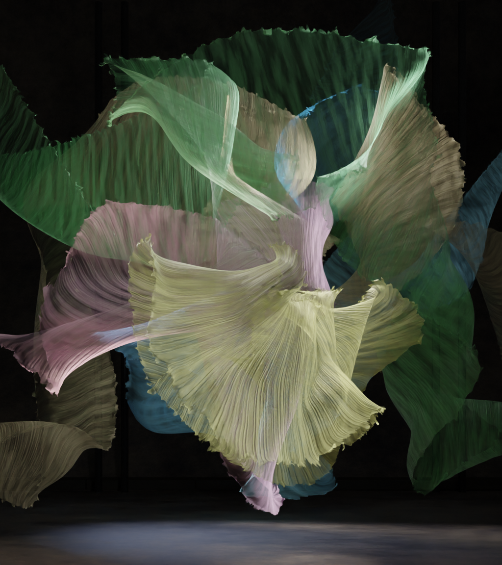
I see, what you mean with “mixed a bit too much” and changed some lights and brightnesses to enhace esp the left side. (main post updated). Also the, now even more, fringed edges help with the separations.
Anyway I’m not finished with the process, and Gimp will certainly comes in use later to darken some of the outer structures. Let’s see how brave I am to touch some of the inner ones as well
I never thought about adding other midde- or foreground elements to this stage like set. But I will give it a go: It certainly can add some depth to the scene. Not sure I want to change the set completely, though, to justify them.
Cool !
Yeah subtle changes but it’s better !
It’s probably worth putting in into gimp and do some tests there. I think the image can benefit a lot from different tests there , I can try some if you like !
I don’t think there is a lot to add in the 3D , you already have a very strong foundation !
Giving it a second look, it might be worth testing a few things with colors, maybe it’s possible to remove some of them to get a simpler palette !
As said , nothing stands being really wrong, everything is already great but testing stuff might bring new ideas !
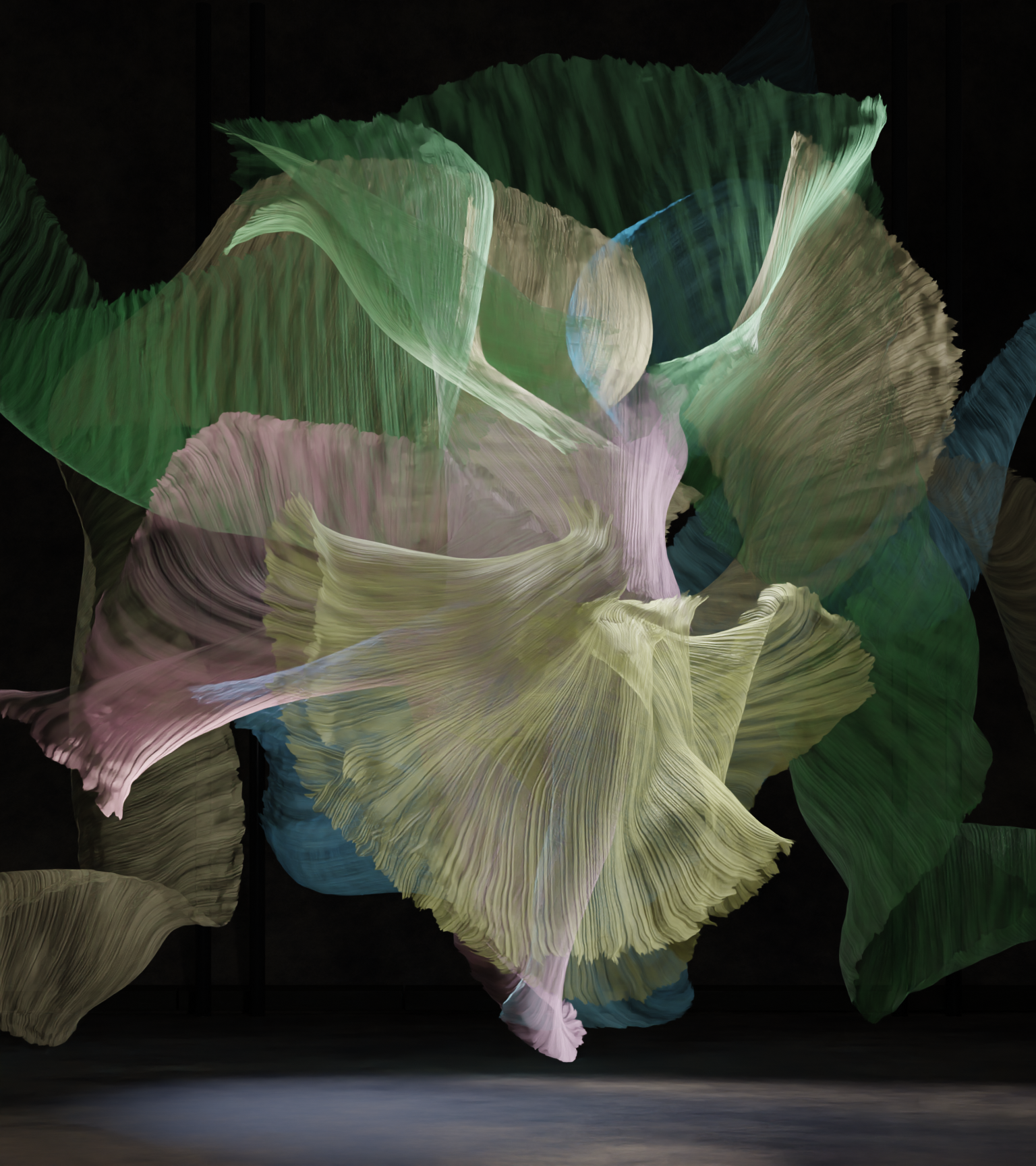
There is not much more to gain from changing lighting settings, as the different lights and bands are interacting with each other. So yeah, some painting is the next option.
I added some elements to see how it works. Hm, It certainly adds separation and depth. Will have to sleep over it.
About the colors, dimming some down is certainly worth a shot. As there are exactly 5 bands, I feel like I need 5 different colors.
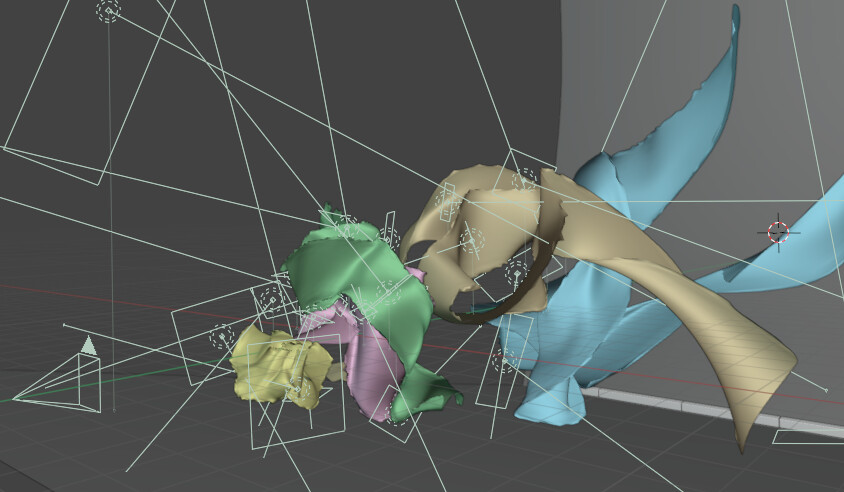
Wow ! That behind the scene image ! You really went over the top with lighting !
That’s super interesting and well done because it’s quite easy to make things looks unnatural that way !
Yes it’s interesting, maybe something like that in the background can be less distracting :
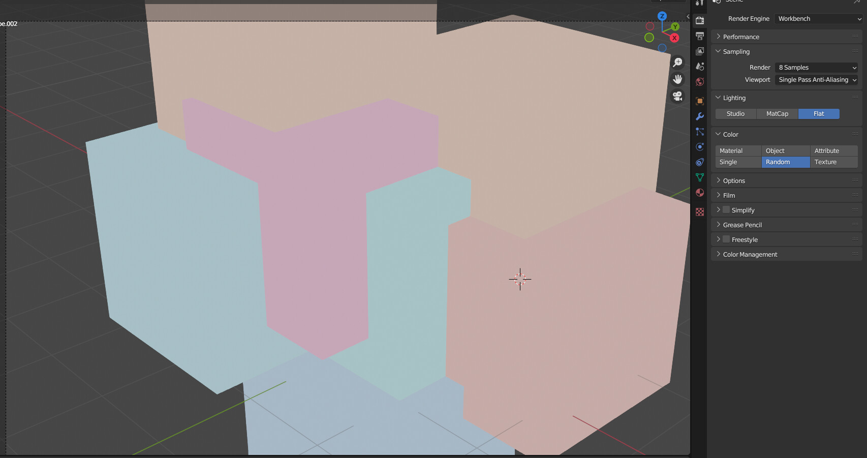
By setting the render engine to workbench you can export an image were each object got a color and therefore allows for easy selection with the magic wand. It’s not perfect but for quick and dirty work to get an idea it’s great !
You can try to have a global palette with one main color but slight variations , like yellow , red , orange. and then create contrast with a complementary if needed.
Right now each color is on the same level, they all have the same value and saturation, so maybe making them even more similar can work better .
awesome ! it’s getting better and better !
It might be worth to try to “cut” the silouette of the character to the point where this is getting too much. I got the feeling that it’s possible to separate it a bit more ( in painting app) . I’d try to find the extreme and balance it down !