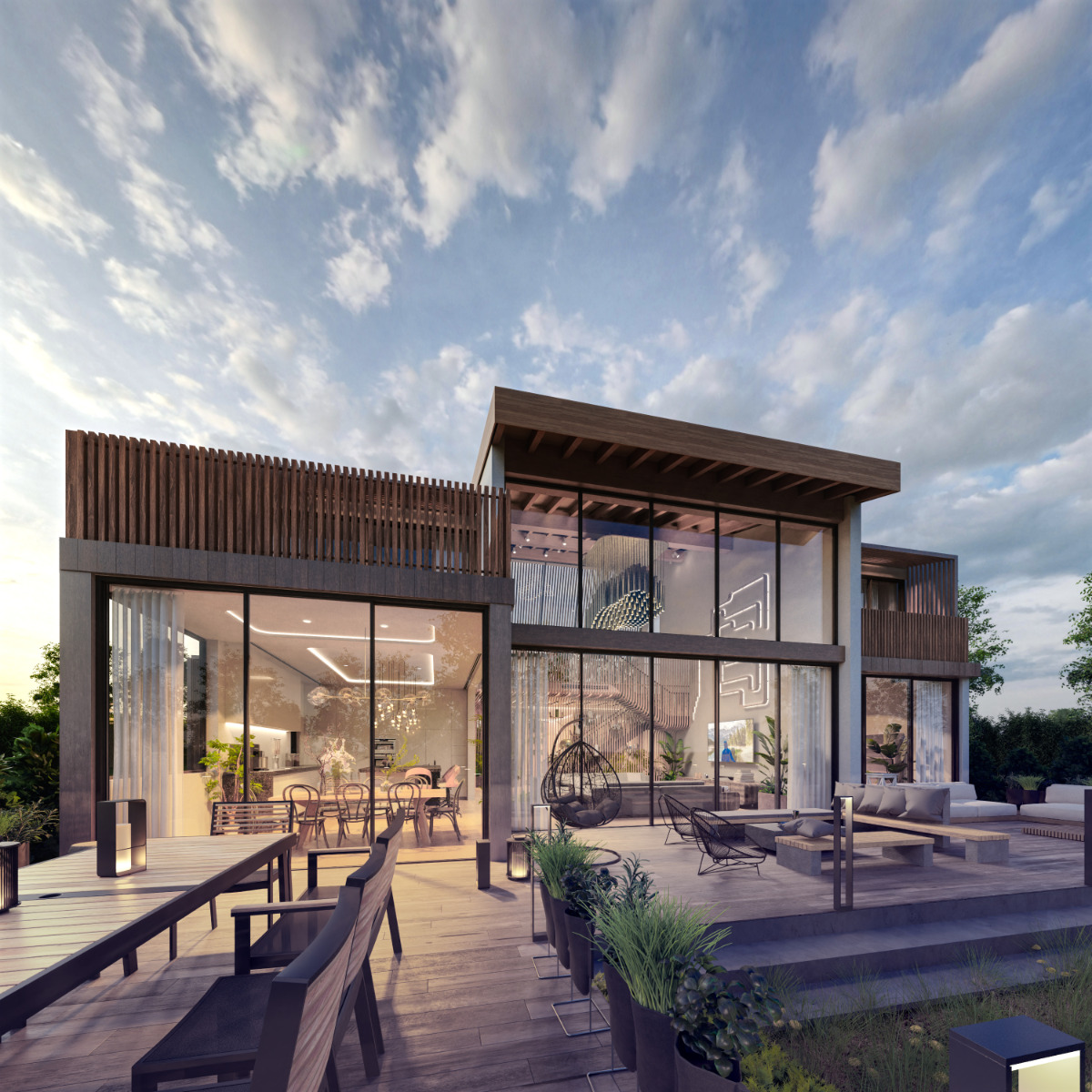
Here is one my latest projects - Golden Ratio House, where all spaces are proportional to each other.
I have been chipping away at this project for longer than I would like to admit, and I am super happy that I finally found the time to finish it, where I am responsible for both the design and visualisation. I am an architect and I find visualising my own projects as ever more important. Full project profile can be found at https://uhstudio.com/projects/golden-ratio-house
Rendered in Cycles, post-processed in Affinity Photo.
Big fan here (also architect, also love doing visualisations)
Really like those renderings, looks like an awesome place! Very interesting read on your website too.
I have a few (very nitpicky, probably too harsh) comments:
1st image: Love the sunset vibe! It could be even stronger though, I think with some more contrast in terms of light intensity. In my opinion, the outside should be a bit darker. It is too brightly lit in my opinion and has a purple tone to it which could be more blueish (to convey the sunset mood).
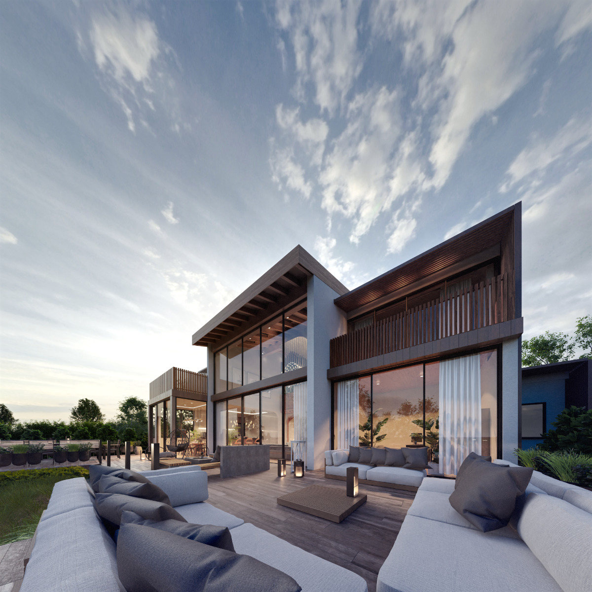
2nd image: I also think the outside is too bright but the purple tone is gone, it looks very nice!
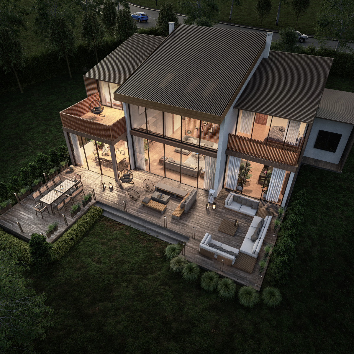
3rd image: This is much more brownish in terms of tone and doesn’t fit well together with the vibe of the other 2 images. I miss that nice blue sunset tone in the colours from the first 2 images. I know it is a different view with no sky though
I am also not sure about the composition here - you just about cut a bit away of the subject on the right and left hand side. I think I would prefer to either have it fully in frame or close in a little more to focus on something more specific rather than the full structure.
I know this sounds harsher than I intend it to be - I really like the project, especially the first 2 images! Just thought that my feedback might be helpful.
Oh, and btw: I love those interior renders on your website too, they are really nicely done!
Thanks for the commments - Yes. I do find it difficult to match the mood consistently as I am looking for how to crate the best image possible for the current view I am working on. Also, I am not payingt to much attention to complimentary colours in the images, yet
Appreciate your kind comments. What is it that you think makes them good?