Done. Made mostly in corel painter 4. Any critiques on shading? I’m not to good with shading.
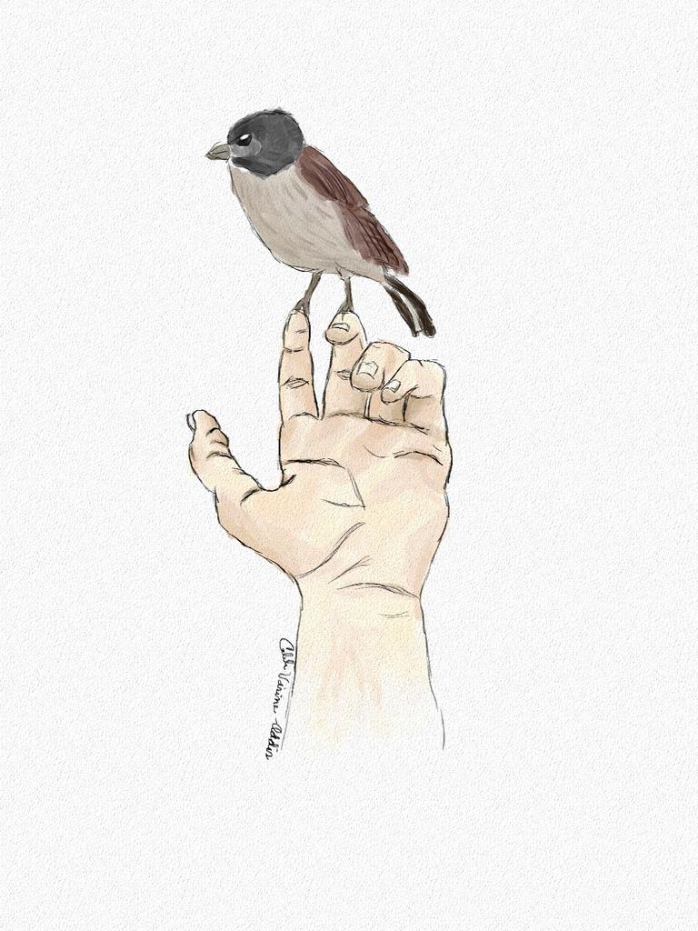
That’s really nice. Well drawn. For the shading you’ve got a nice watercolour style for the hand going on, it would be nice to see that translate to the bird a little more.
as in? I’m not sure I get what you’re saying.
Thank you though, it’s nice to get good feedback from a fine artist as yourself.
Hey
As alway i try to give an as detailed critique as possible for me. If it sound to harsh I am sorry for it. And ofcourse it is my personal opinion.
At first I would say if you want a more realistic shading. Juse your own hand as a reference. There you would see all the different lightnesses and colours. especialy on skin it is not smart to paint with the “I think this is skin” colour.
My second point would be that the thumb bend inwards on the joint. Is that realy that way?
Than my two last critiques would be the bird that is not realy on the fingers and so it looks like it has no weight. To complete The Composition is very central. So you could probably easy add some space to one site. That would ad additional interest to the Image.
I hope my critique helps you so you could become an even better Artist.
Have a nice day
hey,
Thanks for sharing your critique with us. Really its very useful for us. And it helps us to make more designs using these critique