Hi guys,
I’ve just started to work with archviz, and I am trying to get hired as a freelanzer to my first customer. However I still don’t have the results my potential customer is looking for.
Could someone please give some advice what I have to do to improve this render:
I have not been able to create the “magic” mood in my renders. I guess it has to do something with the light, but I don’t know what.
Could somewone please give some advice?
Yes I do agree with @Miss_BB, be careful with your lighting. A white wall in real life, outdoor, will be more yellow. That’s depend of the sun and the color of the sky.
You should change the color of your grass. Also, come closer to your building, to obtain a huge front edge.
One more thing : the power of the picture that you use as reference is the color of the wall. Try to find some references with white walls, that will give you some tips to enhance your work.
A render like that need a huge amount of post-prod, so don’t hesitate to render and save different layers like AO, glossy direct, and so on; and play with them on Photoshop or Gimp
Thanks, @Miss_BB and @Gaut.C.
I have been using Fimic Color, but I will try to do some more experimentation with the light and change the camera angle.
@Gaut.C, I agree that the power in the reference image is the color of the wall. It’s like the wall is glowing or something. Do you know how to make this effect? Is that something that should be done using blender, or is this something I should do in phothoshop?
Don’t pay intention to this sort of effect for the moment. If you want add some glow, do it at the end when the render is already perfect for you. Moreover, the effect that you think is glow, actually isn’t it. I think the specular map is really good for the wood, and the lighting help it to have a great look.
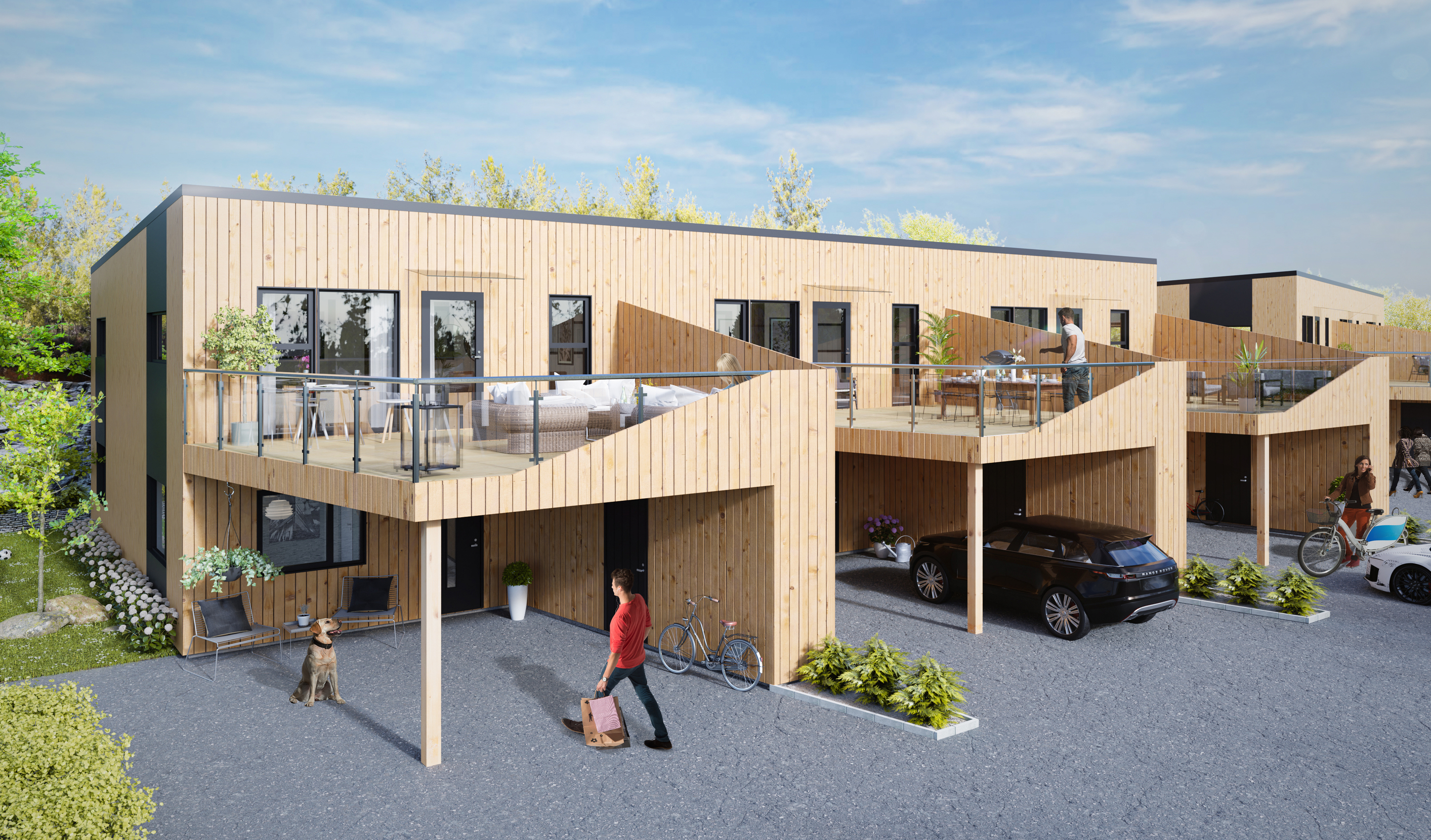
Thanks a lot for good advices @Gaut.C and @Miss_BB. I’ve played around with the camera angle a bit more to come a little closer to the house, and played a bit with the strength of the light and added some warmer color to it (using advanced settings in PRO-lighting: Skies). This is the best render I’ve done until now.
I’ve also tried to do some post-processing, but I have no idea what I am doing there. So this is the best so far after trying to change some values in camera raw…
Now, mind that was very rough change, you could do much more with masks and layers in photo-editing software. Also, mid-tones should be fixed
Other advice will be more general - first plan, what would you like to catch viewer’s attention, and try to differentiate this by putting more light or color to this. Hope, that helps
It is looking really cool, so much improvement from where it started. The thing that seems the most off to me right now is the driveway, in addition to the bumb map you may want to subdivide it and add a displace modifier. Also adding in expansion joints can help to increase the realism
The advancement of your work on that particular picture is impressive.
I would like to add some things to improve your work.
All of the images references are showing the building from the garden, and maybe that’s one of your problem, the front is empty, just gravel of a parking lot. So I don’t know if you need to change all the foreground, or trying to modify it to give those houses a proper entrance.
The scene is missing some imperfections. Just a bit of disorder in that perfect world
Same way, it is possible to add objects on the terrace of the houses ? You made some glass bodyguard so you can see through and they don’t seem used
And where I have circled feels a little flat, I’m not sure if this is due to lack of light bounces or compositing, but if I’m going to judge by how the shadows are and use that to guess where the sun is, then you should have brighter shadows there.
This is my first project, so there is a lot of space for improvement.
I’ve only been doing 3d vizualization for about 2 months, so I am looking forward to improve!

 (to your materials).