House, courtesy of Andrew Price’s ‘Architecture Academy’
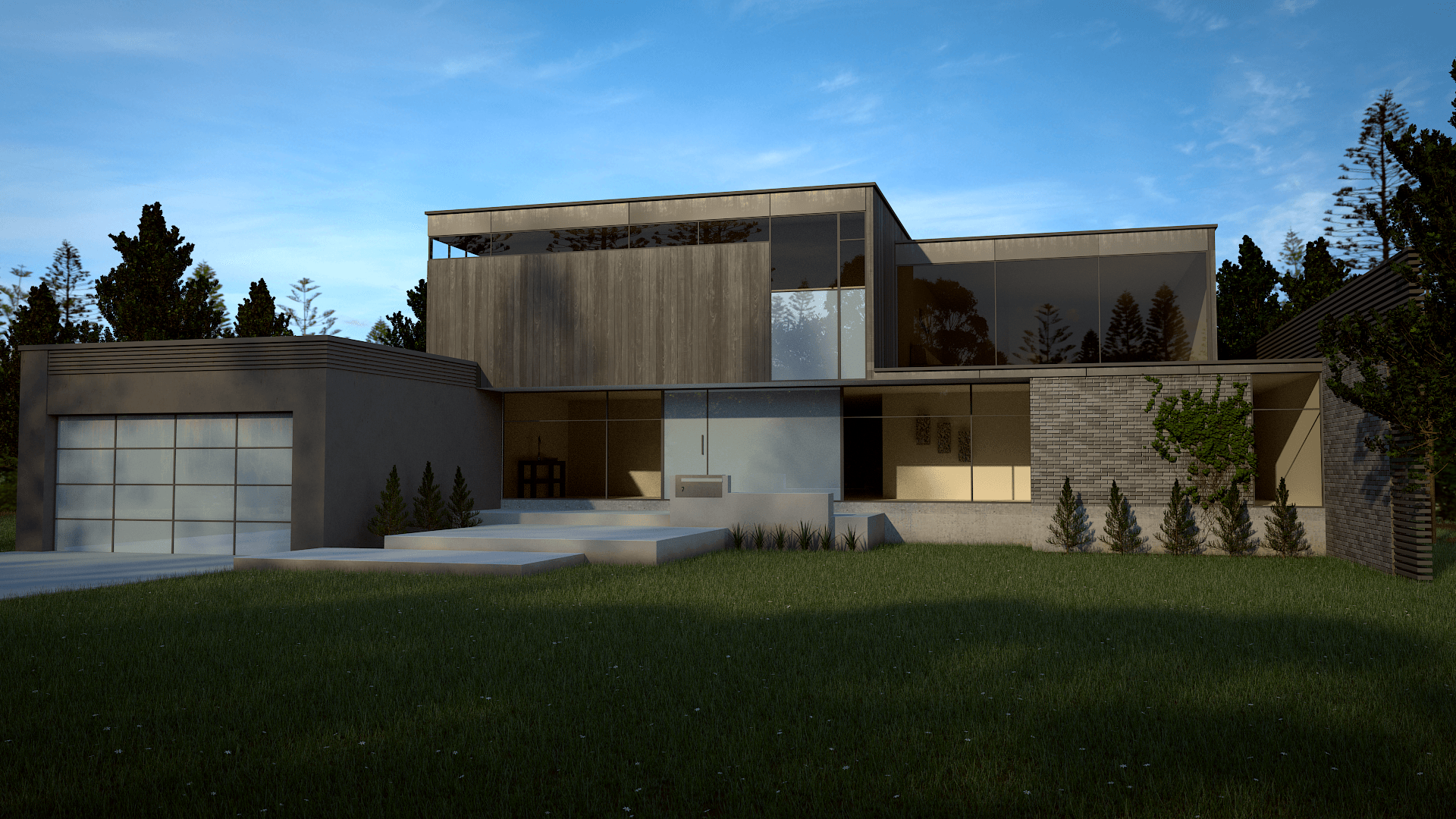
Looks like you have a good base here. Seems to me like the materials on the house itself is too “busy”, like you’re trying to do too many different ones. The bricks seem a little small, too. On the bushes and trees around the house, they need a bit more variation. They’re a bit too uniform. A “cheap” trick on that is to rotate them a little so they’re not all facing exactly the same way, but adding in some variation on the object won’t hurt either.
Overall, I like the composition. Just needs a little tweaking to push it further!
Cheers mate, I appreciate the advice.