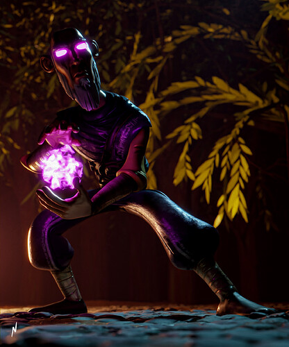
You have good atmosphere, colors, it’s a nice dynamic pose, this looks really good overall  I think the main thing lacking here is composition and contrast. It’s hard to tell where I’m supposed to be looking, especially since the subject really blends into the background. You have some really nice fill and back lights going on here, but I’m not seeing much of a key light. Adding a stronger key light to the subject would help a lot with contrast
2 Likes
You can use volume in this scene it will looks great. Try ones.
1 Like
ok, I’ll try that
thanks
maybe I should add a purple key light
