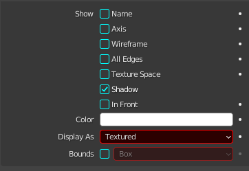
So, the current Blender arranges the check boxes in Properties like this:
Older blender, pre 3.0, arranged those check boxes side by side in a grid instead of stacked in a column.
I personally don’t like this, I find it an egregious waste of space, and it just forces me to do more scrolling.
They are now all stacked to allow the Keyframe dots on the right.
Move that panel lower in the window stack if it annoys you. Or press A as your cursor hits it - to collapse it.
Learn some Python if you absolutely must have the grid arrangement. Download the portable version of the pre 3.0 version and find the code snippet you want. Make an addon with that snippet. There are a number of code templates in blenders text editor.
Jump into the coding section of the forums and see if someone wants to do it for some practice.
Or do some egregious $$ waving in the job section.
Wel that seems a little silly to me. Why even HAVE the animation dots when you can just hover over pretty much anything in blender and press “i”?
I like my interface to be as dense with options as possible, I like to have everything there and visible as much as possible. I like having the “viewport Display sub-panel visible at all times” The old grid arrangement was simple and elegant.
But yeah, I might go to the coding section and wave some money around. I might try ChatGPT first but with my experience with it so far, I doubt it could manage that.
Thanks!
I’m surprised noone else has had a problem with this. In my OCD mind
… stylus users. Apparently many have some delusion that changing the object in their right hand means they no longer need to use a keyboard…
Ahh - so this is not manifesting as everything in nice. tidy. sane. lines?? All together in the middle like the new layout. LOL. And please dont mind my Obsessively Non PC mind.
Try jobs - voluntary first. There are so many lovely folk here that will just do things in the voluntary section.