What compositor nodes do YOU prefer when doing color adjustment work for your image?
I mostly use Curves, because I know it well and it’s pretty straightforward, yet flexible.
But I often have problems with the overall image having too little contrast. The blacks might not quite be black, and the whites tend to look a bit grey.
I know I can look at the histogram in the right corner toolbar to see where I’m at, but I guess what I miss most is an Adobe-style Levels tool, which shows the histogram AND I can adjust the levels nicely at the same time.
But maybe I just haven’t found out the right way to do it in Blender.
I try to get the render out without corrections. I think it’s what you’re supposed to do with 3D rendering. I don’t understand why you need to fix everything later on post processing.
You can do what ever you like, but if you need to make changes later it is much easier (less render time) to change some layers/passes instead of re-rendering the image.
If you want to composite other elements into the 3D scene you may need finer control over those elements that the 3D space could not provide.
Finally shots on either side of an animated piece may not match to well, so you can manipulate them to match better.
But seriously though, you are missing out a lot, and it is probably the cause of why all your renders look average, unbalanced or even sub-par.
And it’s not really fixing, it’s improving. And you basically do it because it is easier and it takes less time
than tweaking your lights ad-infinitum.
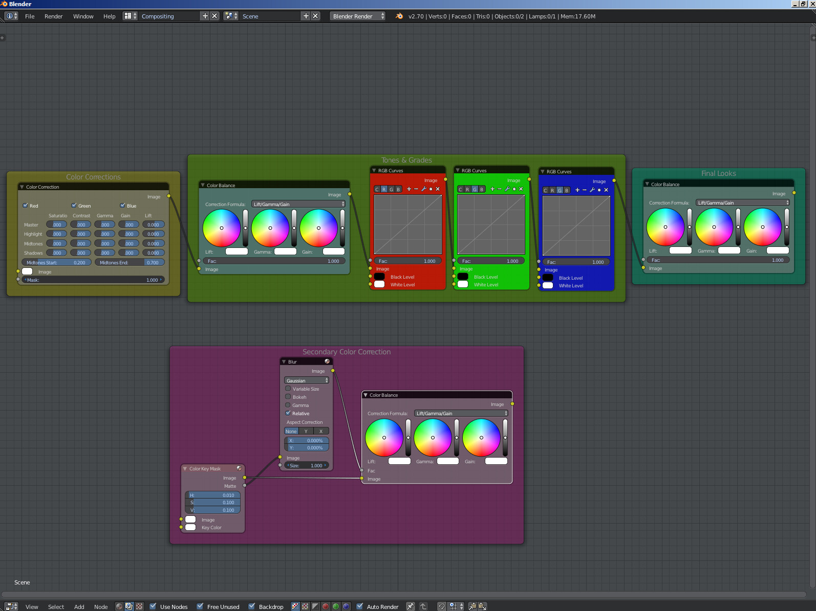
Cool stuff. I like it how you separate the RGB stuffs to 3 different curve-nodes for clarity and swiftness.
One question: What do you use the blur for in the secondary color correction stage?
The color key node is a good key for selecting a range colors. But if you are working with 8bit images codecs, your edges and pixels will start to break down. Your benefits are in the softening of the mask pixels output. Your mask/selection will look smoother. The blur node has different filtering blur algorithms. Each one may affect your neighboring color pixels in a different way. I would use the relative filtering mode because you have more control over the 4:3 & 16:9 individual pixels.