Hello.
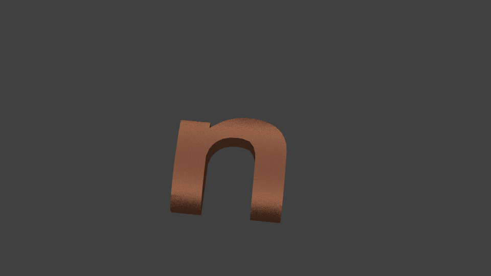
I have imported a svg text, and extruded it. Then I applied Boolean-intersect with a cylinder to get the curved surface. Then smooth shading and edges split modifier. I get what you see in the picture, and I share the blend file.
As can be seen in the image I get these faces (marked with the red point) as if they were in low relief with respect to the other faces. These imperfections are very noticeable in Glossy material with a low value of Roughness, and when the lamp is strong and small size.
It is very likely that I had applied bad procedures to obtain this final letter. But I want to know, assuming the case to get this mesh: how is called that kind of imperfections? Why are so noticeable with Glossy materials? What would be the best method to fix it?
No need to be so hostile, you can download the file for free by using the “slow download” option (200 kb/s is perfectly fine for downloading a 500 kb file)
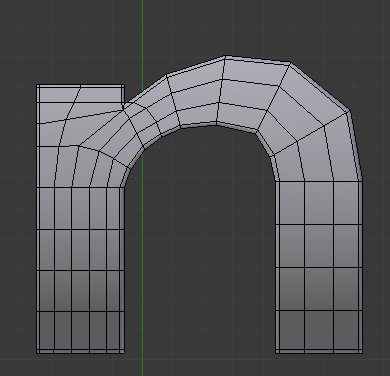
But back to the original problem; the strange shading is caused by your topology. You seem to have mainly quads, but they are strangely placed. Try to change the topology so that you have quads going all the way across either “leg” of the letter (having quads with three fo the vertices in one line is generally quite bad)
I always upload my files on free hosts. In this case in FileSwap if you press “Slow Download” you can download the file without paying anything. It’s the way that works most of those services. I have no account on FileSwap and I do not make money doing it.
I had already uploaded files before that way and no one had complained. I really wish that you ask before taking conclusions.
Regarding the ngons, whenever I have problems with smoth shading, the answer I get is ngons are responsible. I wonder what are the advantages of ngons?
Not sure if limited disolve eliminates ngons, but that does not solve the problem. I continued to have imperfections and surface is not smooth.
so looking at the mesh it is mostly all triangles. theis is also bad for creating smooth edges. ( why this would be i don’t know ans it is calculated as triangle when rendered…) i’ll see if i can find a quick fix that doesnt involve joining the faces one bye one!
Thanks RickyBlender.
I had noticed that, but that way I do not get the metallic glitter and curved effect you see in the image I had posted.
Perhaps the sun is not the proper way to light and there is another method for get that linear glow without the imperfections. I tried with the sun with big size and Anisitropic Shader, but I can’t get this glow in the letter.
@RickyBlender. Sorry, I do not know what to call nor how to say it in English. I think I mean the “reflection”. Just that this look as seen in that image that I post.
I will try an HDR as environment and an image map. So you say that there is no a problem mostly related to the topology? Or you say it’s a bad topology and the problem can be minimized in the way that you say?
(note : in case you have difficulty to upload your .blend files to your thread in blenderartist, you can try to use http://www.pasteall.org/blend/ , usually trusted for uploading/downloading blend files)
@Sanctuary, thank you very much, that looks exactly like I wanted with small sun size and glossy material. The fix must be manually then. I guess this must be a hard work if you have many letters or objects. Now I should get good tutorials that explain rules to follow for good modeling or topology. Thank you for the .blend example.
Ideally you will try to keep modelling the letters in low poly and let the Subdivision Surface modifier do the rounding, this way it’s easier for you to control your topology and adjust it as you need.
After that , adding edge loops as “support edges” to control the smoothness or hardness of the through the Subsurf shouldn’t be harder than a CTRL+R and moving them more or less close.