How to acheive perfect downscale filtering in compositor?

Hi,

I’ve been using the transform node in the compositor and getting dodgy, crunchy/dithered looking results even with bicubic filtering.

It’s apparent to our producers that the final image is sort of thick and aliased. I prefer not to use photoshop just to get around the down-scaling issue.
Currently I’m getting far better results from having the image as a scaled down smart object in a PSD. (And this is even without the automatic sharpening effect)

For those who want to test, there are similar results in Krita with a transform mask on a file layer, I can get better down sampling than in Blender.

Can anyone share a custom node setup that will produce industry standard looking down-scaling, just like Photoshop’s?

-S

Maybe you share your setup so someone can have a look at it… because no problems here…


But maybe i’m not savvy enough to meet your standards.

Keep in mind that reducing and image is way better at 50% or 25% otherwise all pixels don’t get averaged the same way, and it can look bad.

You can try to add a slight blur (like 2px) before downscaling to get a smoother result,
You can try to replace the blur by a node filter set to soften, and also add a node filter set to sharpen with very low value, try different combination of those.
That can lead to a better result, but if that’s not enough you’ll have to rely on external software which will use other algorithm than bicubic.
Hope that will help people to get more comfortable when looking at pixels…

Anti-aliasing node will deliver a decent result, very similar to cubic filtering. Compositing softwares like Nuke, Natron and AfterEffects have more filtering options.

@Okidoki

It’s subtle. It’s tough to explain unless we take a look at a direct comparison, but when you see an icon on a big monitor and it’s stationary and meant to attract the eye, a non-artist can tell the difference between a blender interpolation and a standard one. I have them requesting me to make it smoother yet not too smooth as to lose detail, and that’s where I’m forced not to achieve this in Blender. They see the result from Photoshop and are like ‘Oh cool you fixed the crunchy pixels’.

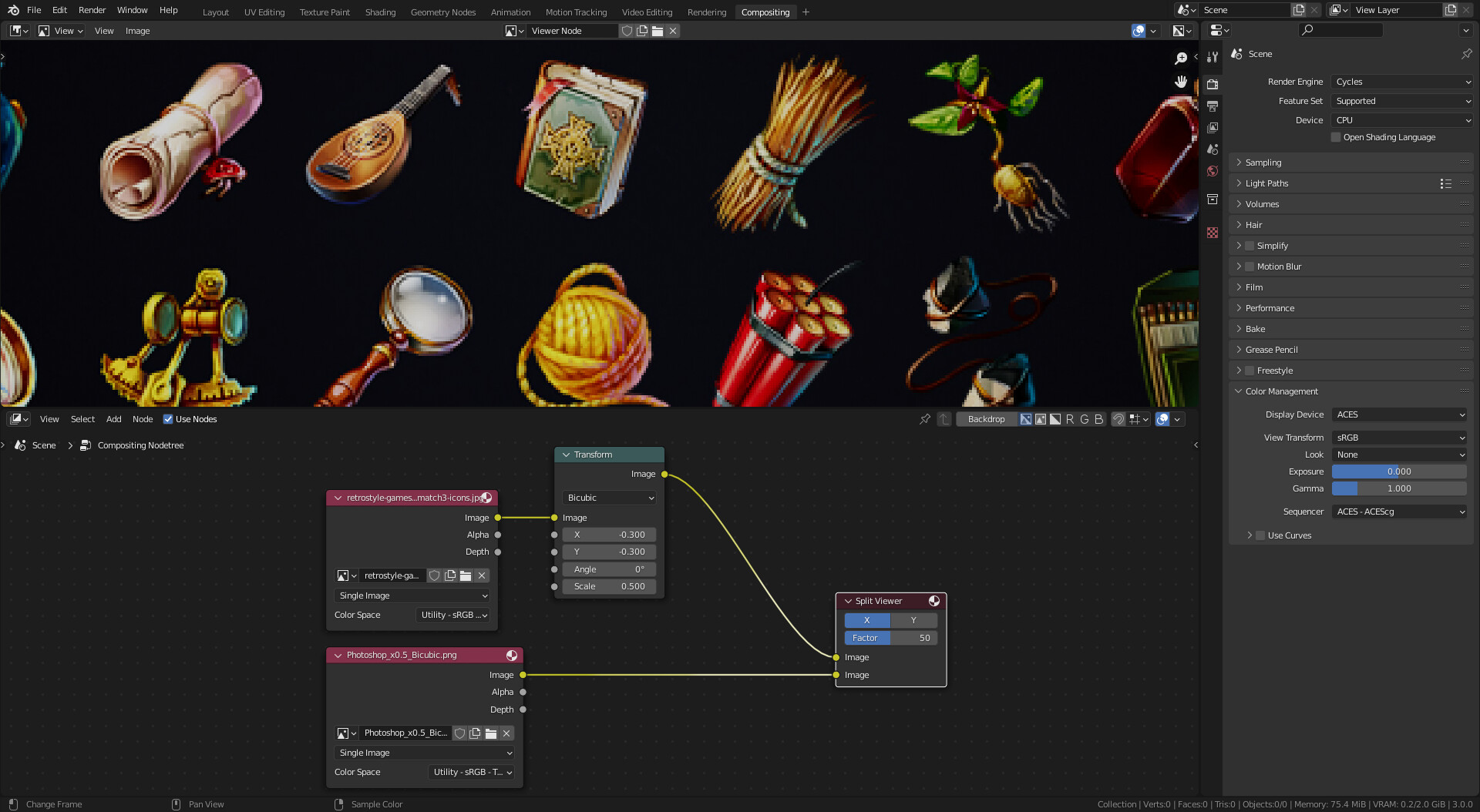
I’ve got two examples here to illustrate what I mean:

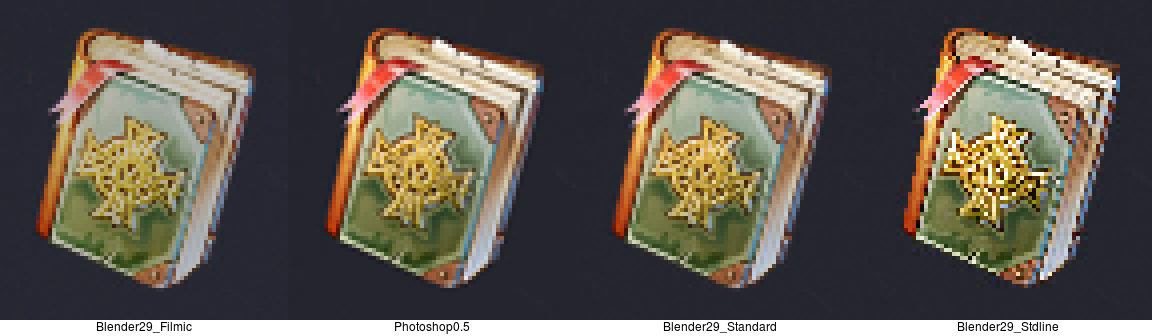
This is using your same setup of a simple bicupic transform to half scale in Blender:

The result is EXACTLY the same when using bilinear, or while using nearest neighbor with smooth or blur before it.

And Bicubic when done in photoshop (Not bicubic sharp or auto, but just regular bicupic option):

If you download that and flick it over this next image on and off, the difference starts to pop out.

Blender is losing fine details because the pixels are getting thickened, not just softened.

In addition to that, all pixels are being translated 1-half a pixel away from the original mark.

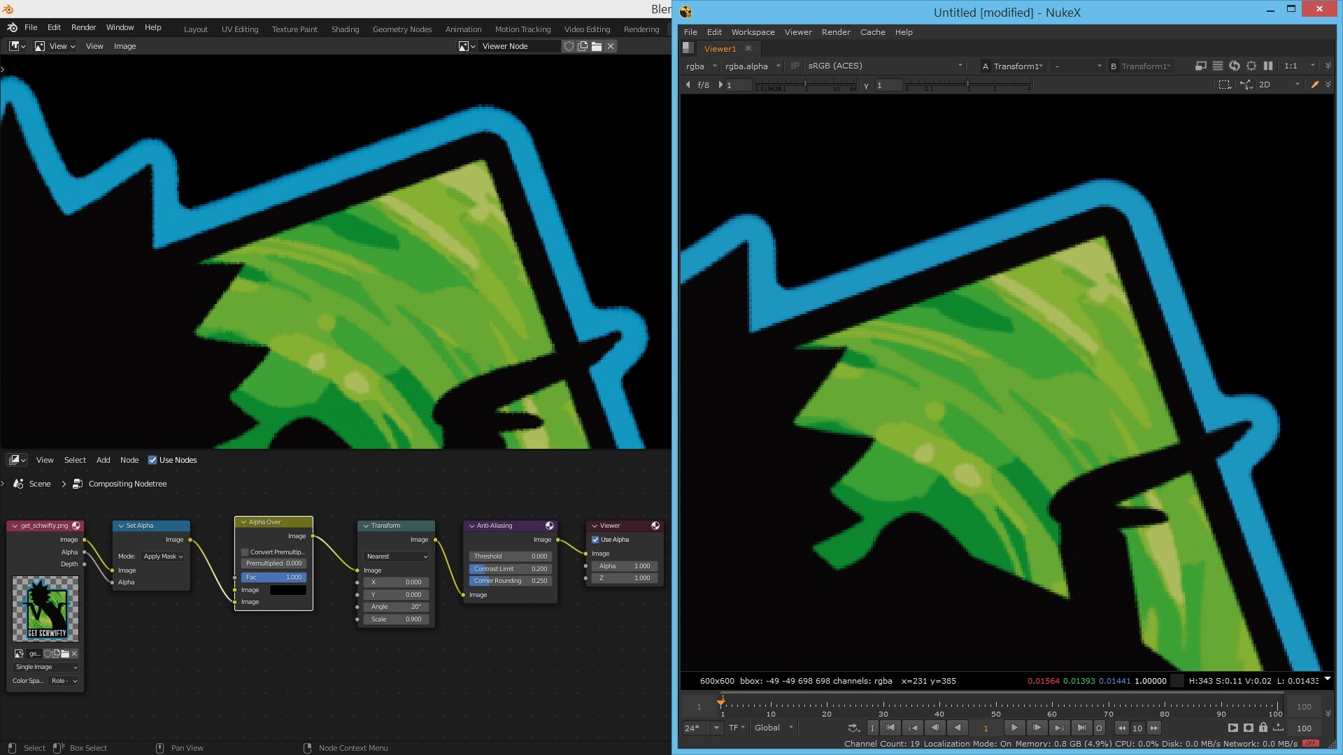
Krita does this to the left one pixel but still provides almost the exact same bicupic treatment as Photoshop, and of course is better documented should we dig down on this more:

This suggests to me that the algorithm in Photoshop and Krita is based off a similar model which makes blender the odd one out with something that is not the standard Bicupic operation.

Take a look for yourself and you’ll see that Blender’s bicubic is not doing the standard stuff that ensures optimum amount of retained details. What it’s doing and how it’s doing it is what I’d like to know. I really want to break that down and understand the problem better.

I still have faith that we can get the same effect as Krita and photoshop at least using the available nodes. Granted, you can get close but not perfect using the soften/sharpen, though I still can’t retain the same level of detail as standard Bicupic scales. And Anti-aliasing node is KIND of ok in SOME places, but I notice it fails on a lot of edges and you end up with gritty/noisy contours like the above example when compared to Nuke.

Does anyone have any additional information that explains the differences here better?

Particularly if anyone wants to try and match the results up in compositor and show me your results.

Kind regards,

Simon.

1 Like

Ahh now this is a bit more clear what you mean… you are aware of the fact that https://en.wikipedia.org/wiki/Bicubic_interpolation is a mathematical process which does produce the exact same result? But (and that’s the crux) there are muliple possibilities to apply it (on or between the pixels, forward or backward) and even using different ranges (radius)… and of course some software producer may just do it in their own way… so i did a little research on the original image (https://retrostylegames.artstation.com i guess) and there is a difference between using filmic and standard View Transform in the Color Management and i do see a difference between Bicubic an Bilinear…

. I used also Krita 4.3.0, Gimp 2.8.18 and Gimp 2.10.14 (interesting difference between gimp). The upscaling was made with ImageMagick using -filter point -resize '400%' to just see it better (unix script and some other examples in the zip look.zip (424.1 KB) ) So yes… the image apps do a bit more smoothing… it would be interesting to look into the differences in sources of Gimp and maybe Krita…
So maybe one additional question: You do render a model as image for an icon and downscale that at some point or what is the workflow because for example it’s huge difference to downscale to 90% (9/10 of original) or at 90% (10% of original) … (or what are the correct words for this difference in english)?

I’m getting very similar results here using Transform node, there’s a -0.3 px change in X,Y. But using a split viewer it’s difficult to tell which one is which. Artstation file: https://www.artstation.com/artwork/rWYZE

Okidoki

Thanks for your time, and your english is great :slight_smile: , no worries! I suspect from the slight displacement of pixels that the issue is as you suggest, to do with the plotting of pixel samples. That might explain how features appear slightly ‘thicker’ upon transform.

For reference, I’ve been testing these symbols with standard view transform due to the source image being 8bit jpeg. Normally, I would render in filmic and ‘save as render’ to get it srgb friendly in png 8/16bit outputs.

I adhere to power of 2 changes when possible. We generally like double sized renders of the final symbol as opposed to x1.5.
Let’s say I had a symbol in game at 512x512. I would render it at 1024x1024, and bicupic scale down by a factor of ‘0.5’ for maximum clarity.

Those symbols appear on a large screen, so we need to make each pixel matter. Further; they stand out negatively against assets generated in Photoshop on competing machines. Unless I rely on Photoshop, I basically don’t quite stack up with the final look of the art.

lucas.coutin

I tried the view transform and also had trouble. I recommend using render wrangler to swap between two images to get a more contrasting and complete view of the differences.

I have not gotten away with it those differences, heh.