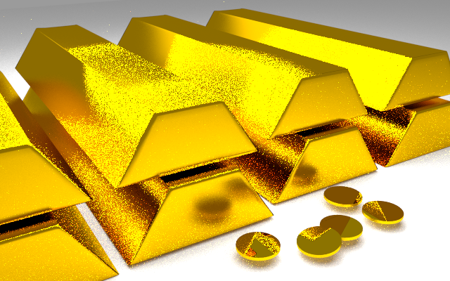
Just did a really quick render of some gold that I made, can someone tell me how to improve the lighting? It seems that the top part of the gold bar lacks lighting and looks just like a plain color. I used a plane for the floor and set a color for background of the world, and added 2 point lamps right on top of the gold bars and 1 plane on the top left of the gold bars shining down.
Yes and no. It is a pic with 32bit depth. This means that unlike your normal photo this can store values below and above 0 and 1, 0 being black, 1 being white. So in practice you can increase the exposure without losing detail and getting banding. And with some node tricks you can even make it to cast sharp shadows like a sun setup would.
As always, “look at the light.” Look at reference pictures of actual gold bars, and look at the light.
For instance:
The lighting here is obviously completely blown-out. On bar #3 in the top row the edge of the bar literally vanishes.
The mirror-like reflection of the coins in the bar is unrealistic.
The overall lighting of the room is a sterile white, and there’s no variation of the color-temperature of multiple light sources.
There’s absolutely no subtlety in the effect of the noise-texture nor the band-texture on the bars. Get to know “node-based textures” very well, no matter how you render. If you look at the light in any picture, you will see that any real-world object has many subtle ways of dealing with the light that bounces off of it.
Often it works well to build-up a lighting effect one light at a time, one aspect at a time. For example, starting with a flat lighting of textureless bars to ensure that the tonal-range is good: no opaque shadows, no burned-out spots, and so on. The color and arrangement of light is pleasing and believable for “sticks of dull yellow plastic.” Then, you start sneaking-up on the rabbit, one step at a time, adding one new aspect to what you had before, after considering which of many different possibilities might give you the most bang for your buck, and saving many different in-progress versions as you go.
So, what I’d do here is to strip-off the materials from what you’ve got, and start at step#1 which will be the three-or-more point lighting setup, light color, intensity, and placement. Then, basic object colors for diffuse and for specular. And so on. One change at a time, saving constantly into multiple files. There’s no right-answer, no right-outcome, only choices, and a discplined way of making them.
Also remember that cast gold bars, and finished coins made from those bars, will be two entirely different materials. They might share the same basic color-swatches, to say that they are both, indeed, “gold,” but the treatments that have been given to them make them visually night-and-day. So, you’ll definitely have two material-trees.
Thanks for the tips sundialsvc4, but how do I know what kind of source of lighting I’m supposed to use for the best effect? And are you saying that the coin and the gold bars should be in different materials?
how do I know what kind of source of lighting I’m supposed to use for the best effect?
Light isn’t just used to make things visible or shiny. Every light you add to your scene needs to have a motivation. In other words, “best effect” depends on what you’re trying to say with the scene. The lighting for a basement where the thief stashed the gold (warm color from a single bare overhead bulb, very contrasty) will be very different from lighting in a stark bank vault (eg fluorescent tubes are cold, blue, harsh).
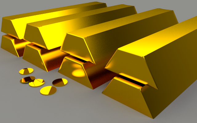
Yes … this is your scene, hence “your sovereign choice” as to what does and doesn’t constitute an “improvement.” But you can, for example, now critically compare the two pictures you’ve presented so far:
The material does look a lot more golden.
The noise-tex is gone and no one will miss it.
There’s a definite problem of separation … the bar-stacks #3 and #4 appear to be joined.
The lighting across bar #3 is noticeably different.
The bars appear to be floating, and to have an odd metal “bent tongue” say on the top surface of lower-bar in stack #4 where the side-edge facing the camera meets the top.
The lighting is still “hot.” I’d call the facing-side bars #1 and #2 to still be “blown-out.”
The lighting, shading etc. of the coins won’t fly at all. (Probably, you will need two sets of lights, layer-specific, one for coins and one for bars, unless you decide to composite two shots.)
Still, all of this being understood to be a work-in-progress small-step, these changes are significant changes that can be considered. As usual, some might be called steps-forward, and some are steps-back.
By the way, if you use “shaded views” and “textured views” in OpenGL, you can get a lot of very-useful, real-time feeback about what you’re doing, just as you add lights and move them around before you (as we old-hands would say) “shoot another Polaroid of it”.
(“Polaroid?” Oh, ask your folks.)
It is, in any case, a very subjective, incremental process that, most of all, obliges you to: “look at the light.” Not the scene, not the gold bars … the light.