Internal links (onsite) - No setting for this in site prefs. Hold Ctrl while clicking for new tab. MMB tries to open new tab but Firefox thinks it’s a popup.
External links (offsite) - Same or new tab setting in prefs. Hold Ctrl while clicking for new tab. MMB opens new tab.
I’ve now disabled the ‘open externals in new tab’ setting so my Firefox setting (do not change focus to the new tab) works when I Ctrl click. Internal links override this somehow so a new tab for an internal link gets the focus no matter what.
I think that’s the behavior I’m seeing. I didn’t double-check.
Edit: I like the new forum and liking it more everyday.
I forgot about Ctrl, thanks @LarryPhillips. And that one opens new tabs, but gives them focus, unlike when used with other links where they don’t focus. WTF really.
@Gumboots it smells like the header images, instead of doing the HTML thing, they first go with the weird way, and maybe later fix or accomodate what is normal. Useless long path, IMHO.
You maybe right that packets are small, but its a jquey+request +script exectution everytime. Unlike more static pages who do load once.
@Felix_Kutt@bartv
I did a speedtest at speedtest.net at work
ping 23ms 18mbs up and 18mbs down, its not fast but not a huge latency either.
I got this same behaviour at home where i have a fat DSL modem.
The more I use the site the more I like it. It’s a lot less clicky than the old site and as a person that uses the back button on my mouse, it’s much better now.
Right to make clear IM NOT A TROLL, I hate this new site. And I think most old forum users do too, as shown by the fact hardly any new posts or comments are being made. The old site you could see how many users were viewing a thread (maybe you can on this but isn’t obvious).
Where do I start,
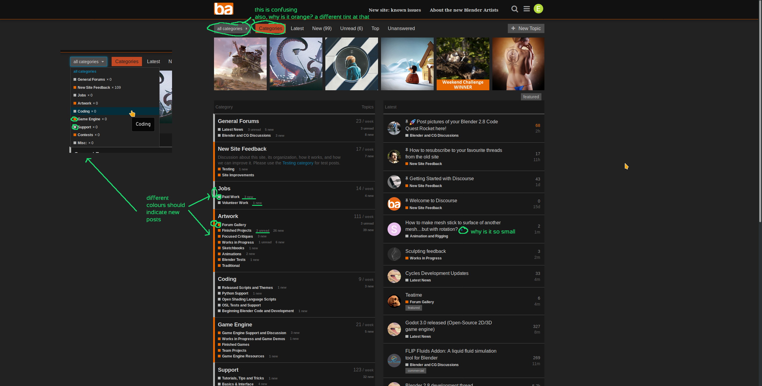
1.The main threads page is nasty, No clear categorization in any way that’s useful. It’s ugly, the old system had clear equally spaced forum areas that spanned the page, now it’s a complete mess.
2. The main usable size of screen space isn’t taken into account at all, stupid little comment posts with massive amounts of wasted space either side of the post (you should be using all screen space for posts)
3.Your always taken back to the very first post, (WTF) rather than the latest.
4.No top bar back to forum home links at all, yeah you can click the ba image but that’s just shite design, sorry.
5. Icons look like they were from 2000, In fact the whole site looks like it’s gone back in time 18 years.
6. Scale is all wrong in so many areas, header, icons, menus, forum lists, forum posts. you couldn’t of got this more wrong if you tried. I thought funding was generated to do this change? Looks like was spent down the pub to me.
Seriously, why didn’t you just take the design from the old forum and copy it over to the new platform, Can it not do that layout design? And last of all, the site constantly gives messages of page unavailable, error etc etc. This is to be expected with a new platform but if you carry on with this type of experience no one will want to use this place anymore. Im tempted just to ask for a image of the old site.
No. Long lines of text are a PITA to read if there is more than one of them. Attempting to read entire paragraphs when the text stretches all the way across a wide monitor is not fun. This is a basic and well-recognised typography principle. Lines of text should preferably be less than 75 characters, and preferably quite a bit less. Books are arranged on this principle, for good reason.
Shouldn’t be. If you click the relative time link (1h, 2h, etc) over at the right of the topic index, it should take you to the last post.
Meh. It works. I can live with it. A linked icon is pretty standard stuff.
You can argue personal preference until the cows come home.
Yes about scale. Not sure about pub.
Ok, I may be able to offer a partial solution, if you are willing to experiment a bit. A few of us have been playing with custom themes, since the Powers That Be have said the site is still WIP.
Do you happen to use Firefox or Chrome or Opera on desktop or tablet? I can give you some code you can run with an add-on, and see what you think of the results.
Hey, Just to make clear im not trying to be an ass hole, it just comes natural.
Good, agreed I just looked at the link you posted. Much better, Clean is the aim in my eye’s.
2.We don’t agree here, Yeah I know what your saying about the Novel layout system. But guess what my screen isnt portrait, it’s landscape. I was never saying lets cram text from the left edge to the right edge but balance. Right now the amount of empty space on either side is too drastic, and having the text area offset to the left rather than middle of the screen sucks balls. The scroll bar takes half the screen, just odd.
If your not logged in it takes you back to the first post every time, I dont want to have to log in every time I view a site.
Logo sucks balls ( would suggest Blender artists in complete form as the ba image just unbalances the header area), scale size to header is all wrong. I hate no link headers but that’s me.
5.Yeah I bet your a beatnik.
6.Agreed, Now put your big boy pants on and get it sorted .
Im on Firefox win 10. Im willing to help if I can.
I haven’t really written much here but I’ve been a passive user of the forum for a couple of years now and I have to wholeheartedly agree with the title of this thread.
I can’t remember when was the last time a website made me so annoyed. The forum feels so janky now. Everything is constantly moving. When I scroll to the top of the page it loads more posts and moves the scrollbar to the middle of the screen so apparently I need two scrollbars now.
Also, forum looks comical on a 27" 1440p screen. It feels like it was made for smartphones in mind and forget the desktop.
But the biggest offender in my book is the infinite scrolling. It feels like living with a messy roommate who takes your stuff and never puts it back where it belongs.
Please for the love of cute innocent kittens bring back the option for pages.
I know it took a lot of work to move the forum so I apologize if my post sounds harsh. I mean no disrespect.
Some of us are just talented like that. I like to indulge myself at times.
Doesn’t for me. Just tested it. What are you clicking? I was referring to the links under the “Activity” column on the topic listing. They take me to the last post whether I’m logged in or out.
Worse. I’m Australian. Abandon hope all ye who want to argue.
I’ll take a look at the code tonight to make sure I haven’t missed anything (which is another way of saying I know there is one item which is currently screwed).
The custom CSS runs on Stylus, which is available for Chrome, Firefox and Opera on desktop, and for Firefox and Chrome on Android (but I haven’t got the links for those handy).
Good thing about this is that if you want the whole damned forum full width, you just change one number at the top of the custom CSS. Works a treat, and you don’t have to argue with stupid people who want things their way.
The way around that is to not use the browser scrollbar inside topics, and to instead use the little Discourse timeline at the right of the posts. If you use that, it works much like a normal browser scrollbar.
I don’t like it much either, but it’s apparently what we’re stuck with because it’s hard-coded into the back end. It’s workable once you get the hang of it.
You might need a plug-in for your browser though. I use stylus on firefox and stylish on opera.
That is of course subjective. But in general terms when catering to the general public you will have to conform to the lowest common denominator, it’s true. Thus indeed the second half of your post is factually correct whilst the first is a subjective view.
edit:
/me thinks some people need to learn to use the page zooming functionality built into any modern browser.
And I do. The screenshot just showed how it looked at default.
But zooming doesn’t fix the use of white space, does it? There’s a lot of wasted space which combined with the overall flatness makes everything look like jumbled mess.
Don’t know how it is in other people’s browsers, but the Discourse time line scrollbar doesn’t update the view until I release the mouse button. This is how I expect scrolling to work on an Amiga 500 with a 9600 baud modem and feels very anachronistic for a “modern” web page.
There is a thing that is bugging me.
Everytime I attach an image referenced by an external URL, the system automatically edits my post and downloads the image to reference it locally. And I systematically feel somewhat disturbed.
Not sayin this design choice is wrong or abusive, it could be or it could not, but I don’t understand why I feel like that.
Is there anyone who can give me a clue about why I consider it unconsciously wrong?
I can’t answer about why you feel that way, but the reason for downloading these images locally is preventing broken images in the future. Especially if you look at older posts, you’ll that a LOT of them look like junk.
Yeah broken urls was the main reason I’ve considered. Another one was to avoid people post abusive content and then change simply the external content mantaining the same reference. As for my feelings, I’ve thought about some other reasons. For example the fact that someone else edits my posts is somewhat intrusive (even tho edit history is visible). Also there are things like copyrighted resources for example that, even if I’m not that taliban, I could find wrong to reference them locally associated to a post that belongs to me. Also what about simply unharmful memes? (I know meme things is controversial, but it’s just an example) Why burn local space for things with a so low temporary validity?
Not a proposal, just a discussion argument, wouldn’t be fair to let user decide if reference resources locally as the old forums used to do?

 .
.