With this new design i feel like i was sunken in a black hole where some random trash flying around and no way to figure out what it is and how to deal with it. Hate this oversimplification smartphone era(((
Agreed, can someone not lock this.![]()
Actualy i like new forum, to go to the last post, you need to click date or post count. Easy on all devices (desktop,mobile,tablet). And its more pleasant to read long threads with lots of replies. I waited for year for this and not dissapointed, GJ
OK, so now I’ve had a while of using the new forum I’ll comment on the things that still bug me. Generally I love the new modern features, ease of quoting and replying to people and ability to like comments, but there are a couple of small things that make using the new site hard.
-
It’s annoying to spot new threads and threads with new posts. I think this could be improved by simply changing the theming so that all threads are white unless there are new posts, in which case they are orange. A new thread contains a new post, so it would also be orange. Threads stay orange until you read them or mark them as read. It doesn’t have to be like that, and I’m sure there are better ways to highlight new posts, but currently I find myself opening every subforum I’m interested in two tabs from both the unread and new links just to make it easy to find new stuff. Even when I do this, all the threads are shown in white and grey, and have white and blue circles after them, which is confusing. Perhaps I need to learn what all these things mean, but it isn’t particularly clear, and could perhaps be improved by modifying the theme a bit.
-
The infinite scrolling. I doubt there is much you can do about this, but the way discourse loads posts is somewhat unpleasant to use. Scrolling through long threads is absolutely horrible, as it’s hard to scroll precisely, and when posts are loaded, their content is not known, so they are all shown as a blank template and resize as they load. Perhaps seeing the number of the post (which can easily be calculated) would help alleviate this a little, but the posts resizing as they load really doesn’t help make scrolling usable.
Also, on a mostly text site like BA it’s less of a problem, but I’ve never been keen on infinite scrolling that doesn’t clean up previously viewed posts after you’ve scrolled way past them, as the site gets heavier, and the scrollbar gets more and more unweildy. The scrollbar seems to always work the same way here, however.
Anyway, I think the biggest issue is just being able to find new posts and topics easily, and this can probably be fixed with some theme changes. When we first moved over, I was mostly just viewing the 2.8 megathread, but since that got locked and split into multiple smaller threads, it has been a pain to find what is actually new regarding 2.8.
Before I knew a post was on page 14. Now? Completely lost.
I just noticed another browser breaking site “feature”: Now that I am at the end of this thread, if I drag my scrollbar to the top and release it, it jumps to the middle, and I’m not at the top of the thread. 
I dont think its broken, You’re correct that if you drag your browser scroll bar to the top, it stops halfway like you said, but if you are trying to get to the top of the thread you should drag the blue slider of the thread not the browser slider.
The blue slider doesn’t respond to Wacom pen input (Windows Ink), which is what I use instead of a mouse due to RSI these days.
I love the new site, but the old version did some things better. For instance, I could instantly see the latest comment without having to move the slider. The paging system also allowed us to go to specific parts of the thread in one-go. Now we have to slide the slider and make a kinda rough guess of where a particular comment is.
This is good for mobile, but a kinda pain on PC, which we mostly use. We could instead use “jump to page” menu along with the scroll.
TOO MUCH DAMN AJAX!!! COMMON!!!
“Body seems unclear, is it a complete sentence?” WTH?
(Moved by bartv)
Very strange place this now be, indeed!!??
(Moved by bartv)
And a bit useless too, why I can’t post anything? I can only post stuff here, not cool guys.
Now I need to go find an alternative forum that works,
I think you just lost me as a member.
Please be more explicit - you can’t post where?
BartV
“Please be more explicit - you can’t post where?”
The only place I can create new posts is HERE in “Site Feedback”
Pick the relevant subcategory to post in; you can’t post in the parent categories.
And it’s worth mentioning that this isn’t a change. You couldn’t do that in the previous forum software, either.
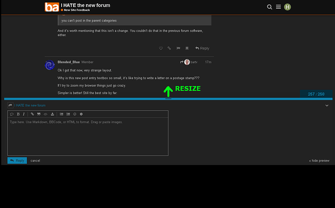
Ok I got that now, very strange layout.
Why is this new post entry textbox so small, it’s like trying to write a letter on a postage stamp???
If I try to zoom my browser things just go crazy.
Simpler is better! Still the best site by far:
This is a resizable textbox, which is great because you can go thru previous posts in the background while writing your answer in the foreground.
hide preview is good too.
really we should have a preview tab.


