Oh my god, I found the reply button.
I agree, this sucks.
You mean the button that’s at the bottom of literally every single post? Where else would you put it?
The reply button that thousands of users already found and used since we migrated?
I cant tell where one post ends and another begins, the only reply
button is at the bottom in the stuff about other topics and since
there’s no scroll bar I had to use the arrow keys to get there. I cant
find your post so Im trying to reply directly via email…
Are you running any extensions or add-ons in your browser? There’s a reply button with every single post.
Perhaps you could share a screenshot that shows what you’re seeing.
Hello all -
Just wanted to chime in after letting things sit for a while.
I personally find the layout to be quite cluttered and less readable than the previous/old version, but that’s usually not a big deal as these things tend to be easy to tweak. So on that front I am okay with it, as long as it doesn’t get swiped under the rug and gets cleaned up eventually.
However …
The sidebar/scrolling situation is objectively worse than any good old regular forum layout with threads split into pages. Such a scrollbar may be great for chat uses (similarly to Slack) but for a forum it is completely inappropriate. It makes navigation slower since it cannot catch up with power user input like fast middle click scrolling. And this issue is deeply rooted in this design - there will always be a point when things cannot keep up, precisely because of the infinite nature of it.
Of course someone may say “but, on a legacy design you still have to click page numbers”. Yes, and that’s the whole point. The beauty of a legacy layout is that one always know what to expect when it comes to scrolling/page flipping/reading. Basically the user can always see what’s ahead by quickly glancing at the size of the scrollbar on the right, the number of thread pages at the top and bottom, or even the page count shown next to a thread before clicking it. All this vital data is hidden now, and that makes things objectively worse for anyone actively browsing (as opposed to casually scrolling through an infinite feed of content like on social media)
In short : if I had one single request, that would be to revert this aspect to a legacy design. It hurts the site quite badly as it makes it much, much harder to read and navigate threads … which is the main point of a forum in the first place.
Some of the new features are nice (like the post/edit box, which is nice and snappy) but all this is very secondary to the deal breaker that is inefficient scrolling.
I just randomly clicked on this thread and wanted to say that i love the new forum.
It’s fast, it’s clean and I’ve gotten used to all the quirks it has.
im not ok that half of the screen is empty with a narrow text in a middle. if i zoom in in my browser to fill most of the screen space i can’t see more than few posts, if i start typing a reply the box covers half of the screen it’s very uncomfortable to use the forum now(

it’s obviously designed for smartphones and not for desktop pc.
Do you really want to read a line of text that is 2000 pixels wide?
did smartphones do this too?

Narrow columns of text are much more readable.
yes if there at least few of them not just one.
smarphones oriented vertically most of the time when reading browsing etc, so this column layout fitted well for them.

I made almost identical criticism to what you are doing, when the new forum was just a project. But mainly because the column on the left of the old forum gave me an incorrect feeling that text took up more space across the screen width.
Anyway, I use an addon in Firefox to set the Zoom of the page to 130% (zoom page WE). So bigger text and less space on the sides.
That’s not an answer to my question though.
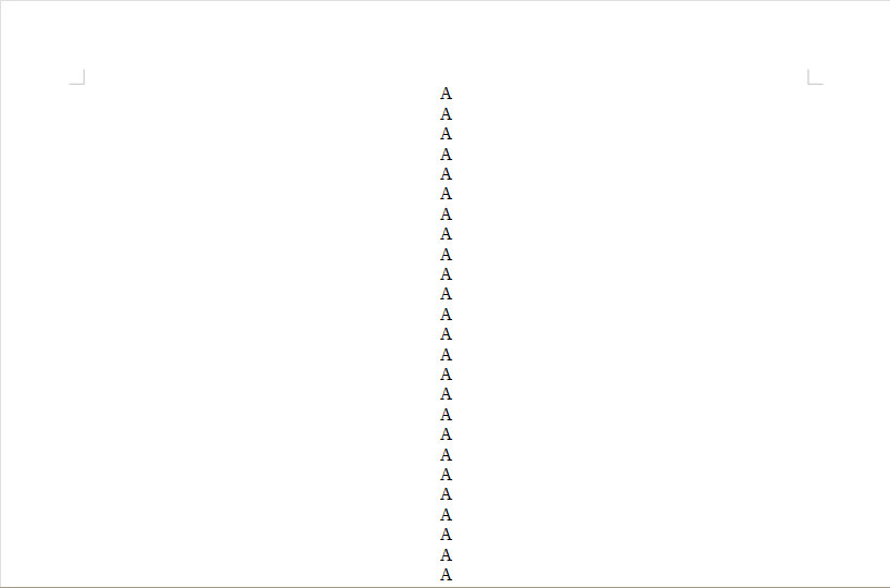
Narrow text is easier to read, check out this elaborate mockup I prepared:

Really, widescreen monitors are not convenient for reading text. adding some filler on the side increases readability.
1 Like
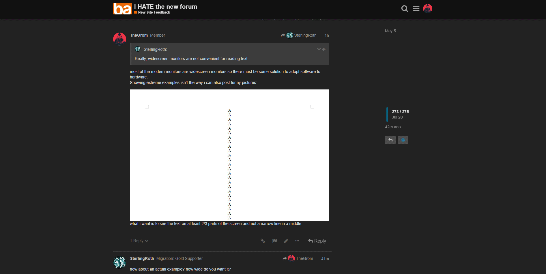
most of the modern monitors are widescreen monitors so there must be some solution to adopt software to hardware.
Showing extreme examples isn’t the wey i can also post funny pictures:
what i want is to see the text on at least 2/3 parts of the screen and not a narrow line in a middle.
how about an actual example? how wide do you want it?
This is a design topic that does, in fact, have hard data behind it as verification. A line of text that spans a full monitor screen (assuming at least 17" diagonal screens) is more difficult to read than one of narrower width. I can’t recall the hard numbers off the top of my head, but there’s both an optimal measured width and an optimal number of characters in a line. Most modern website design practices incorporate that… and Discourse is no exception to that.
You’re welcome to edit the CSS yourself and make your own experience in the forums more difficult to read, but that’s not a change that’s favorable to most people.
how?
i want to achieve something like this:
You might try using the Stylus browser extension. Some other forum members have used it to make and share their own custom themes. Some of those ideas have actually been incorporated into the main site.
where is this thread with themes? i want to check what’s going on there but i can’t find anything
click the hide preview button in the lower right.