Is that why I have gotten several 403 forbidden errors?
@Daedalus_MDW, it looks to me as if your mobile is picking up the desktop site. If you go to the menu next to the avatar, you should be able to pick ‘mobile’ site from the list, which looks like Cebbi has it.
@Therahedwig you are correct, i did that because the mobile gives me a headache. and most things are even bigger.
I do agree that the new forum needs a bit of improvement, but I do trust that Bart and the crew will get many of the niggles out of the way once the base is in fully working order.
He did mention in the initial migration thread that he wanted to have the site moved before seriously taking up other topics (such as overall site design).
2 Likes
Lol at this thread title. This always happens whenever any site changes anything about their interface.
I must admit my first impression was “WTF?”, which was quickly followed by “Meh, it’s usable”. I’m currently still at that stage.
1 Like
I join the haters club. Fortunately at least one can remove the monosaturated fat from this site using ublock origin and the hide objects selection.
In my case and as example i use these 3 rules:
blenderartists.org###suggested-topics
blenderartists.org##.timeline-container
blenderartists.org##div.column:nth-of-type(2)
For too long threads (insert strong insults to discourse forum developers here) just press “end” button and things should be manageable.
Death to Discourse. (No offense to Bart & Co. but paraphrasing the joker… “Very poor choice of forum software…”)
4 Likes
Well, for me new forum is looking ugly, previous was much more nice in my eyes.
3 Likes
“Meh” just about sums it up. I’m sure those who live their life on twitter find this very familiar, me, not so much. I “grew up” on BBS then trad. forums, clean, well laid out and not just “hey look, another gimmick / eye candy”.
7 Likes
That about sums it up. To me, the primary reason to visit a forum are the posts written by users. The new forum appears to pay a lot more attention to badges, notifications, recommendations and other ‘features’ than to content or usability.
At this stage, I don’t expect to be visiting the forum as much any more as I used to. The ‘fun’ features aren’t fun to me.
6 Likes
No, I don’t hate the new forum, but the infinity scrolling (despite navigator) is suboptimal.
The clarity is completely lost.
A possibility to switch back to “normal” pages would be a great thing.
5 Likes
I don’t think “normal” pages are supported with Discourse.
I Highly prefer the old forum too. It was just such a clear, good design. This looks like a huge design mess, to be honest.
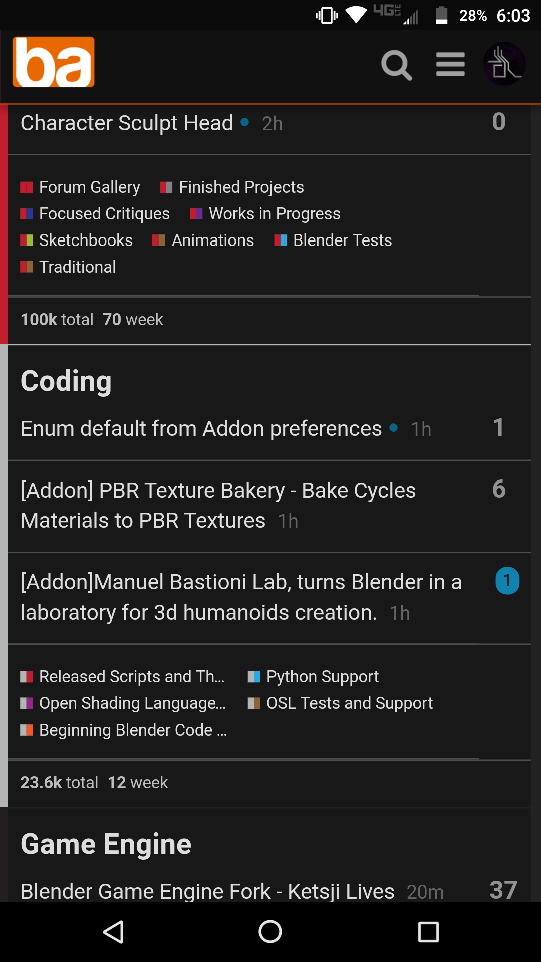
I mean… look at this:
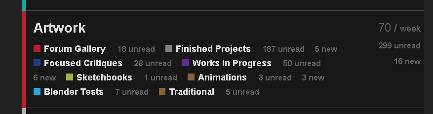
Why aren’t these in easy to read columns/Rows? It just looks like scattered text. Why?
While designers in blender 2.8 has raised an issue on why (in 2.79) buttons/text in some panels aren’t aligned, the forum has gone completely the opposite direction lol.
But i guess I’ll have to get used to this… It’s not terrible, it’s usable, but vastly inferior…
5 Likes
This has been recognized already and is on the list of things to fix - Suggestions for category color codes?. There’s a lot of things that need fixing, some more important than others. Users may have to bear the pain of looking at some ungraceful looking menus for a little while, but I’m sure they’ll survive.
1 Like
Try the light theme for now for better alignment. Is said going to the dark theme also @bartv?
Edit: Cool, thanks bartv. As fast as you like.
1 Like
Makes sense as a ‘quick fix’ - done.
1 Like
Have to agree wth the OP. It’s messy AF, slow, and most importantly, totally broken with NoScript. On top of that, I can’t log in on mobile, and had to follow the password reset procedure to log in on PC despite making 100% sure I had the right credentials. I’m not sure what will happen now when I log out.
I dont know what the plans are, but lots of space width no info, maybe put the reply option elsewhere.
Put people’s icon on the left (not in header ot he message)
I doubt the longer threads will be get more clear, and errors loading pages, which eventually get solved.
But ehm is this progress or creation of management work ?.
1 Like
I hate discourse.
- Cookies/cache issues on mobile. I’m posting this from the secondary browser
- Using lots of bandwidth.
- Not suitable for long discussion with images.
- I want to jump to page number quickly without loading images from pages i’ve read.
- Not cost effective.
5 Likes
I know it was all a lot of work and its great to keep things going strong, but the overall layout and function of this forum now is unlike any other forum I’ve ever used and frankly if this is how a ‘modern’ forum works, then I’m afraid I’ll pass.
5 Likes