I’ve been working on 3 different 3d scenes using the same main piece of architecture for an embarrassingly long time and I hate the way all of them look because I suck at choosing good looking colors. I’m red/green colorblind.
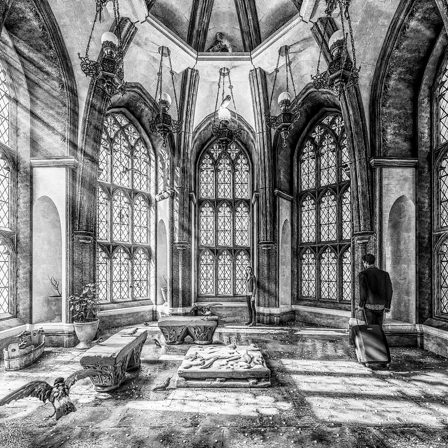
I edited one of the renders to have a black and white drawing effect and I really like it. I wish I could color it and possibly use that as a guide for the colors I’d want to use in the render. But I suck at color.
Oh. Sorry, I’m poor. That’s why I posted this in the Volunteer Work section.
Open invitation to anyone: If you can see colors properly and like coloring things and feel like coloring it however you think would look nice to you, that’s all I’m hoping for.
we’re all poor these days - it’s that old capitalism thing - i did read your post, i was hoping that you would give me an email or gdrive, dropbox etc so i can look at the file
I think only the architecture is really in that drive account. The assets are in a few other ones… or they might not have been backed up yet. I’ve gotta look tomorrow. I think most of them might be in here https://drive.google.com/drive/folders/1lq2Dp52zlgtsgTj7YN_E6bt1sFZ96khf?usp=sharing In the Virtual Museum of... folder but I’ve been having a lot of google drive headaches lately. The people are probably somewhere else in the main sketchfab folder.
i’ve just looked through your sketchbook series and to be perfectly honest, i can’t see anything wrong with the colours you’ve chosen - both the colour of the white and brown stone are spot on - the pots and the plants look fine, too - you’ve got the terracotta just right.
the floor looks a bit odd, but that might be intentional. is it meant to look wet and full of stars…
you do realise that being colourblind means that you can’t judge the accuracy of the colours, right…
This whole thing is just procrastination. I’m supposed to be rebuilding/tweaking the arch building to be seamlessly repeatable for use in another scene that I’m rebuilding for no real reason other than to have something to do. This scene is just a distraction I’m playing around with. The contents of the room are just the most recent free 3d scans I converted from sketchfab into blender assets. No real motive or thought behind them.
Yup. The people could be green and I wouldn’t even notice. My kid pointed at a the tv screen and said he wanted to watch “ogre”. Took me forever to realize he meant she-hulk. From the corner of my eye the thumbnail just looked like a generic woman. All current textures are from the original videogame the architecture came from or a pbr material I downloaded. I just have to trust the materials I chose are colored properly. I once won an art competition in highschool because I colored all the water on earth purple. I could have sworn I used a blue marker.
have you tried converting colours using a colourblindness chart into RGB or hexadecimal - for instance, the chart shows what so-called ‘normal’ eyes see, and then show what it looks like with Protanopia, Deutanopia and Tritanoptia - you can then use those values to at least get close to the colours you want - but ultimately you’re going to need to rely on someone you trust to check the final result for you.
one of my best friends is colourblind, and driving with him is always a bit of a nightmare because red light look green to him, so you have to pay special attention because he talks a lot and forgets to check the lights - how he’s managed to get to this age without seriously injuring himself or anyone else is a mystery to me.
i used to build websites, which is how i know about these things.