
I created this cherry blossom and it came out good, but I’m trying to figure out how to make it even better and more photo realistic. What things should I do to help give my environment and cherry blossom a more lifelike? I posted a pic of it and I render it in cycles.
I think it is clearly visible where the borders of your objects are. For example the river is one curve and mirrors the sky with no ripples and you can’t see the ground. If you wann go lifelike you have to watch trees yours is just bark and blossom soto speak. But nevertheless nice.
1 Like
In addition to what @Okidoki said, you could also think about adding some shadows (e.g. make the tree cast shadows on the flowers beneath it). As the mountains are the background, consider adding some atmospheric effects (fade to blue) to them. Depending on what you are going for, you could also play with depth of field in the camera settings.
1 Like
I would try to make it more artsy and model more with lighting in this one, than make it more photo “realistic”. What comes to mind compositionally is:
- Push the mountains further back to make the smaller. Mist pass will be your friend here.
- Push the ground more towards the tree, alternatively pull the camera back a bit. The subject (tree) doesn’t have to fill the frame as much as possible.
- The ground and water would then make out the bottom portion of the subject framing, perhaps with some flower, leaves, and branches foreground elements being out of focus.
- The square format makes me think of large frame, in which I would use a very wide depth of field and only let some of the foreground elements go out of focus.
- A darkened, slightly overcast sky would give an incentive to darken the mountains which helps separate the tree from the background in terms of intensity, as well as serve as the top portion of the subject framing.
- Sun beams guided toward the fully illuminated tree (sun not blocked by clouds). Shows the contrast on the now darker background and makes the tree pop more.
I had a specific photo in mind, and I believe it is Ansel Adams but maybe I’m remembering wrong. I wasn’t able to find it. I’m not claiming “this will work”, but it is what I would be looking into for a more artistic approach.
1 Like
I appreciate everyone inputs. This will help me out on what things I should work on. There’s a lot of things that I need to learn about blender but this gives me an idea on what to look out for. I’ll post my update render once I’ve made more edits on it.
@Okidoki @LordoftheFleas @CarlG
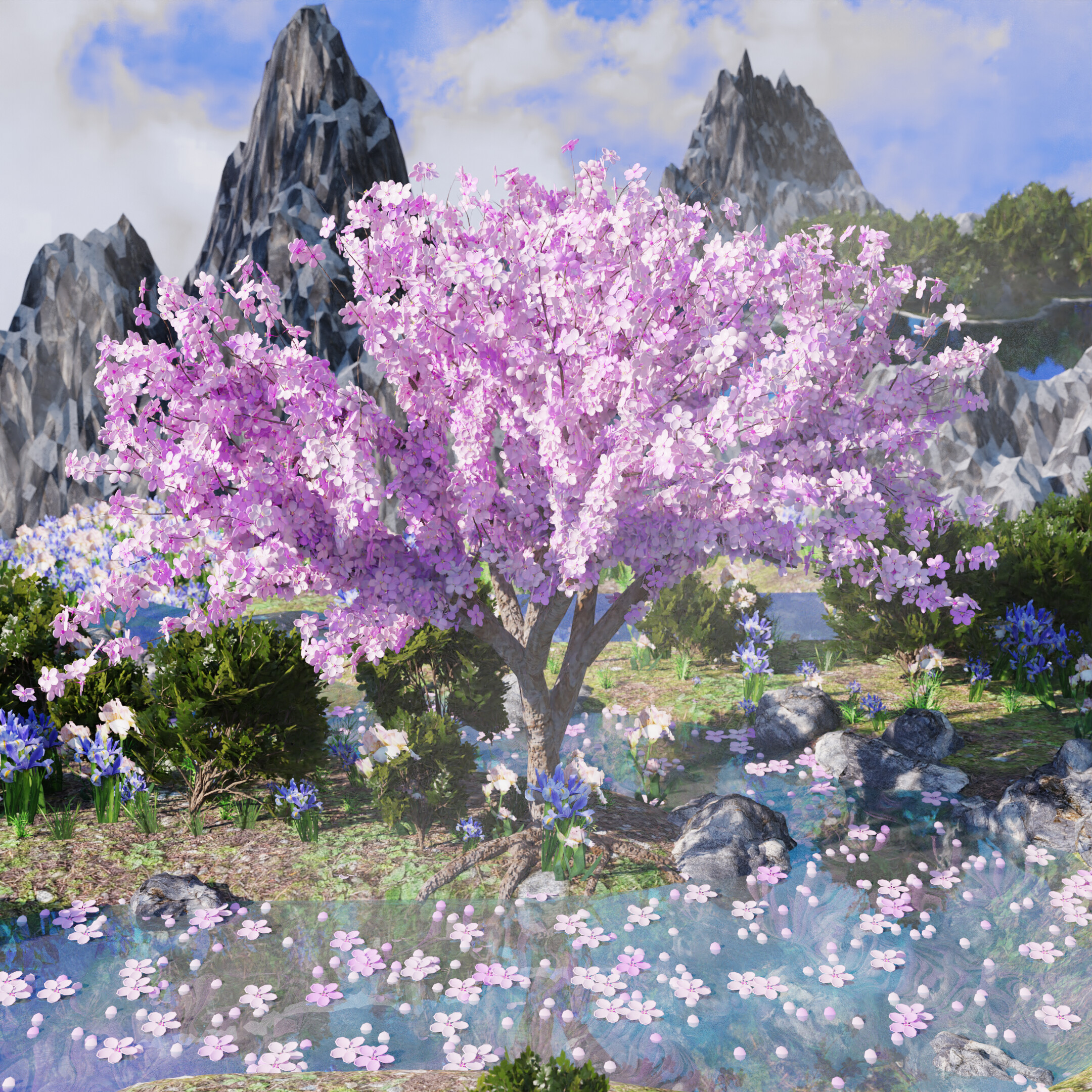
It’s been awhile but I’ve made some improvements on my last image. Let me know what you think
This really is an improvement on the original version!
I really like how the tree pops into view now especially the blossoms. There’s also a better separation between the layers now (tree, bushes, mountains), while the stream feels more integrated into the landscape. The slight depth of field really helps here.
What I think can still be improved further:
-
The tree and the bushes as well as the stones on the side of the stream (really like those, btw) are on the realistic side, while the mountains in the background are more stylized. If you are not explicitly aiming for this kind of juxtaposition, you may want to increase the detail on the mountains a bit.
-
The roots of the tree as well as the flowers do not feel well-integrated into the ground, you could improve the transition a bit, maybe by adding a bit of shadow, or darker dirt around where they touch the ground
-
The ground below the tree looks quite flat, maybe some bump or even displacement mapping could help here.
Still, all in all a much better picture!
Thank you. I’ll still be working on it and try to make the ground seem more natural
Sorry but I feel the opposite. The mountains seem more “believable”. But everything else looks like an impressionist painting.
That being said… I really like it the way it is.
Maybe consider this project “Done.” And start something new - with the knowledge that you’ve gained.
Something that I think would work much better here is: "This is a painting."
And, if you decided to take that approach, I’d say that you’ve (almost?) arrived and that you are well on your way to being #featured.
Thanks. I’ll probably consider the picture portion done for now, but later on I’ll probably revisit it to make an animation version of it in the future
Post a hyperlink to the render your talking about, I want to check it out.