
c&c plz
c&c plz
HOLY MACKERAL… how long did THAT take?
For the most part, this is awesome. Amazing work.
However, there are things that stand out as very unrealistic. I don’t know if that’s cause of the realism of the rest that is making a big contrast, but they stand out nonetheless.
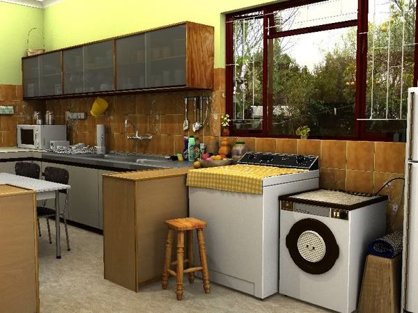
The scenery outside the window looks more like a poster pasted up on the glass than an actual outside scene.
The bowl of fruit looks more like a bowl of billiard balls.
The open lid of the washing machine looks like it’s photoshopped on. The shading just doesn’t seem to gel with the rest of the image.
There are white lines infront of the window that I can’t figure out.
I think if you fixed those issues and made a few wear & tear tweaks around (scuffs, dents, general living consequences) then this would be almost photorealistic.
the white lines are security bars, but you can’t see them in front of the scenery
the trees etc is just a photo, you are right kormiic, however i dont want to model my entire garden so any solution?? maybe just leave white?
how should the fruit look? is the shape or colour wrong?
will investigate the washing machine lid.
getting onto those wear/tear marks. still wip
thanks so far.
Could I possibly get a closeup of the fruit bowl so I can get a better idea of what’s going on?
This scene looks fantastic!!!
One thing you might try (just a guess mind you) Is you put the outdoor photo on a plane outside of the window. Then get a little reflectivity going on the glass and it might look better. (this is just speculation but might be worth a shot)
I agree that this is a really good scene. Specifically, the modelling is very nice. Like Kormiic said, the fruit doesn’t really look like fruit. The wood countertops look funky, specifically, the top border is raised on top around the edges, most countertops to not do that. Now, these next crits are made out of observation and with almost complete ignorance as to how to correct them:
The textures for almost everything except the appliances and the faucet seem to be way off. Also, the lighting needs lots and lots of work. The textures would probably be passable if the lighting were better. As for the outside scene. Maybe try placing the image on an object a bit away from the window and set up some outdoor lighting to shine through the window and reflect off the window glass. I wish I could help you with any of what I just said, but I don’t really know how to do that yet, just getting the modelling down right now.
Good scene, great modelling!
First class render. The detail is great. I presume this is modeled on a real kitchen.
The fruit is a bit too saturated in colour, which makes it look unreal.
Is that multibox down by the microwave, with all the cords running out, legal?
I agree that this is a very nice piece of work. The first thing that stood out to me was that if you are going for photorealism, the lighting needs some work (I know it is still WIP). The light in the room just seems to uniform. I didn’t get the sense that there was light coming through the window versus any light that exists in the room. It looks sunny but it doesn’t appear that there are any shadows being created by that light.
Nice render indeed!! Excelent texturing…
For my taste some of the edges are too sharp though.
Looking forward to see the final render
cya
try to put some reflection on the ground bcause the table and the chair seams to be floating, and is a bit cartoonished, try to encrease the nor of the textures
1-10 give you 8,99
i dunno, but in the US not many homes have a washer/dryer in the kitchen. seems a little outta place.
also everything is so ‘clean’. even a showroom would have a slight bit of wear and dust on it. i havent found a good tutorial for them yet, but look into dirtmaps.
I pretty much agree with what has been said here.
The lighting needs work.
You could cover up that out side image alittle
by adding shutter blinds.
Like this…
http://www.shadesshuttersblinds.com/BasswoodTapesDiagram.gif
http://www.crawfords.co.za/images/SM_defaultpic.jpg
http://www.allaboutshutters.com/images/plantation-blinds.jpg
here is latest version. no osa due to long render times 

<edit by moderator: Geocities does not allow hotlinking. Always post a separate link to the image so we can copy/paste it>
oops, exceeded limit. try this
Nice work! (Looks like you’ve been busy).
Anyway, the only crit I can think of at the moment is the oversaturated colors.
It makes look a bit “toy” like rather than realistic…and it seems to me that your are
going for realism.
The kitchen sink also seem a bit too “white” rather than brushed steel.
I also agree with the others on the lights, but it goes hand in hand with the texturing
so maybe this would be the time to do so 
plz plz higher res! I must see more!
can someone plz tell exactly what over-saturated colours means? and how too fix it would help.
i have reworked lights and have shadows now, but obviously it’s still not good enough.
saturation is how much colour is being shown. Try messing around with the colour controls on your TV, if you will turn the colour to the bottom, it will be in black and white, this is “no saturation” then if you put the colour to max, then human skin will look sunburnt and really red. This is high saturation
did some postpro in gimp, mainly some desaturation. few minor tweaks to do still then it’s finished. been busy re-rendering my drumkit so couldn’t work much
looks like photobucket made the picture low res. oh well.