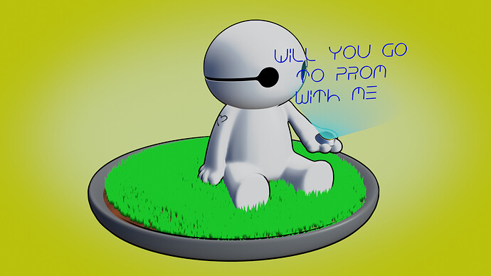
Im asking someone to prom with this render, and I need all the notes I can get. If you have knowlege of cute, Ghibi style characters, any help would be incredible. I’ve got 4 days left, and I know this is not a big thing in the long run, but it means a lot to me.
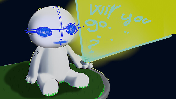
Some ideas, with a really quick and very dirty mockup…
1/ Reworked the composition, avoid having the text over the character,
2/ make the charcter look at us
3/ maybe add a mouth smiling ?
4/ darker background , so the character , text and the halo will pop up more. Here it’s a bit too much , can be reworked with better colors and a slight gradient as you did. Maybe add some stars and make it a night scene, the character is then lit by the holographic halo and the text ?
5/ less bright grass, so it attract less the eye,
6/ shadow on the grass, so the character and the grass is better integrated together.
7/ add variations on the grass blades so they haven’t got all the same colors.
Good luck, 4 days lets plenty of time to improve an image !
Let’s see how it goes and tweak that more latter !
Thank you so much for the critique! Im going to work on all of those as soon as possible
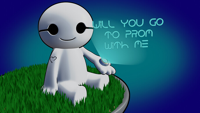
Cool ! Indeed it’s working much better, well done !
Isn’t it missing a “?” at the end of the text ?
If possible offset a bit the text so it doesn’t touch the head, you’ll get a better read for the text and the character !
Then, it’s possible to keep tweaking all the tiny details until the end of time… But maybe it’s better to send it as soon as possible unless you send it to a real CG nerd on Artstation…
Good luck !


