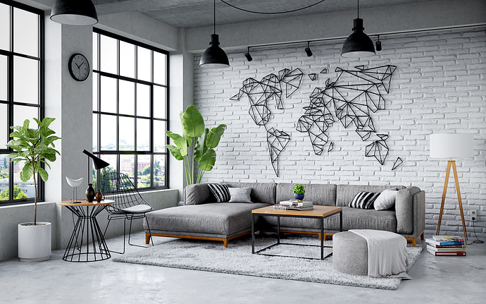
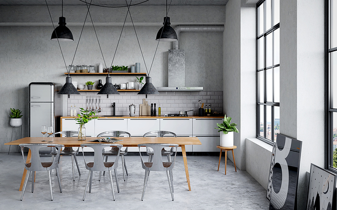
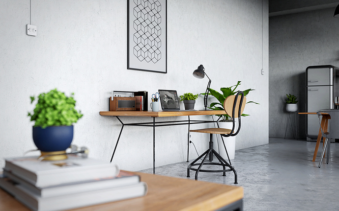
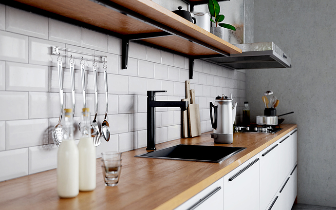
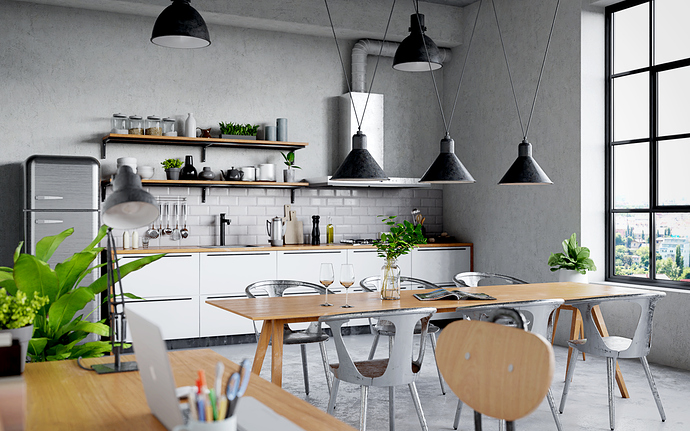
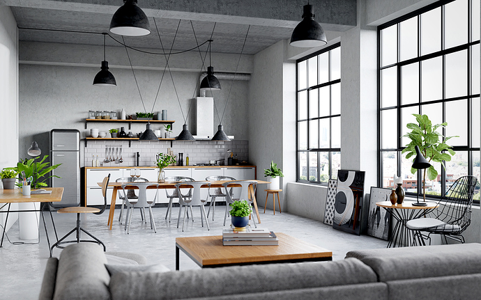
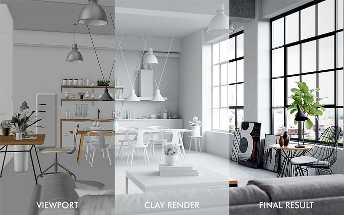
Another personal work to improve my skill. Industrial style interior made with Blender 2.79 rendered with Cycles with 2000 samples. Each image took about 1-1.5 hours. Post processed with Affinity Photo. Textures are from poliigon.com.
this is very impresiv, nice work,
Thank you very much!
Your windows look especially good, and that carpet is amazing. Adding baseboards or molding, even to modern architecture, can add a bit of realism to areas that are lacking detail. Sprinkler pipes are a nice touch too and are often seen in modern lofts like this one. I might randomize the direction of the dining room chairs a bit, they are looking a bit too perfect.
impressive works, i like them.
Thank you very much!
Thanks for your feedback!
Glad you like it!
where do you get Clay Render?
It is in the render layers tab, there is an option to override the material but hide the window glass first.
Excellent work! Beautiful light, textures, and composition. The only architectural criticism to note is that usually kitchen countertops have a slight overhanging ledge. They are never really flush as you show them in the kitchen render.
Thanks for your input!
I absolutely love your setting and the lavish detail that you have poured into the various props and so-on. However, I’d like to toss out a few random considerations, for your consideration . . .
-
“So, what’s happening outside the window?” Even if you create the outdoor scene separately and composite it into the finished image, the overall presentation would be enhanced if the exterior consisted of something more than a fog-bank . . .
-
“So, why are those overhead lights, and that lamp, turned off?” The real world is filled with lighting sources that have color, and once again “compositing (and maybe, BI …) could be your friend” in opening up possibilities for injecting both color and directional-lighting into these various scenes.
-
“Thank you, Cycles, for giving us an accurate depiction of the light that’s coming in through that great big window, but …” in any photo that you see in any magazine, most of the actual lighting sources are not physically-correct: they only pretend to be. Therefore, consider building up other (BI?) lightings for this scene, and merging(!) Cycles’ version of the lighting into it.
Great work, congratulations, I especially liked the idea of triple rendering comparison, nice visual 
Muito bom!!
Great! 


