Looks fantastic. However, I would take out the chromatic aberration you’ve got. Chromatic aberration is only good for covering up mistakes by making a render look like a poor quality photo. For an ArchViz, you want it to have the best quality possible—also, since there are practically no mistakes in your scene, there’s nothing to cover up.
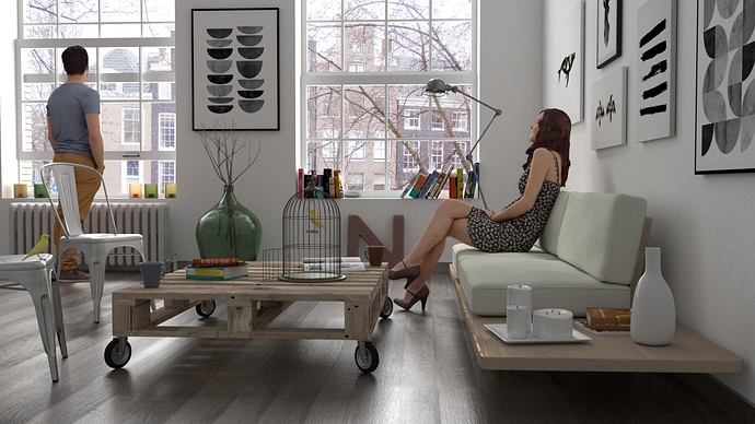
Ok this is the render without any changes nor compositing neither color correction…
and yes i mean latest ![]()
Attachments
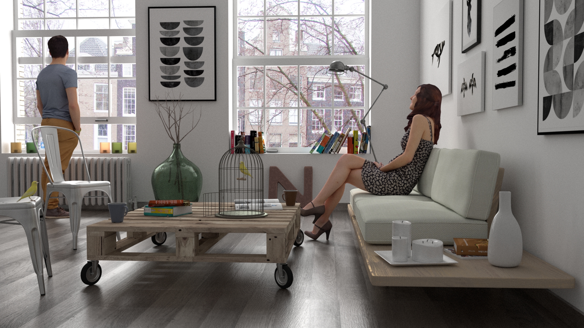
Far better!
lol, wow, I was not expecting “that”. Why did you use so many edits in the image? If you had dialed back a bit on the filtering it could have been photorealistic; I mean the filtered one can “maybe” pass a bit for it but it’s more of a “definitely Photoshopped” kind of photorealism. I think what I’m seeing and the preference for the unfiltered one is much less saturation.
Okay so setting the filtered image to multipliy or overlay with like 50% opacity/alpha, or better that over a desaturated (slightly yellow hue shift) version with multiply and alpha 25% really gets closer to that photorealistic look or at least the one from TV. There’s still something off, not sure if it’s that I’m not seeing grunge or it’s entirely something else but either way it’s good but I think “something” could use more work.
Thanks for images; by the way, how long did it take for you to make the scene and models/textures/etc?
P.S. Here’s a link of the imageI was talking about.
yes also the original image was good, but while playing with compositor came out that light effect and the render appear to me more lives and interesting so i decided to use that. Also in the real photo i prefer strong effect of light… ok is possible that i have exceeded a bit but is a matter of taste i think.
Ooo my Ji. I love it
really real feeling. But I think the man and the woman, especially the woman seems to be some bigger
5 stars man!
Great!
Cheers
So what tool did you use to produce a “clay model” of this … obviously … real … :eek: … scene?

Looks good, congratulations
Very nice I like it
This looks amazing, the characters look great! Only thing I’d comment on would be that the light effects on the floor are a tad excessive. Also, you’d think the sofa is really uncomfortable since she is barely touching it! A more normal sofa would give a lot more. Keep up the good work!
Wonderful.
Very beautiful 
The integration of the poeple in the scene is stunning. Incredible render !!
How did you get the chromic aberration around the people and objects? Very photographic.
its Cool. awesome work
Thats just truly amazing, congrats my dear sir !
Fantastic! I, too, feel the light effects on the floor are a bit excessive, but it looks great and maybe that’s exactly the kind of glow and light you want, in which case, great!
Yes, the female looks like she’s sitting on a hard bench. If you could model the cushions to be indented and rippled a bit under her weight, and sink her down onto the cushions a bit more, she’d look more natural as if sitting comfortably. Right now, it looks like she’s a bit uncomfortable.
only just a little of lens distortion in compositing