Interior lighting challenge

Hello,

This post is more of a discussion starter rather than asking for an exact solution. At the end of it all, it’s just something I’ll need to experiment with. But I am interested to hear what people’s ideas for a lighting setup would be.

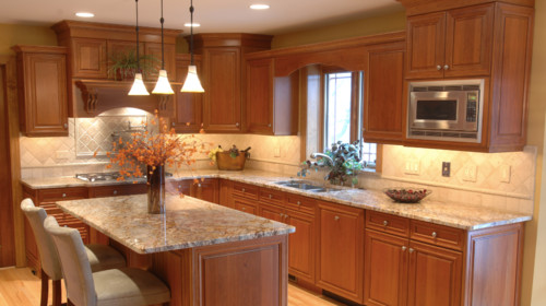
I’m modeling a kitchen and getting a lot of inspiration from houzz.com (a GREAT site for references). My goal with my kitchen scene is to try and emulate the lighting setup as you see in the photo - a combination of natural and artificial light which tends to illuminate everything at once. There doesn’t appear to be a focal point, but rather having the viewer “take it all in”. I think that is the intention with this style of commercial photography. I don’t know how something like this would translate in 3D, specifically the lighting. Or is it even possible?

A lot of the tutorials I’ve watched and other things I’ve researched usually have more ‘artsy’ renders, and thus a focal point. Those just seem a little easier to set up.

I’d imagine there would need to be some post processing involved here?

Anyway, looking forward to hearing some thoughts.

Photo by Floyd Builders, Design & Consulting, Inc. - Discover kitchen design ideas

The thing that jumps out at me first is the color of the lighting. You have cool toned lights coming in the sink window and an off frame window to the right, this balances and contrasts with the warmer pendant and undercabinet lighting. Since there are so many sources of light in this scene, you could also get away with adding in some AO based fill light (.1-.2 brightness)

The post pro will help to soften the edges of your light sources, like the hanging pendants.

Also, make sure to use reflections to tie the lighting together. The glint of the pendants against the microwave help to connect everything in the scene.

1 Like

Thanks for your thoughts! When you say AO based fill light, I think I do know what you mean, but unsure how to implement in Blender. I guess what I mean is, I know where to flip AO on and adjust, but it’s the “fill light” part I’m unsure about.

just these settings here:
image

Enabling this helps to fill in some of the light without needing to calculate a bunch of light bounces.

1 Like

This is interesting, i’ve been doing interiors in blender for a few months now and it’s hard to get the lighting like this! What I’ve found best is to try to light the scene “naturally” as much as possible using HDRIs and sun lamps/big mesh lights and then add in the artificial lights to fill in the areas that are still dark. But it’s mostly a case of doing lots of tests and changing the brightness of everything until you find the sweet spot.
But I’m still new at this so maybe there’s a better way!?!?

1 Like

It’s a challenge alright. As an artist, I’d like to ignore the technical aspects of CGI and just get to the good stuff. It’s overwhelming, but I know it’ll make for better renders, and better art.

Yep, HDRI’s are definitely a must. Thank goodness for freebies. These types of images are hard to make, and it’s understandable why.

Here are at least a few other things I’ve learned.

  • As already mentioned, use of HDRI’s. I recently found out they can be rotated in order to adjust the light, and even be combined with other HDRI’s by way of gradient transitioning between 2 (or more probably) images. So, get a sky map for natural light coming in, and combine it with an interior environment light and angle it towards the scene (as in, through an open wall).
  • Use the FILMIC setting. I guess this is a godsend when it comes to dynamic range. I haven’t used it to its full effect yet, but am eager to. Essentially it allows you to really crank up the energy of lights without blowing out, or washing out, high values. And it negates hotspots.
  • Use of “portals”. You set up an area light in a window, select “portal”, and scale the dimensions to roughly the size of the window. Selecting portal effectively makes it not a light (clunky explanation). But instead, the portal helps “pull” the light through the window opening. There’s my very non-technical explanation.
  • Use of the de-noiser feature.
  • Lastly, as SterlingRoth suggested, the use of AO fill lighting (ever so subtle).

I’m sure there are plenty more things, but this is what I’ve recently discovered anyway.

2 Likes

How so? I usually settle for sky texture and sun lamp as they (to me) clean up faster.

My additions:

  1. Render out the two lighting styles in passes and just add them together in post. That way you can control their coloring and brightness separately without rerendering. Tiny spotlights and big environment light rarely mix good: for test, just try small and big area lights mixed together. Be mindful on self emitting stuff, such as the LED in the microwave here, you only want them visible in one of the passes.
  2. Hanging lamps (and possibly ceiling spots); make sure the shade itself is the actual emitter rather than basing it on retransmitted light.
  3. In some cases, I prefer to have a massive area light do the diffuse lighting for multiple light fixtures, and have them control glossy only.
  4. For the hanging lights, I would add spot lights to simulate the spot/falloff rather than physically accurate.
  5. The AO trick can be utilized by the simplify menu; it’s super useful for quick(er) testrenders, for finals you either turn it up or off.
  1. I’ve been told I’m wrong, but I get the feeling I get less competition for sampling unnecessary surfaces if I turn off MIS for dark materials and objects that doesn’t contribute much to the light bouncing.
  2. If you have big highly specular surfaces that would bounce light specularly (such as the table tops), energy will be lost if you turn off reflective caustics. To counter that, I tend to use a “if seen by diffuse surface, reflect as diffuse” setup using light path node. I won’t be “correct”, but it prevents energy loss.
2 Likes

Couldn’t tell ya, honestly. Just parroting what I’ve seen/heard/researched. But you actually bring up something else I’ve been struggling to understand. When you say sky texture, are those not HDRI’s? Is that the same as a sky map?

Would that be in addition to an emitter then? And by having them control glossy only - I guess I’ll have to research that. Not sure what that node setup would look like.

Thanks for all your suggestions. Certainly gives me a lot to look into.

Try doing this in … Blender Internal. No, I’m serious.

The lights here are obviously very directional – notice the chairs beneath the countertop – and there are a lot of them: an array of actual light-fixtures in the ceiling in addition to those under the counter, over the stove, and three accent-lights over the counter. Strong and definite shadows are visible next to the door at eight-o’-clock in the frame. There’s an off-camera diffuser reflecting light on the front of the counter, and outside light on the right counter beneath the microwave. The temperature of these colors also varies quite a bit. Most of the illumination is probably coming from that array of ceiling lights. There are certainly work-lights underneath all of the cabinets.

To my eye, this would not look good as “the usual Cycles render,” with hazy light that seems to come from nowhere at all.

One pragmatic BI trick that I might use here is the shadowless light-source, followed by shadow spotlights which would allow me to place the shadows and to set their intensity exactly as I wanted them. Many objects in this picture don’t cast shadows at all, while the most noticeable shadows are next to the door and upon the surface of the chairs. So, inject shadows precisely where you need them.

1 Like

Pretty brilliant actually. I’m going to try this out.

I think it’s worth pointing out:

  1. a lot of these kinds of commercial images are not really intended for consumption in the way that a lot of archviz blender artists want their images to be consumed.
  2. Many of these images are not created by professional artists/photographers. A lot of real estate photos are taken by the agent on their iphone with whatever lighting happens to be there at the time.

Things like Houzz are used a lot by real estate agents, home stagers, interior designers, etc… Yes they are used by the general public as well, but it is far better for a contractor to catch the attention of a real estate agent who can give them steady work rather than a random homeowner who may have one or two jobs for them over the course of a decade. As such the images are trying to show everything at once - every detail of a chair, every cabinet in a kitchen, every granite countertop. They’re objectively just not very good images, and I would not strive to have my archviz look that way (of course this depends on your audience, but it seems most of the Blender community wants to have images that are appealing to the average person).

When I do archviz professionally, the question I am usually asking myself is “what mood am I trying to portray?”. Then I work backwards from that - orange light vs blue light, soft vs hard light, materials, focal points. It’s ultimately a stylistic choice, but for the kind of work I do I tend to stick around warm hues and softer lighting to give that home-y feeling. Very rarely do people care about the bumps in the flooring or glass refractions. I wish I could show some examples but unfortunately I’m professionally prohibited from doing so.

Again, this all comes down to your audience. My company works with homeowners, so we focus a lot on lifestyle and how the design will make their home a nicer place to live. If you work with a property developer or real estate agent, you may instead want to show off materials in a way to demonstrate raw monetary value.

Edited to add: As someone who works in archviz, I’m often bored to tears by archviz images. Look towards film instead. People don’t remember their favourite real estate image, but people will talk for ages about their favourite Wes Anderson interior scene.

1 Like

@octopuscats - Spot on. Great information. I hear you completely, it makes perfect sense. I don’t think I have any reason to re-create the above photo other than for practice, or in the rare event somebody would want a light setup like this. I struggle with deciding on a direction to take my CGI, whether to be a generalist or have a specialty, or audience.

And great tidbit about looking to film.

The sky texture node. It’s not HDRI as such although I set it to high strengths. It doesn’t contain localized light locations so it is easier to sample. Maybe HDRIs are good, but I memory wise I can’t afford to set the high map size required, which may be the reason I need way more samples to clear it up. I only add sun lamp to sky texture node if I want direct light (tiny very bright sun, or big dimmer sun for more cloudy conditions - I can always use any HDRI/Backplate I want for the camera).

I think that you will inevitably be more of a specialist, in something, than a generalist, in everything. You do need to know how everything works together, but real-world CGI projects are very labor-intensive undertakings that inevitably involve a lot of people who “have a knack” for this-or-that part of it, and who enjoy doing it while others don’t (so much).

I’d like to see you realize something like this scene – and to use BI to do it. I think that its approach will be very well-suited to this scene and its lighting structure.

What I get rather bored-with is … “Cycles interiors.” Soft, pasty-looking, utterly-boring light that “comes from everywhere, and nowhere.” Real photographers spend a lot of time with reflectors and with directional light sources to achieve their results. (Also bear in mind that this particular scene obviously has some auxiliary light-sources which do not appear in-frame: you will need these too.) I’d say that a professional photographer did this shoot.

2 Likes

This is a big reason I like looking towards film, and have picked up photography as an infrequent hobby. Every second of a film is shot in a very deliberate way, and thanks to (or because of?) the large budgets directors have no problem reshooting the same ten second scene over and over for a twelve hour day to get the perfect lighting.

As an aside, I was watching some video with Simon Pegg commenting on his most famous films. He explained in one of his films he watched himself become a father from one cut to another. One day they did a shot where he had to knock on a door. Then he took a 6 month hiatus as his wife had just given birth and he had some other projects going on at the same time. The first shot they did when he came back was the other person opening the door he knocked on, so what was less than a second in film time was actually over half a year in the real world. That’s a lot of thought and planning that went into something a lot of people probably never thought twice about

Anyways, don’t look at arch viz or real estate. That’s where you get all these boring interiors - grey counter tops and beige carpets and white leather. Kill me. Look at film, look at photography, look at art history. Find the styles you like and what you like about them. I’m personally a big fan of tenebrism and romantism - very dramatic, strongly lit paintings. Not saying you have to have pitch black in your work, but try pushing those boundaries and see what happens. I usually go to the extreme and work backwards.

https://postmediavancouversun2.files.wordpress.com/2018/04/caravaggio_judith_beheading_holofernes-jpg.jpg?quality=80&strip=all&w=840&h=630&crop=1

1 Like

A world-famous photographer, Ansel Adams, condensed (film …) densitometry into an easily-digestible “zone system,” which applies to video (“additive color”) just as it does to photography (“subtractive”) although in a different way. The histogram tool should be your bestest friend, because it can quickly tell you the distribution of light-vs.-dark both for the scene overall and in any of the RGB colors.

The human eye scans a scene, adjusting the iris constantly, and assembles “what you see” in the brain’s visual cortex. You can perceive over 20 “f-stops” of light-and-dark. Neither video nor printing can come even close … ± 4 stops or so on a good day. So, you have to closely adjust the tonal-range of the finished output to effectively simulate what the eye would see in the actual scene, when the eye views that render or photograph.

I sometimes(!) use Cycles to get that “beautiful, even light,” but I also combine it with BI renders to get that “strong, directional lighting” ==and== to calculate where the shadows associated with those lights will fall. In post-production, data from the both image sources can be combined in “the perfect digital darkroom.” (For instance, add those shadows and maybe tint them slightly [blue].)

Ansel himself famously observed that, while a (film) picture is captured in the camera, it is made in the darkroom.

This is why I smile just a little when I hear the words, "photo- realistic." There is no such thing. A good photo isn’t realistic at all – it just looks that way, given the tough physical constraints of the medium.

O. Winston Link produced a series of photographs which captured the dying days of the steam locomotive days with stunning photographs – and he did it with flashbulbs. He meticulously calculated the light levels that would appear throughout the scene, and he documented his laborious but very successful methods and criteria. (In the image that I linked to, specifically notice the movie screen, which was a photographic composite. He engineered that, too.) He had only one chance to get it perfect – and, he did.

1 Like

Your insight is wonderful! Thank you!

@CarlG

Hi again :slight_smile: Just now circling back to this, but I’ve been meaning to dig in deeper into your suggestions.

So what you said above, I’m having trouble figuring out how to set this up. I guess my main question here is how to have two lights (area and emitters) affect different properties of the same object. Just for example sake, let’s use a counter stop with a glossy surface, and light pendants hanging over. Is this something I control in the countertop’s material nodes?

EDIT - Just found a possible answer. I’m probably needing to look into light path nodes?

Lamp objects: Doesn’t support light path node wrt visibility. They can only be controlled with the object/cycles settings visibility controls, but these lack the refinement the light path node offers.

Emission mesh lights: Does support light path node wrt visibility. Although object/cycles settings work, I tend to use light path so that I can enable seen by glossy or seen by singular; i.e. for camera and singular, I may use a lower light strength (in addition to using gloom) to avoid aliasing stepping from bright lightsources and their sharp reflections, whereas for rougher reflections you wouldn’t see them anyway because they are already blurred.


In the image I have two lights; blue area light at the right which have only diffuse activated. On its left is an emission mesh light whose emission shader is active only for camera and glossy rays, also the camera ray is weak (no stepping aliasing) whereas the glossy ray is strong (heavy aliasing stepping, emphasized for this purpose, bloom would also be helpful). The ground rectangles is a grey diffuse with a sharp glossy via high fresnel.

1 Like

@CarlG - Thank you so much for the explanation! This helps.