These interior scenes are pretty popular, and I decided to do one (working through a tutorial) to practice various skillls I’ve been working on lately. This one uses a photo ref and I’m pretty sure the perspective of the furniture in the room is different from the perspective of the room itself. I used fspy for the room, and appending a bit of furniture (from BlenderMarket) didn’t match the reference. This is not the first time I’ve noticed this in interior scene reference photos, and I’m wondering if the photos are actually comped. In a previous example I saw that lighting was quite different too, as though the furniture was shot in studio and comped into a room with a more homely vibe.
Anyway, I’m following Andrew Price’s tips on reducing render times, with some other approaches to lighting that replace indirect lighting (or most bounces anyway( with a few area lights). Plus portals at the windows of course.
Actually another thing that makes me think the reference is comped is the bad design of this room. In the photo the ceiling fixture went all the way to the far wall! Would be a bit hard to get from one side of the room to the other. Also the space is far too small for use as a lounge and dining room. I’ll probably make it a bit larger before doing too much work.
Some other changes I’m making from the tutorial:
Model in (Maya x) Blender, sculpt in (ZBrush x) Blender, texture in (Mari x) Blender, render in (Arnold x) Blender, composite in (Nuke x) Blender.
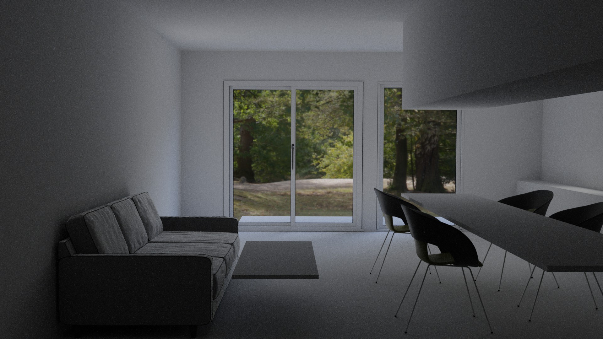
Just blocking out at the moment. Chairs and couch are imported so have some textures, rest doesn’t. Big widow by Archipak. HDRI from the wondedrful HDRIHaven.
For those who are interested in such things, render time in Cycles was approx 6 mins at 256 samples.
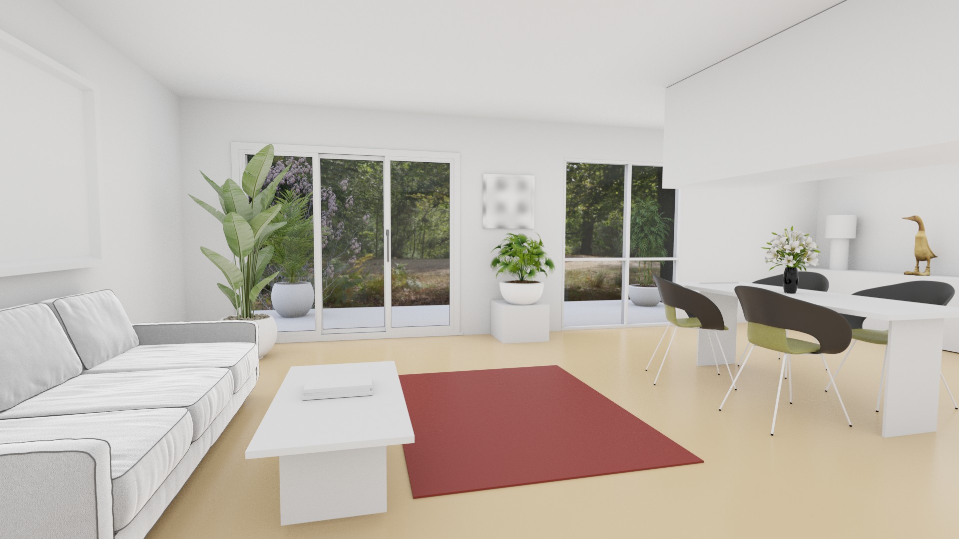
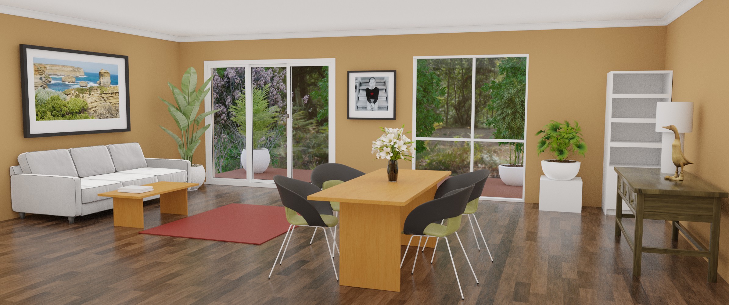
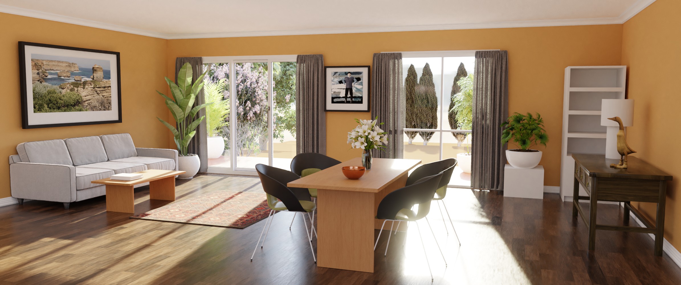
Some renovations, some props, some basic materials.
Time to start on the details. Might be a while before further updates.
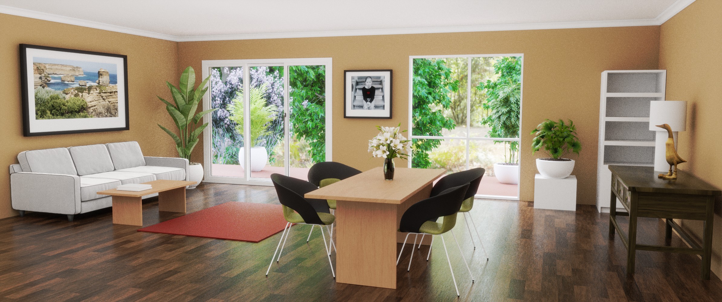
Different point of view, different lighting, a few more textures and minor renovations.
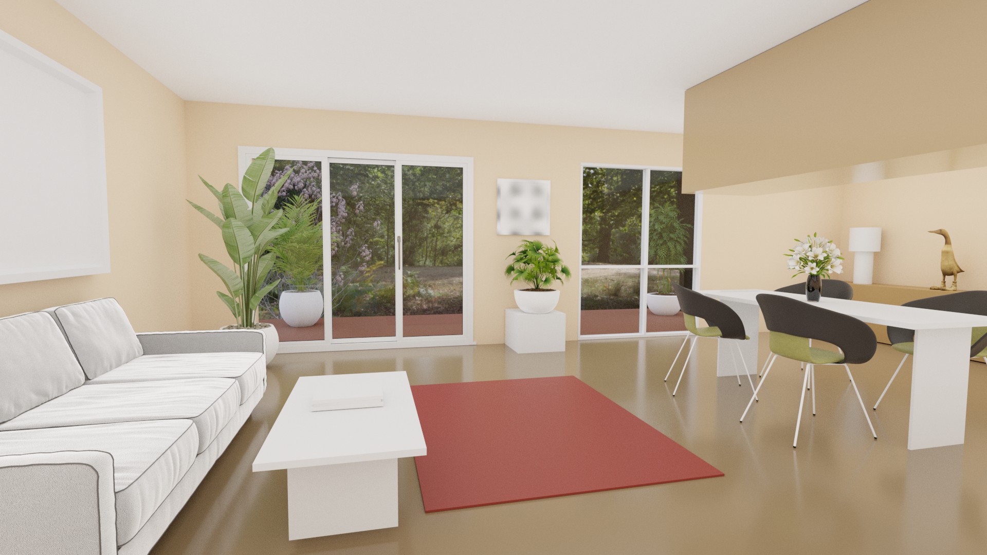
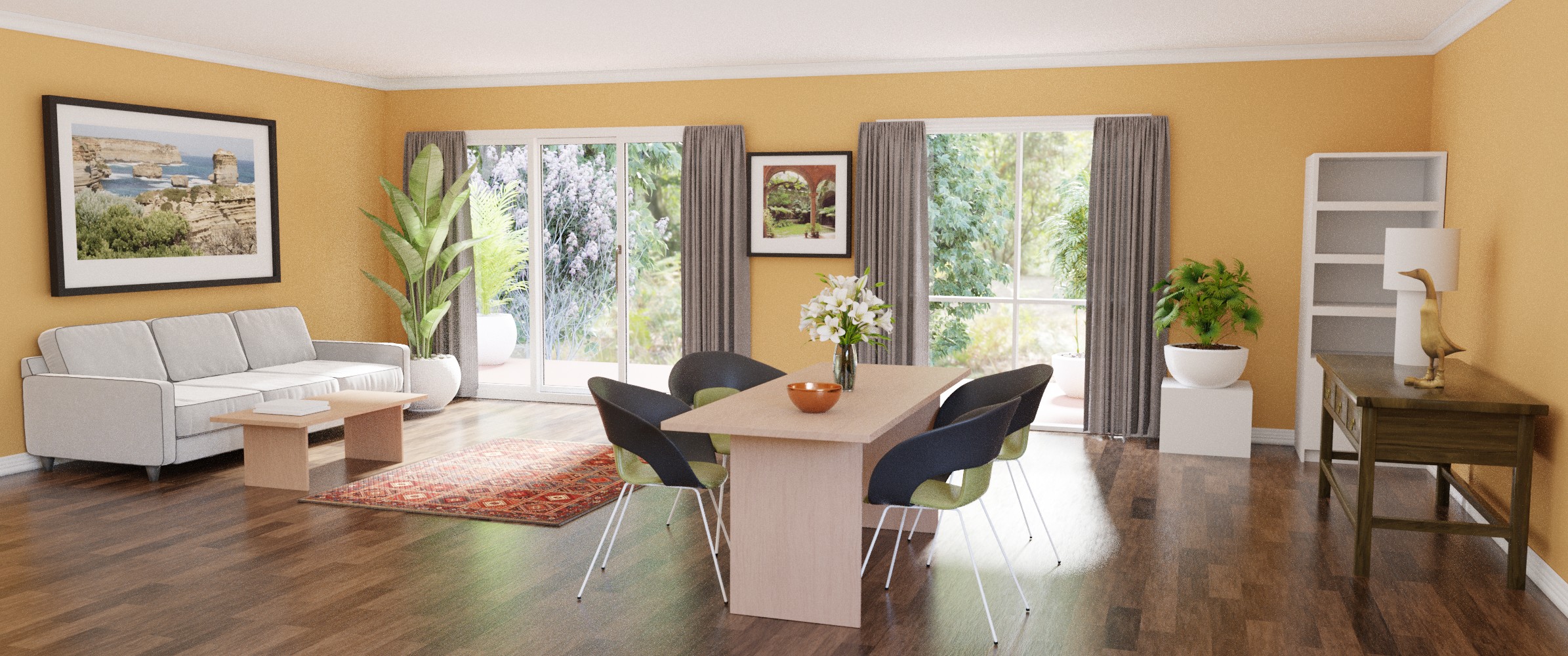
The forum software is suggesting I edit posts rather than add new ones, so here goes. Added some ceiling cornice, still to do skirting board and architraves for the right window. Used curves for profile and path. Also found a couple of images for the pics. Might change them later. Also that ceiling fixture was annoying me (from the original reference photo) so I decided to let it go.
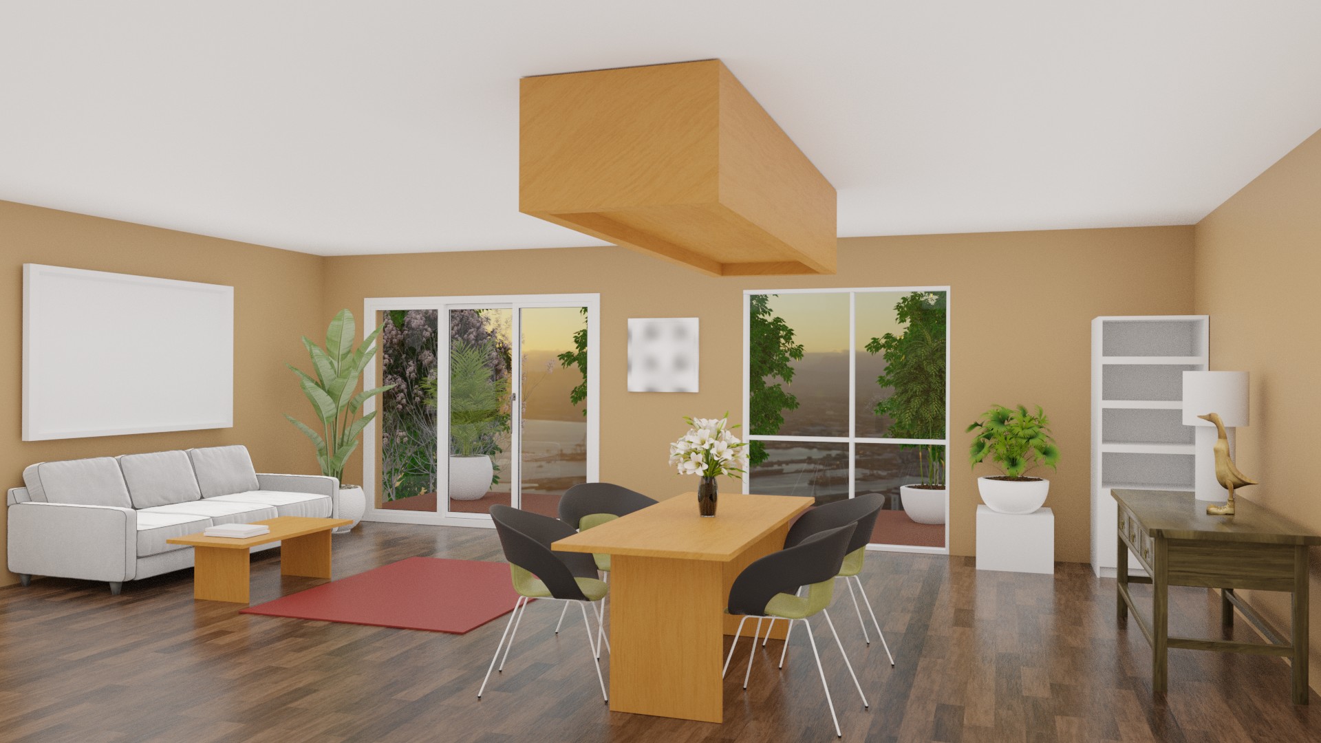
Nice work, but in my opinion, the scene is too bright. It feels a bit like the entire room was in a light volume. To me, the first render lighting was more convincing 
Keep it up
Thanks  I’ve actually got the same light setup I used at the start (an HDRI with light portals at the windows) but the windows are quite a bit bigger in later versions, which I guess is what is making the interior lighter. I agree that the first one is a bit more moody but I don’t know how to recapturre that without making the windows smaller, which I don’t want to do. Maybe I can scale down the light portals.
Compositor to the rescue (and dialling the sky up to 10):
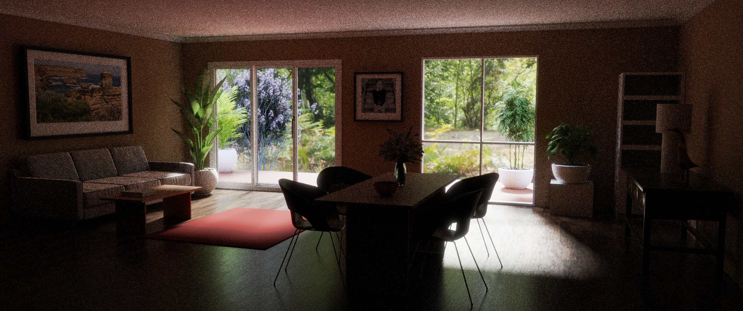
Looks like I’ve been making a big mistake with my lighting. I need to refine my understanding of AO. I’ve been trying different approaches to interior lighting and they seem to be conflicting with one another. Here I’ve disabled all AO and the scene is, obviously, much darker. So, how to deal with this in a realistic way? Using AO is not realistic, nor is using area lamps. Turn up the bounces? Maybe I’ll try that. More windows (out of frame)?
Basic structure done, now for the details. A touch of AO was necessary. I tried particles for the rug but Blender crashed.
I thought denoising was on by default, but seems it isn’t. So here’s a cleaner render, without requiring too many samples, and just a touch of AO. I think I’ve solved my lighting problems, now just need to add some extra props.
Nice ! That’s much better ! I like the dark noisy one though  Well, without the noise of course ^^ But i find the mood pretty cool