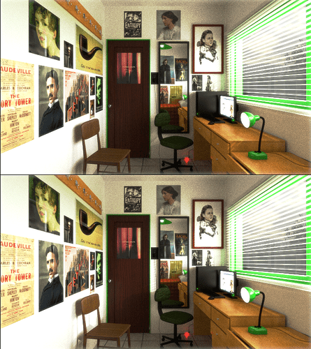
I fixed some things that were wrong in the last render, like the left side posters, the size of some things and a couple of materials. I also added a little glow in compositing so it doesnt look too crisp. I am not sure if changing the direction of the sun lamp helps, I wonder if somebody could help me with that, also if you notice something that could be improved, dont keep it to your self. the final render will have more samples and twice as resolution. also, again, the pictures on the posters are not mine, they are CC. if you own any of the images and dont want them there dont hesitate to contact me.
Looks pretty good but there are few things I feel are missing or could be improved:
- Windows sills and frames.
- Plants in the window.
- The door is very thin, this might be intentional, kind of hard to tell.
- Skirting along the walls where they meet the floor.
- Some sign of how the posters are hung (tape, nails, etc).
- Keyhole for the door.
- The door handle feels very low, raise it up a bit.
- Add some papers and clutter to the table.
- Mousemat
Good luck!
The super skinny door as mentioned before but also the direction of the swing (pretty much all door open to the nearest wall). No switch by the entry, I see there is an outlet, which is very out of place and at an odd height. (Sorry, I’m an electrician I notice that kind of stuff.) The “fold” texture you used on the posters is way overused, seems like every one has it, posters come rolled in tubes to avoid creases I’d say keep the creases to the smaller ones that could have came out of a magazine possibly. I’m guessing that is a coat rack above the posters? First off it’s way too high to be used, also it seems to long for just a single bedroom. And why two chairs, seems like clutter in an already cramped room. If this is a bedroom, where is the closet. Also back to the posters, I know some people are anal retentive, but every poster is perfectly level. Lastly, the whats with the bright red light down by the rolling chair? It’s super bright to the point where thats where the viewers eye is drawn. And also the stuff that Nosslak pointed out. Keep up the good work though, your textures are great and properly sized and your lighting looks great.
good critics! funny about the door, is the same size of mine, I guess I have a very odd door. the lack of a closet is intentional, that is the reason of the other chair and the long coat rack. will be better when I add clothes to it, first I have to make them. I dont know how does look a rolled poster, mine are all folded because I moved several times, besides they look more interesting that way. will try to change it. every thing else will fix, or at least try.
keep up with the critics, its good to know those mistake that I cant see.
