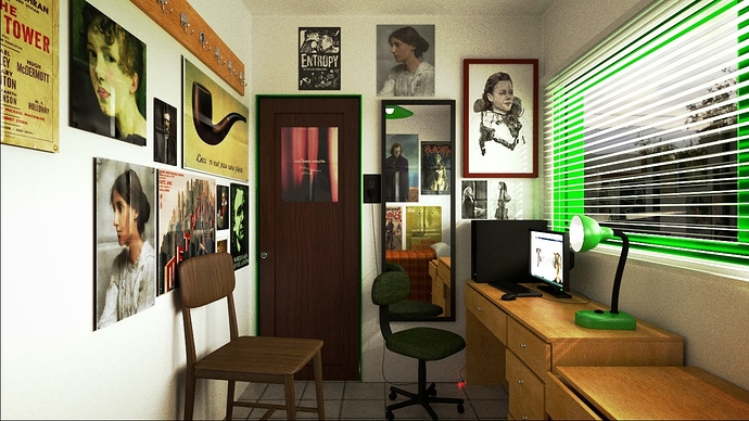
so, This is my first serious render, is a humble bedroom of an literature student that I created in a story years ago. first things first. keep in mind that the scene is meant for a character that is poor and depressed. I will accept comments like that chair shouldn’t be there or you should put that poster out of the way, but not something like, your render looks poor and depressing you should do a lounge room with fancy furniture. second, please, I want constructive critiques, if you say that the render sucks because you dont like office chairs or you love it because you like poe, I am not going to take it serious, read the sticky in the subforum. and yes, I know it can have more samples, I will work on that. I can see that te lamp is a little too big, tell me if you agree with that. and the computer plug is to little. the images in the posters are Creative Commons and I didnt do them, and neither saw those movies, just searched for CC to replace copyrighted images from movies I liked, if you own those images and dont want them there, do not hesitate to inform me, also tell me if you own some cool images that I can use you are welcome to send them to me. besides that I invite you to go nuclear in my work, I want to know if something is wrong and I cant notice it, I will do everything within my abilities to fix it. already satisfied, Turkheim.
lamp base definitely looks big, compare it to monitor base even with perspective. Hiight at left wall feels a bit too bright considering sky in window.
Something that looks out of place to me, is the scaling of the two chairs relative to each other. But it is nice first render for sure.
harleynut97 I didnt notice that, thanks
storm_st you think that will be fixed if I brighten up the sky, Is just a picture that I put behind the alpha of the actual render, or is the render inside the room the one that is too bright and I sould bring it down
you used the one picture with the girl twice. The one at the front wall looks like a poster. We can see that it was folded once. And on the left wall we see the same picture like it is printed on the frame, but one can still see that it was folded before. Another thing thats “disturbing” me is the green glare around the door frame. But all over all it looks nice 
MarkusB, I noticed the girl when it was too late, the one in the left wall is also a poster, but I moved away the wall because reasons to long to explain, I will fix that. the door frame is green, its not a glare. I think It is a very thin glare, I think I can work it around.
