Well, I never thought I would bring the project up again but I did.
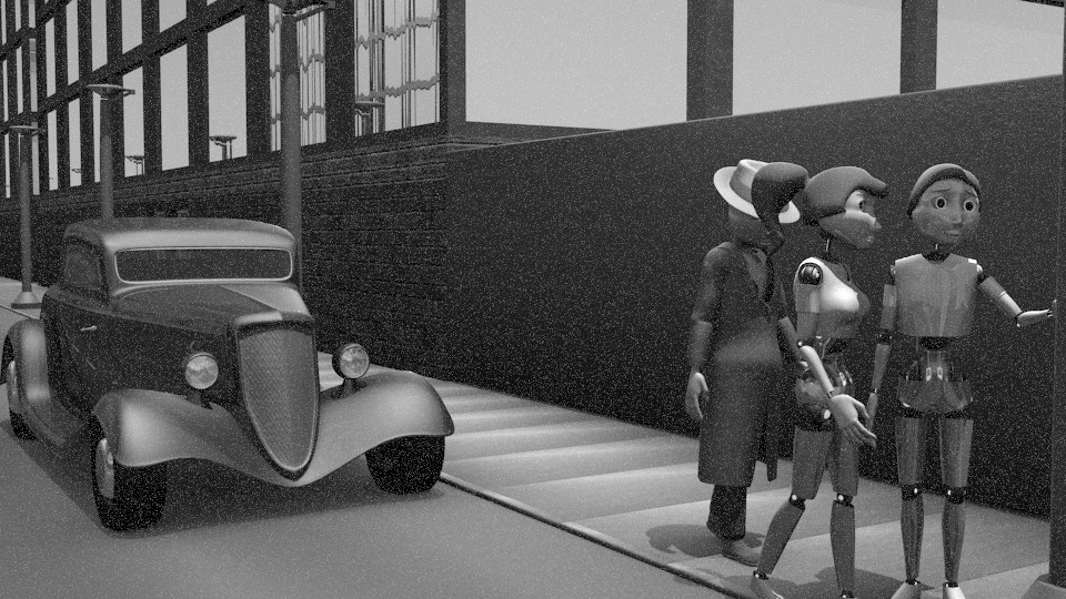
For those of you who don’t remember, the IR3 short originally used to be a sort of montage depicting two robots that have a core inserted designed for emulating affection between other bots with the module. Likewise, the “father” of the female robot was following the two bots around a countryside. Most will remember that the female robot was my major robot character, A132. Likewise, the father would be my alter ego: James Frendin Robot.
because of the cheesiness of the last storyline of the Short, i’m working on changing it up a bit. But as for now, I’ve made a little progress on James.
Took a bit of a while to model the fedora off of my own but not so long that i am up too late (2 AM is not late for me. 3 is).
Im also debating whether i should make the character wear the hat tilted or not. In my author pics i always wear it tilted because it somewhat conceals my own identity. But the character looks nothing like me and thusly its debatable on that fact.
A132 is obviously going to be in this (otherwise my pseudonym wouldn’t. After all as the story goes, my alter ego is her adoptive father).
in the short, she won’t be wearing the dress attachment. If she will, it’ll likely be towards the end.
same song will likely be used.
though i did tweak it a bit so that some instruments are more prevalent (and i got rid of that hideous sounding hillbilly drum in the end and replaced it with a loop).
anywho. Im hoping this’ll get done since Nina is ready for rendering. I’ll be updating as much as i can when i can.
Enjoy!
T.F.A.F.T.D. And all associated characters are copyright to James Frendin Robot, Brandon A. Nolan, and The Zealous Knight (Zelous Moore Knight).
A132 is copyright to James F. Robot and associated with TFAFTD.
Did a little bit more work and am thinking of maybe altering the story a bit into a more storyform. Likewise, the score will likely change to make it a more cinematic form (though I’ll probably include the original as a song played by a radio in a city).
I decided this after thinking a bit back to a Disney short I watched not too long ago called Paperman.
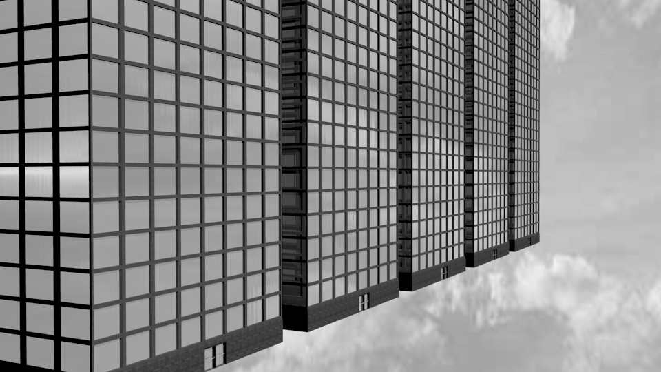
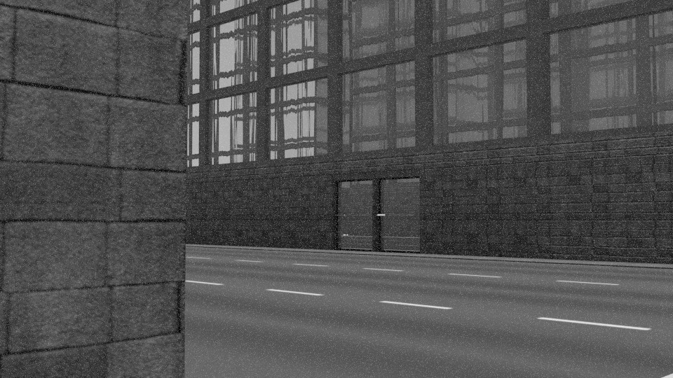
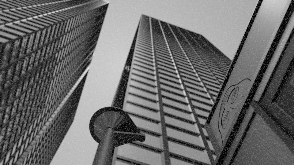
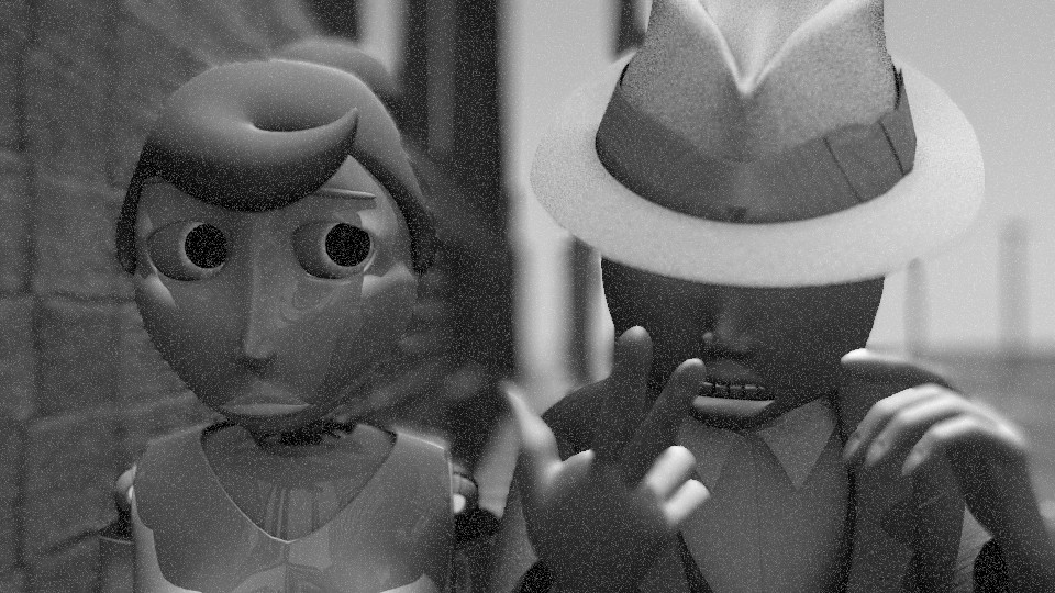
Some work on the city. Also experimented with a rendering style and have decided to make it look somewhat like an old film (even though the story is set in present day united states).
Likewise, I started work on a diner for the first scene. It’s supposed to be a typical 1940’s design (Because I like the 40’s :D).
But again, the story is not set in 1940. it’s set in 2012-2015 ish.
Looking more and more like a professional project as time goes on (ish). I adjused the lighting so that it was more suited for outdoors light levels. also put two of the characters in to test the scene a bit.
It’s kind of an attempt to mimic old film (which is turning out kind of nice in my opinion as far as that is concerned) . Although the noise could be toned down in visibility.
One thing that I would like to commend on is the layout of the HUD display that the robots are looking through (assuming I have this right…). The details on the right side of the HUD are great, they are meaningful and help tell part of the story. The robots need to be concerned with their battery levels. There is an identification element as well which is interesting. The items on the left side look like random tech-detail, which isn’t working as well. They feel tacked on like space fillers. If these had the same sense of purpose or could help reveal details to the viewer about the story then they would be more successful. Try to come up with some relevence for these or drop them from the design. The reticle in the middle of the screen is great, and works well. It goes a long way in accomplishing the job of showing the audience that this is ‘robot-eye-view’. This means you may not need as many other details around it.
I also agree that the noise is a bit too much. I bet if you saw this moving you would find that it was very overwhelming. Tone it down by about half, and apply some degree of depth of field, and these stills will be great.
I do have DoF in there (just on a farther focusing distance, the DoF isn’t as visible as needed). And thanks for the tips on the HUD i thought they were a bit on the awkward side.








 Can’t wait to see it finished!