Sorry, I was trying to imply that the best that can emerge is that there is a clear understanding among the culture, and that work is done to properly divide the display referred operations away from the scene referred. In Nuke for example, as Organic cites, there is a simple toggle, with scene referred variants by default.
This can happen. If you read the mailing list going back nearly a decade now, you will see that there has been long-standing confusion on this front.
Filmic was an attempt to put these issues front and centre, while also providing a kit that helps to elevate the work folks are currently doing without being too intimidating.
Another key point is that Filmic was designed to get people talking. So ask questions. More than a good number of people are well equipped to answer the questions. Everyone benefits.
Good steps, thank you for your great work! Question regarding the interface, any chance to replace the contrast settings by values/sliders for unlimited artistic control? Corona VFB does this nice with seperate control for filmic highlights and filmic shadows, contrast and saturation values, custom LUT, Highlight compression etc.
The reason is that it doesn’t really work well for animations and such as you need a constant view. You need a fixed middle grey (note how 0.18 scene referred is always pegged at 0.5 display referred via the transforms?), a fixed dynamic range, and other details. It also makes it very challenging to adapt to HDR10 output with a mangled set of scene referred ratios. Finally, the whole thing gets much trickier with wider reference space primaries. All things coming soon…
Feel free to experiment with a single CDL to adjust for a grade. You might be surprised how much you can tweak with a single CDL.
If the concepts that Filmic leans on gain enough traction in the culture, the UI will permit an imager to select a transform and make things like Curves work correctly, while augmenting the CDL capabilities at the same time.
Troy_s; Can you elaborate what you mean by ‘the culture’?
You’ve been using that word a lot, so I’m wondering why you use it? If it’s to refer to the Blender community, why not just use the standard language seen everywhere else?
Likewise, if it refers to output from Cycles, I don’t know why I would want my images to look ‘cultured’ as opposed to just pleasing to the eye and well made.
Also, regarding your point against sliders, are you actually implying that Corona’s experienced developers chose the wrong approach for their tonemapping module, and where does that leave the similar approaches seen in engines like Octane, Luxrender, Indigo, ect…)?
I’ve seen discussions popping out about the video over on other forums (non-Blender), so the topic is definitely very hot now.
Have to say fair play to Andrew, he has done exactly what he aimed to achieve with the video, in creating a lot of exposure for himself and at the same time bringing a topic that can be very difficult to understand to the attention of idiots like me.
Everyone hating on Price - he never stated or implied that he or the guy he was working with invented the concepts that they are working with.
I remember years ago when people were pushing linear workflow.
I think that the problem with this is that there is so much to learn in CG. Especially if you want to do it properly. I think people are concentrating on getting the basic “How do I make it look good in the viewport” so much that they don’t want someone telling them that what little they already learned is all wrong and they have to start from scratch with textures and lighting. Especially when you make your first render and you left out a gamma step somewhere and it looks like a nuclear explosion went off somewhere out of frame. It’s one extra layer of complexity that most artists probably don’t want to have to worry about.
What I don’t understand is why this is considered as a color management issue in Blender when it is in fact a tonemapping issue, there is not such a thing as a “film space color”. And to understand it I think users need some real knowledge on photograpy. Actually all digital cameras are using variants of traditional film s curves for tonemapping because is the only practical way to encode 6 stops into 8-bits technology, without clipping out lot of range and with a “recognisable” result. 8-bits encoding standards were modelled after traditional film capabilities and way before digital sensors were a mainstream technology.
And the result of such tonemapping is not smooth but rather fast transitions and lack of contrast in both ends of the histogram, which is one way to encode more stops in the rather limited standard range.
For me the most critical part of any tool is full integration in the pipeline. Having accurate colours in view port is critical. That is why I like his Filmic solution over post processing.
As for film space colours, isn’t that where Rec709/209 … darn forgot the name. but there are few colour spaces that are well established and available.
Hope blender will include some of them in the future relases. not as post processing, but integrated directly into the viewport.
There already exist a space color that professional grade IPS monitors support and is called sRGB, which has got several specs from the REC709 standard. REC709 has nothing to do with film like tonemmaping. If you expend several extra bucks maybe you can buy a display that can show extra gamut approximating the Adobe sRGB space color. Color management should be understood as a pipeline where every program and interface is mapping colors the same way. I can not find a monitor that supports “filmic” space colors in the monitors shop, that’s why I don’t understand why is supported as a color management option instead as a tonemapping option. I hope someone can explain it.
I think the reasoning is that tonemapping is a subset of color management.
If you take color management to be only the pipeline, then it makes it confusing where to put the filters. If filters don’t gel with the color management(by, for example, clipping values), then it is easier to see them as part of the color management as a total concept or dealing with all sorts of color stuff. Tonemapping then is a filter that is part of the color management pipeline like all color affecting filters.
As for why you would get OCIO to do the color management: Interoperability. OCIO has the tools to do tone-mapping, and you can use a OCIO config in all OCIO supporting operations.
Ace: Nobody is stopping you from trying to get a stylised look. The point is to make it easier to get to that look as you start with a good solid base that is easily reproducible because it is based on standardised ways of doing things. That’s also the idea behind PBR
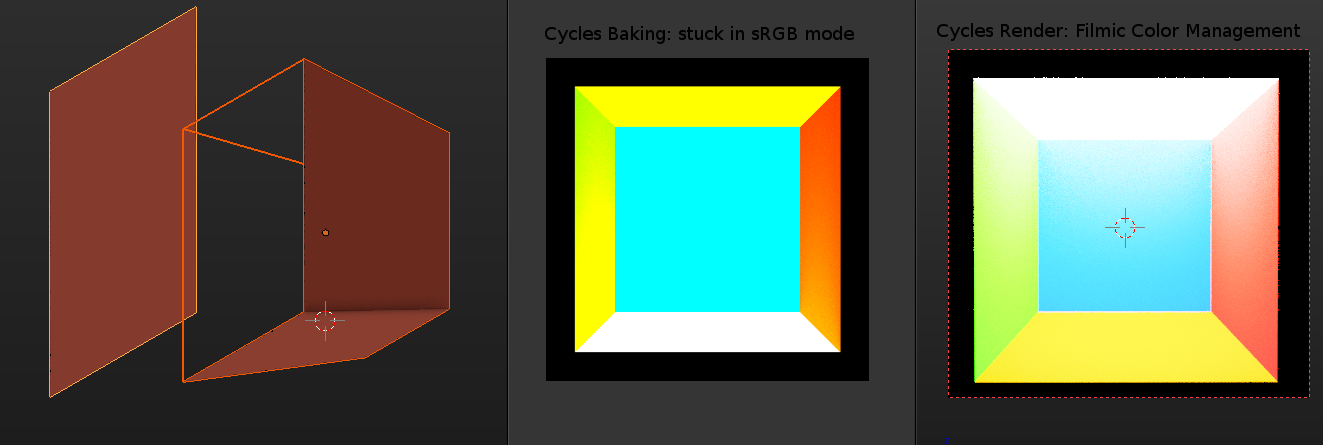
I post a test i have made, unfortunately Blender Cycles baking doesn’t support Color Management so it’s not possible to get proper interior lighting bake not burned. I hope to see filmic compatible it will be very useful for lightmap baking for games and architectural visualization and get more realistic results and brighter rooms.
The top face is a white emissive set at 500 of intensity.
No, don’t do that! To do correct calculations, your game engine needs lightmaps in linear space, not transformed. Consult the documentation of your engine on what input it expects. Maybe it does expect sRGB textures which it then turns back to linear. That would be a reasonable thing to do for LDR formats like JPEG, though you really want an HDR format like EXR for lightmaps. The tonemapping is done by the game engine at the very end of the frame, you can use a “filmic” transform there too (example for Unity).
What I am saying is getting a look that is realistic, yet does not have the potentially heavy color transformation you get in comparison from a camera.
Look at most movies for instance and compare it to what you see in real life (the contrasts are often a lot harsher, the highlights are a bit more grey, colors seem to have a bit of a saturation change going from light areas to dark areas). The point I was making is that recreating that exact look may indeed be useful for people combining movie camera footage with CGI for VFX tasks, but it’s not a task that a lot of people pursue when using Cycles.
From my experience so far, getting that real-life look without the camera-like transformations is easier to achieve from the base provided with the stock color management than the one provided by Filmic Blender (though it is subject to change as Troy S continues his work). We either need a color management panel that drips with features for color transformation and tonemapping or we need a way for the compositor to generate tonemapping code that is usable for both preview and F12 rendering.
Don’t confuse the colours of the primary lights (IE: “What colours are the reddish, greenish, and blueish lights the RGB values are referencing?”) with the other facets of a colour space.
The colour of the primaries in your reference space must always be transformed to the destination context. In this case, your reference lights are transformed to the display. This has very little to do with the subject at hand.
Because it is quite a bit more than a tonemap. You can also find a plethora of displays out there, as it is currently designed around a REC BT.709 set of primaries. These happen to be the same coloured lights that sRGB uses.
Further, anyone with a favorite tonemapping approach is free to try it out with the Notorious Six™: Albedo values of pure R, G, B, R+B, R+G, or B+G. You will see that under intense light these behave entirely incorrectly. As will many ratios near the upper end of exposure.
So what and why then is consistent and reliable view transform important? A few reasons:
Lighting to a consistent view is extremely beneficial for determining lighting ratios.
A consistent view is mandatory in the realm of animation and motion work, where assets may come from a variety of sources.
A fixed view transform makes mastering for HDR outputs consistent.
View based approaches keep your compositing scene referred linear, which means correct overs, blends, blurs, etc.
Look development across multiple scenes is easier to reuse developed custom looks.
Wide reference spaces can be tuned for per-display outputs properly, including as far as viewing conditions or other colour appearance model facets.
Filmic currently does not use a wide set of primaries for reference space rendering. This is on the near term map. Filmic will also likely get Apple P3 and other display support soon.
For those that are seeking to attach an ICC profile to their work for ICC based colour managed viewing, I would encourage trying Elle Stone’s 2.2 power function ICC. It can be found here for the version two variant, and here for the version four. She would likely appreciate some rigorous testing on her profiles.
After rendering, simply assign / attach the profile to the image in question. Do not convert, as that will transform the data, which is redundant.
I quite agree. I never really understood the point of those ‘film’ transforms since they often just made things look worse, aside from a verysmall selection that only seemed to work on certain scene types.
I was quite blown away by Sobotka’s colour model. Even for non-photorealistic scenes, the lighting and colours are just so much more pleasant, and most importantly more natural.
For fixing the problem of nodes that cause color management issues, maybe color tags can be used. For ‘safe’ operations, there can be a green dot at the top of the node, yellow for operations that are likely to cause some issue and a red color tag for operations that usually do cause problems.
This can clear up the issue without removing any tools, it’s just a minor UI upgrade.
You don’t understand the problem, that’s the issue. There is no “fix”, some operations just don’t make sense under certain conditions. This is universal.
I’m not even sure there is a problem here, at all. The program does what the user asked it to, the user gets the picture they wanted. Who cares if the math is wrong? Again, Photoshop has done color blending wrong since forever. It probably will never be fixed either, because the users are used to it being wrong.